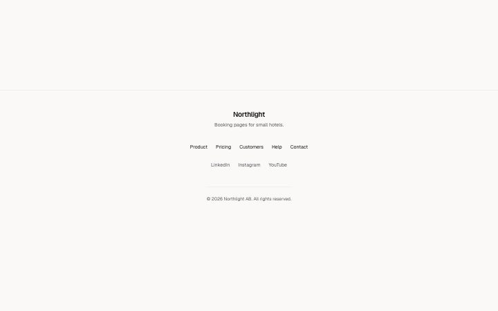
A centred footer: brand and one-line tagline, a row of page links, a row of social links, then the legal line.
Light · Dark
A centred footer: brand and one-line tagline, a row of page links, a row of social links, then the legal line.
Light · Dark
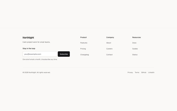
Up to four link columns, with a brand column or a full-width SVG wordmark below, an optional newsletter form and a legal line with legal links underneath.
Light · Dark
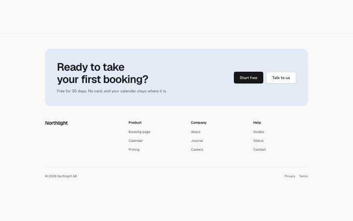
A footer that opens with one last ask: a large headline, a sentence and two buttons on a tinted panel, then the brand, two to four link columns and the legal…
Light · Dark
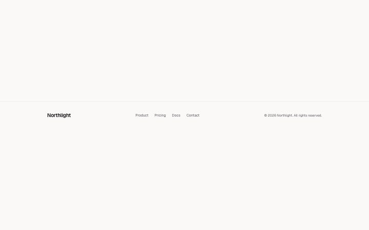
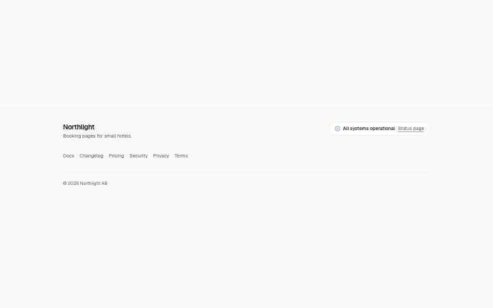
A compact footer for a product: brand and tagline, a status pill (a dot, the words "All systems operational" and a link to the status page), one wrapped row…
Light · Dark
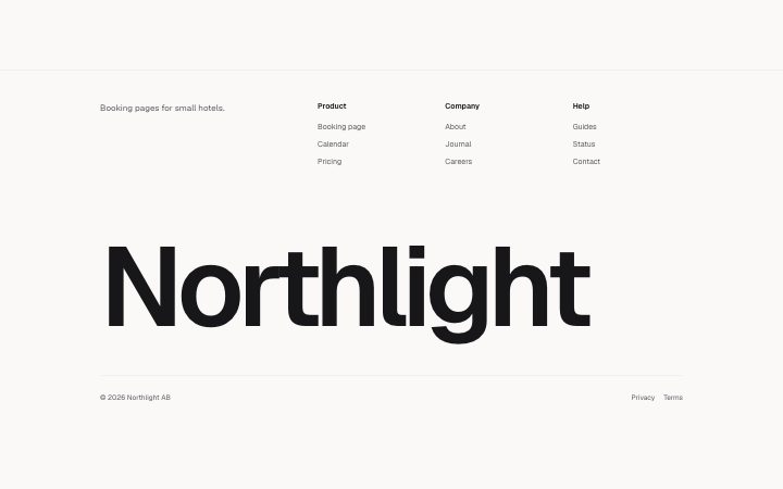
A footer led by an SVG text wordmark that scales to the full container width without wrapping or cropping, with up to three short link columns above and a…
Light · Dark