Upload drop zone
Install
npx shadcn add @klarhimmel/app-files-dropzoneUsage
import { Theme } from '@/components/klarhimmel/theme/style';
import { BlockSurface } from '@/components/klarhimmel/blocks/surface';
import AppFilesDropzone from '@/components/klarhimmel/blocks/app-files-dropzone';

export default function Section() {
  return (
    <Theme theme="brand">
      <BlockSurface>
        <AppFilesDropzone props={{
          "eyebrow": "Files",
          "title": "Upload documents",
          "description": "Contracts, price lists and photos for your rooms.",
          "prompt": "Drag files here, or choose them below",
          "field": {
            "label": "Files to upload",
            "button": "Choose files",
            "empty": "No files chosen",
            "hint": "PDF, PNG or JPG, up to 10 MB each."
          },
          "state": "idle",
          "messages": {
            "dragging": "Drop the files to upload them",
            "error": "One file is larger than 10 MB. Choose a smaller one.",
            "added": "Files added"
          }
        }} />
      </BlockSurface>
    </Theme>
  );
}
States
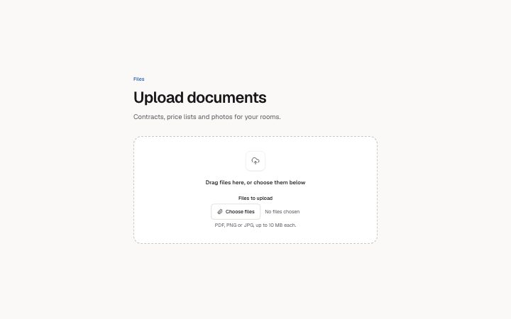
upload drop zone in 3 forms: idle, dragging, error.
state: idle
Files
Upload documents
Contracts, price lists and photos for your rooms.
Drag files here, or choose them below
Drop the files to upload them
No files chosenPDF, PNG or JPG, up to 10 MB each.
One file is larger than 10 MB. Choose a smaller one.
Files added (0)
state: dragging
Files
Upload documents
Contracts, price lists and photos for your rooms.
Drag files here, or choose them below
Drop the files to upload them
No files chosenPDF, PNG or JPG, up to 10 MB each.
One file is larger than 10 MB. Choose a smaller one.
Files added (0)
state: error
Files
Upload documents
Contracts, price lists and photos for your rooms.
Drag files here, or choose them below
Drop the files to upload them
No files chosenOne file is larger than 10 MB. Choose a smaller one.
Files added (0)
Notes
When to use it
The place where a person adds files to an account or a record, with a real drop target and a file picker inside it. Use `app-files-list` after it to show what was sent and how far each upload has got; this block only lists the names just added.
Writing for it
- The prompt line inside the zone holds 80 characters. Say what to drag and offer the picker in the same breath, since the button sits right below it. - Put the real limits in field.hint (120 characters): accepted formats and the size cap. The error message (120) should repeat that same limit so the two never disagree. - messages.dragging is 60 characters and replaces the prompt while a file hovers, so write it as an instruction about the drop, not a second description.
Watch out for
The state field only sets where the zone starts. A real drag sets the highlight on its own, and the added-files line appears only after someone drops or chooses files, so a static preview of that line needs a live interaction.
Usage
The block in a page, with its default content (long lists shortened). Every prop is in the table below.
import { Theme } from '@/components/klarhimmel/theme/style';
import { BlockSurface } from '@/components/klarhimmel/blocks/surface';
import AppFilesDropzone from '@/components/klarhimmel/blocks/app-files-dropzone';

export default function Section() {
  return (
    <Theme theme="brand">
      <BlockSurface>
        <AppFilesDropzone props={{
          "eyebrow": "Files",
          "title": "Upload documents",
          "description": "Contracts, price lists and photos for your rooms.",
          "prompt": "Drag files here, or choose them below",
          "field": {
            "label": "Files to upload",
            "button": "Choose files",
            "empty": "No files chosen",
            "hint": "PDF, PNG or JPG, up to 10 MB each."
          },
          "state": "idle",
          "messages": {
            "dragging": "Drop the files to upload them",
            "error": "One file is larger than 10 MB. Choose a smaller one.",
            "added": "Files added"
          }
        }} />
      </BlockSurface>
    </Theme>
  );
}
Props
The type, default and text limit of every prop. On a real page, over-limit text is kept and checkSections flags it (Installation, Check a page before you ship); this live preview shows the default until it fits. The panel above edits all props.
| Prop | Type | Default | Description |
|---|---|---|---|
eyebrow | string | 'Files' | Text, up to 60 characters. Optional; empty is not rendered. |
title | string | 'Upload documents' | Text, up to 120 characters. |
description | string | 'Contracts, price lists and photos f…' | Text, up to 300 characters. Optional; empty is not rendered. |
prompt | string | 'Drag files here, or choose them bel…' | Text, up to 80 characters. |
field | { label, button, empty, hint } | {…} | Fields: label, button, empty, hint. |
state | 'idle' | 'dragging' | 'error' | 'idle' | One of 'idle', 'dragging', 'error'. |
messages | { dragging, error, added } | {…} | Fields: dragging, error, added. |
headingLevel | '1' | '2' | - | One of '1', '2'. Optional; empty is not rendered. |
Install
Installs
app-files-dropzone- FileField
- About
- A drop zone that takes a real drop (it highlights while a file is over it, a drop never navigates the page, dropped names are listed and announced) with the file picker inside it, so dragging is never the only way in.
- States
- Idle, dragging and error. The picker sits inside the zone, so dropping is never the only way in.