Case studies, cards
Install
npx shadcn add @klarhimmel/case-study-cardUsage
import { Theme } from '@/components/klarhimmel/theme/style';
import { BlockSurface } from '@/components/klarhimmel/blocks/surface';
import CaseStudyCard from '@/components/klarhimmel/blocks/case-study-card';

export default function Section() {
  return (
    <Theme theme="brand">
      <BlockSurface>
        <CaseStudyCard props={{
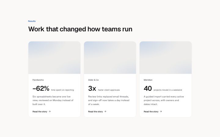
          "eyebrow": "Results",
          "title": "Work that changed how teams run",
          "items": [
            {
              "client": "Fjordworks",
              "figure": "−62%",
              "label": "time spent on reporting",
              "summary": "Six spreadsheets became one live view, reviewed on Monday instead of built over it.",
              "link": {
                "label": "Read the story",
                "href": "#fjordworks"
              },
              "media": {
                "src": "",
                "alt": "A reporting dashboard"
              }
            },
            {
              "client": "Alder & Co",
              "figure": "3x",
              "label": "faster client approvals",
              "summary": "Review links replaced email threads, and sign-off now takes a day instead of a week.",
              "link": {
                "label": "Read the story",
                "href": "#alder"
              },
              "media": {
                "src": "",
                "alt": "A client review screen"
              }
            },
            {
              "client": "Meridian",
              "figure": "40",
              "label": "projects moved in a weekend",
              "summary": "A guided import carried every active project across, with owners and dates intact.",
              "link": {
                "label": "Read the story",
                "href": "#meridian"
              },
              "media": {
                "src": "",
                "alt": "An import progress screen"
              }
            }
          ]
        }} />
      </BlockSurface>
    </Theme>
  );
}
Install
Import
import Block from '@/components/klarhimmel/blocks/case-study-card';- case-study/card
- Category
- One customer story: the problem, the work, the result.
Notes
When to use it
Up to twelve project or result cards, each with an image, client, one headline figure and a link, in a responsive collection. Use `case-study-metrics` when a single customer deserves a whole section.
Writing for it
- The figure holds 24 characters and the label beside it 60. Write '3x' with 'more bookings', so the two read as one phrase. - The summary (240 characters) should say what was done, since the figure already says what came out of it. - A card's link is hidden when its label is empty, so give every card a label if you want the same layout across all of them.
Watch out for
The grid goes to one, two or three columns depending on how many items you add. With exactly two cards on a wide page they fill the width, so make sure the two images share the same crop.
Pairs well with
Usage
The block in a page, with its default content (long lists shortened). Every prop is in the table below.
import { Theme } from '@/components/klarhimmel/theme/style';
import { BlockSurface } from '@/components/klarhimmel/blocks/surface';
import CaseStudyCard from '@/components/klarhimmel/blocks/case-study-card';

export default function Section() {
  return (
    <Theme theme="brand">
      <BlockSurface>
        <CaseStudyCard props={{
          "eyebrow": "Results",
          "title": "Work that changed how teams run",
          "items": [
            {
              "client": "Fjordworks",
              "figure": "−62%",
              "label": "time spent on reporting",
              "summary": "Six spreadsheets became one live view, reviewed on Monday instead of built over it.",
              "link": {
                "label": "Read the story",
                "href": "#fjordworks"
              },
              "media": {
                "src": "",
                "alt": "A reporting dashboard"
              }
            },
            {
              "client": "Alder & Co",
              "figure": "3x",
              "label": "faster client approvals",
              "summary": "Review links replaced email threads, and sign-off now takes a day instead of a week.",
              "link": {
                "label": "Read the story",
                "href": "#alder"
              },
              "media": {
                "src": "",
                "alt": "A client review screen"
              }
            }
          ]
        }} />
      </BlockSurface>
    </Theme>
  );
}
Props
The type, default and text limit of every prop. On a real page, over-limit text is kept and checkSections flags it (Installation, Check a page before you ship); this live preview shows the default until it fits. The panel above edits all props.
| Prop | Type | Default | Description |
|---|---|---|---|
eyebrow | string | 'Results' | Text, up to 60 characters. |
title | string | 'Work that changed how teams run' | Text, up to 120 characters. |
items | { client, figure, label, summary, link, media }[] | 3 items | List of 1 to 12. Each item: client, figure, label, summary, link, media. |
headingLevel | '1' | '2' | - | One of '1', '2'. Optional; empty is not rendered. |