Related content
Install
npx shadcn add @klarhimmel/related-contentUsage
import { Theme } from '@/components/klarhimmel/theme/style';
import { BlockSurface } from '@/components/klarhimmel/blocks/surface';
import RelatedContent from '@/components/klarhimmel/blocks/related-content';

export default function Section() {
  return (
    <Theme theme="brand">
      <BlockSurface>
        <RelatedContent props={{
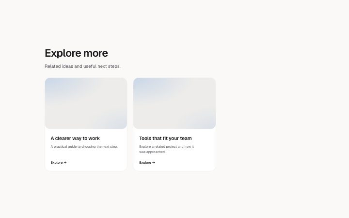
          "title": "Explore more",
          "description": "Related ideas and useful next steps.",
          "items": [
            {
              "title": "A clearer way to work",
              "description": "A practical guide to choosing the next step.",
              "href": "#guide",
              "media": {
                "src": "",
                "alt": "A notebook and a small model"
              }
            },
            {
              "title": "Tools that fit your team",
              "description": "Explore a related project and how it was approached.",
              "href": "#project",
              "media": {
                "src": "",
                "alt": "Connected sculptural blocks"
              }
            }
          ]
        }} />
      </BlockSurface>
    </Theme>
  );
}
Install
Import
import Block from '@/components/klarhimmel/blocks/related-content';- content/related
- Category
- Long-form text and timelines for about and policy pages.
Notes
When to use it
A reusable group of other projects, articles, services, products or events shown after the main content. Use it to offer a few relevant destinations without repeating the item the visitor has just read.
Writing for it
- Give the section a specific title such as Other projects or More guides. Each card needs a destination and a title; keep its summary to one short sentence. Images are optional: omit media for a text-only event card, or supply an image with a useful description. - Choose between one and six related items and filter out the current page before passing the list. The whole card is one link, so its contents should not contain additional actions.
Watch out for
This block displays the list supplied by the page. It does not rank recommendations or load content. Check that every destination resolves and that a small set of items remains useful on a phone.
Pairs well with
Usage
The block in a page, with its default content (long lists shortened). Every prop is in the table below.
import { Theme } from '@/components/klarhimmel/theme/style';
import { BlockSurface } from '@/components/klarhimmel/blocks/surface';
import RelatedContent from '@/components/klarhimmel/blocks/related-content';

export default function Section() {
  return (
    <Theme theme="brand">
      <BlockSurface>
        <RelatedContent props={{
          "title": "Explore more",
          "description": "Related ideas and useful next steps.",
          "items": [
            {
              "title": "A clearer way to work",
              "description": "A practical guide to choosing the next step.",
              "href": "#guide",
              "media": {
                "src": "",
                "alt": "A notebook and a small model"
              }
            },
            {
              "title": "Tools that fit your team",
              "description": "Explore a related project and how it was approached.",
              "href": "#project",
              "media": {
                "src": "",
                "alt": "Connected sculptural blocks"
              }
            }
          ]
        }} />
      </BlockSurface>
    </Theme>
  );
}
Props
The type, default and text limit of every prop. On a real page, over-limit text is kept and checkSections flags it (Installation, Check a page before you ship); this live preview shows the default until it fits. The panel above edits all props.
| Prop | Type | Default | Description |
|---|---|---|---|
title | string | 'Explore more' | Text, up to 120 characters. |
description | string | 'Related ideas and useful next steps.' | Text, up to 300 characters. |
items | { title, description, href, media }[] | 2 items | List of 1 to 6. Each item: title, description, href, media (optional). |
headingLevel | '1' | '2' | - | One of '1', '2'. Optional; empty is not rendered. |