Directory, cards
Install
npx shadcn add @klarhimmel/directory-cardsUsage
import { Theme } from '@/components/klarhimmel/theme/style';
import { BlockSurface } from '@/components/klarhimmel/blocks/surface';
import DirectoryCards from '@/components/klarhimmel/blocks/directory-cards';

export default function Section() {
  return (
    <Theme theme="brand">
      <BlockSurface>
        <DirectoryCards props={{
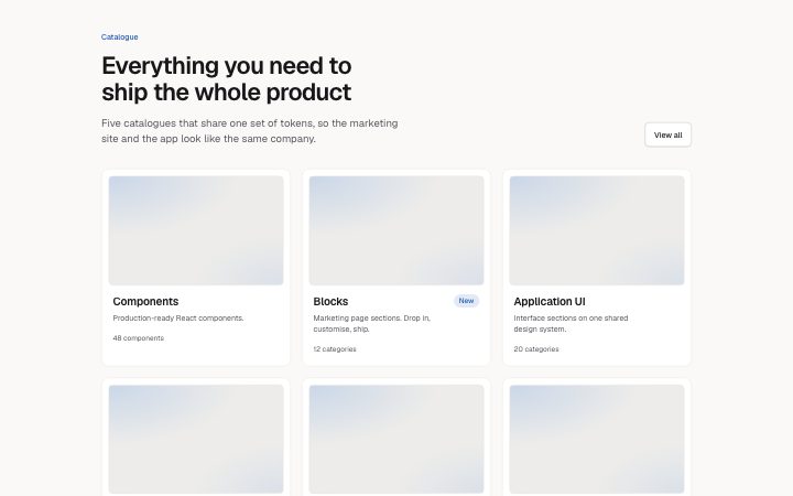
          "eyebrow": "Catalogue",
          "title": "Everything you need to ship the whole product",
          "description": "Five catalogues that share one set of tokens, so the marketing site and the app look like the same company.",
          "viewAll": {
            "label": "View all",
            "href": "/catalogue/"
          },
          "columns": "3",
          "items": [
            {
              "title": "Components",
              "description": "Production-ready React components.",
              "meta": "48 components",
              "tag": "",
              "href": "/catalogue/components/",
              "media": {
                "src": "",
                "alt": "Components thumbnail"
              },
              "actions": []
            },
            {
              "title": "Blocks",
              "description": "Marketing page sections. Drop in, customise, ship.",
              "meta": "12 categories",
              "tag": "New",
              "href": "/catalogue/blocks/",
              "media": {
                "src": "",
                "alt": "Blocks thumbnail"
              },
              "actions": []
            },
            {
              "title": "Application UI",
              "description": "Interface sections on one shared design system.",
              "meta": "20 categories",
              "tag": "",
              "href": "/catalogue/app/",
              "media": {
                "src": "",
                "alt": "Application UI thumbnail"
              },
              "actions": []
            },
            {
              "title": "Agent kit",
              "description": "Skills, page prompts and recipes for your AI.",
              "meta": "3 kinds",
              "tag": "Updated",
              "href": "/catalogue/agent/",
              "media": {
                "src": "",
                "alt": "Agent kit thumbnail"
              },
              "actions": []
            },
            {
              "title": "Templates",
              "description": "Landing page templates. Download the source.",
              "meta": "6 templates",
              "tag": "",
              "href": "/catalogue/templates/",
              "media": {
                "src": "",
                "alt": "Templates thumbnail"
              },
              "actions": [
                {
                  "label": "Preview",
                  "href": "/catalogue/templates/preview/"
                },
                {
                  "label": "Download",
                  "href": "/catalogue/templates/download/"
                }
              ]
            },
            {
              "title": "Foundations",
              "description": "Colour, type, spacing and motion, as tokens.",
              "meta": "8 foundations",
              "tag": "",
              "href": "/catalogue/foundations/",
              "media": {
                "src": "",
                "alt": "Foundations thumbnail"
              },
              "actions": []
            }
          ]
        }} />
      </BlockSurface>
    </Theme>
  );
}
Install
Import
import Block from '@/components/klarhimmel/blocks/directory-cards';- directory/cards
- About
- A heading and a grid of link cards with thumbnail, title, caption, meta and an optional tag or actions. Catalogue cards, groups with "View all", category and template grids.
- Category
- Catalogue pages: headers with filters, card grids, full-width previews.
Notes
When to use it
A heading and a grid of link cards for catalogue entries, categories or templates, each with a thumbnail and caption. For a large set with filters, put `directory-header` above it.
Writing for it
- Choose 2, 3 or 4 columns. Card titles hold 60 characters, descriptions 160 and meta 60, so give each card a title, one line of what is inside and a count. - The tag holds 16 characters and fits one word such as New. Add up to two actions per card only when a card needs a second destination. - Every card needs an image slot filled, since the thumbnail sits at 16 by 10 above the title. The block takes 1 to 40 cards.
Watch out for
If the eyebrow, title and description are all empty the whole heading row goes, including the View all link. The card is one big link to its href, with actions raised above it, so never put an action on a card that has no href.
Pairs well with
Usage
The block in a page, with its default content (long lists shortened). Every prop is in the table below.
import { Theme } from '@/components/klarhimmel/theme/style';
import { BlockSurface } from '@/components/klarhimmel/blocks/surface';
import DirectoryCards from '@/components/klarhimmel/blocks/directory-cards';

export default function Section() {
  return (
    <Theme theme="brand">
      <BlockSurface>
        <DirectoryCards props={{
          "eyebrow": "Catalogue",
          "title": "Everything you need to ship the whole product",
          "description": "Five catalogues that share one set of tokens, so the marketing site and the app look like the same company.",
          "viewAll": {
            "label": "View all",
            "href": "/catalogue/"
          },
          "columns": "3",
          "items": [
            {
              "title": "Components",
              "description": "Production-ready React components.",
              "meta": "48 components",
              "tag": "",
              "href": "/catalogue/components/",
              "media": {
                "src": "",
                "alt": "Components thumbnail"
              },
              "actions": []
            },
            {
              "title": "Blocks",
              "description": "Marketing page sections. Drop in, customise, ship.",
              "meta": "12 categories",
              "tag": "New",
              "href": "/catalogue/blocks/",
              "media": {
                "src": "",
                "alt": "Blocks thumbnail"
              },
              "actions": []
            }
          ]
        }} />
      </BlockSurface>
    </Theme>
  );
}
Props
The type, default and text limit of every prop. On a real page, over-limit text is kept and checkSections flags it (Installation, Check a page before you ship); this live preview shows the default until it fits. The panel above edits all props.
| Prop | Type | Default | Description |
|---|---|---|---|
eyebrow | string | 'Catalogue' | Text, up to 60 characters. |
title | string | 'Everything you need to ship the who…' | Text, up to 120 characters. |
description | string | 'Five catalogues that share one set …' | Text, up to 300 characters. |
viewAll | Link | {…} | See the type. |
columns | '2' | '3' | '4' | '3' | One of '2', '3', '4'. |
items | { title, description, meta, tag, href, media, actions }[] | 6 items | List of 1 to 40. Each item: title, description, meta, tag, href, media, actions. |
headingLevel | '1' | '2' | - | One of '1', '2'. Optional; empty is not rendered. |