Pricing, comparison table
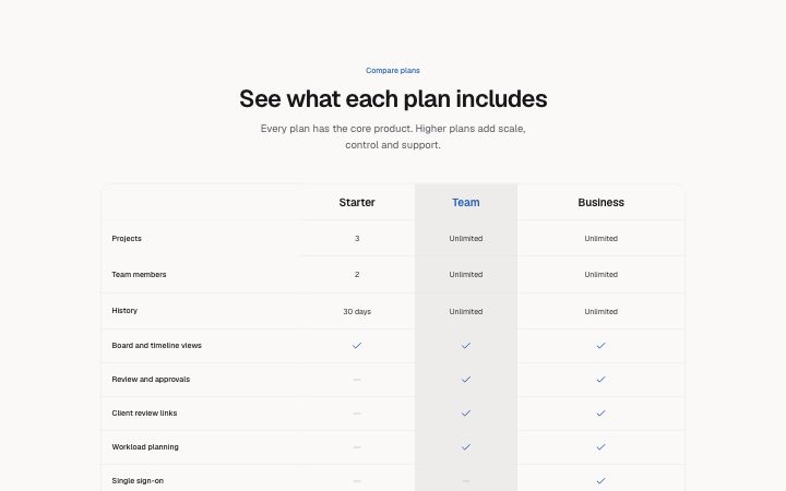
Install
npx shadcn add @klarhimmel/pricing-comparisonUsage
import { Theme } from '@/components/klarhimmel/theme/style';
import { BlockSurface } from '@/components/klarhimmel/blocks/surface';
import PricingComparison from '@/components/klarhimmel/blocks/pricing-comparison';

export default function Section() {
  return (
    <Theme theme="brand">
      <BlockSurface>
        <PricingComparison props={{
          "eyebrow": "Compare plans",
          "title": "See what each plan includes",
          "description": "Every plan has the core product. Higher plans add scale, control and support.",
          "plans": [
            {
              "name": "Starter",
              "featured": false
            },
            {
              "name": "Team",
              "featured": true
            },
            {
              "name": "Business",
              "featured": false
            }
          ],
          "rows": [
            {
              "feature": "Projects",
              "values": [
                "3",
                "Unlimited",
                "Unlimited"
              ]
            },
            {
              "feature": "Team members",
              "values": [
                "2",
                "Unlimited",
                "Unlimited"
              ]
            },
            {
              "feature": "History",
              "values": [
                "30 days",
                "Unlimited",
                "Unlimited"
              ]
            },
            {
              "feature": "Board and timeline views",
              "values": [
                "yes",
                "yes",
                "yes"
              ]
            },
            {
              "feature": "Review and approvals",
              "values": [
                "no",
                "yes",
                "yes"
              ]
            },
            {
              "feature": "Client review links",
              "values": [
                "no",
                "yes",
                "yes"
              ]
            },
            {
              "feature": "Workload planning",
              "values": [
                "no",
                "yes",
                "yes"
              ]
            },
            {
              "feature": "Single sign-on",
              "values": [
                "no",
                "no",
                "yes"
              ]
            },
            {
              "feature": "Audit log",
              "values": [
                "no",
                "no",
                "yes"
              ]
            },
            {
              "feature": "Custom roles",
              "values": [
                "no",
                "no",
                "yes"
              ]
            },
            {
              "feature": "Support",
              "values": [
                "Community",
                "Priority",
                "Dedicated manager"
              ]
            }
          ]
        }} />
      </BlockSurface>
    </Theme>
  );
}
Install
Import
import Block from '@/components/klarhimmel/blocks/pricing-comparison';- pricing/comparison
- Category
- Plans and prices: tiers, a single plan, a toggle or a comparison table.
Notes
When to use it
A feature-by-plan table for two to four plans, with checks, dashes or short text in the cells. It follows plan cards such as `pricing-tiers`; do not use it to introduce a price on its own.
Writing for it
- In the values (30 characters each), 'yes' draws a check, 'no' or empty draws a dash, and any other text is shown as it is, like '5 seats' or 'Unlimited'. - List the values in plan order, one per plan. A row with fewer values than plans shows dashes for the plans left out. - Feature names hold 80 characters and are the row headers. Group them so the rows a buyer cares about most come first, up to sixteen rows.
Watch out for
The first column header is read by screen readers only, defaulting to 'Feature'. On a Swedish or other non-English page set featureLabel yourself, as the icon cells also speak the English words 'Included' and 'Not included'.
Pairs well with
Usage
The block in a page, with its default content (long lists shortened). Every prop is in the table below.
import { Theme } from '@/components/klarhimmel/theme/style';
import { BlockSurface } from '@/components/klarhimmel/blocks/surface';
import PricingComparison from '@/components/klarhimmel/blocks/pricing-comparison';

export default function Section() {
  return (
    <Theme theme="brand">
      <BlockSurface>
        <PricingComparison props={{
          "eyebrow": "Compare plans",
          "title": "See what each plan includes",
          "description": "Every plan has the core product. Higher plans add scale, control and support.",
          "plans": [
            {
              "name": "Starter",
              "featured": false
            },
            {
              "name": "Team",
              "featured": true
            },
            {
              "name": "Business",
              "featured": false
            }
          ],
          "rows": [
            {
              "feature": "Projects",
              "values": [
                "3",
                "Unlimited",
                "Unlimited"
              ]
            },
            {
              "feature": "Team members",
              "values": [
                "2",
                "Unlimited",
                "Unlimited"
              ]
            },
            {
              "feature": "History",
              "values": [
                "30 days",
                "Unlimited",
                "Unlimited"
              ]
            }
          ]
        }} />
      </BlockSurface>
    </Theme>
  );
}
Props
The type, default and text limit of every prop. On a real page, over-limit text is kept and checkSections flags it (Installation, Check a page before you ship); this live preview shows the default until it fits. The panel above edits all props.
| Prop | Type | Default | Description |
|---|---|---|---|
eyebrow | string | 'Compare plans' | Text, up to 60 characters. |
title | string | 'See what each plan includes' | Text, up to 120 characters. |
description | string | 'Every plan has the core product. Hi…' | Text, up to 300 characters. |
featureLabel | string | - | Text, up to 30 characters. Optional; empty is not rendered. |
plans | { name, featured }[] | 3 items | List of 2 to 4. Each item: name, featured. |
rows | { feature, values }[] | 11 items | List of 1 to 16. Each item: feature, values. |
headingLevel | '1' | '2' | - | One of '1', '2'. Optional; empty is not rendered. |