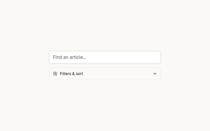
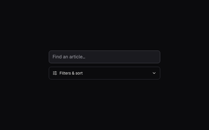
Native search, filter and sort controls that collapse their options in narrow containers.
Native search, filter and sort controls that collapse their options in narrow containers.
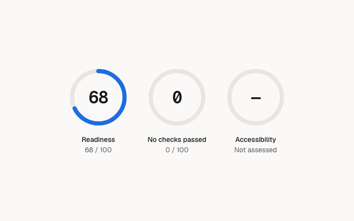
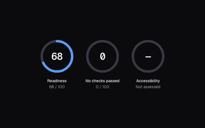
A score from 0 to 100 with a text equivalent. Unassessed is distinct from zero.
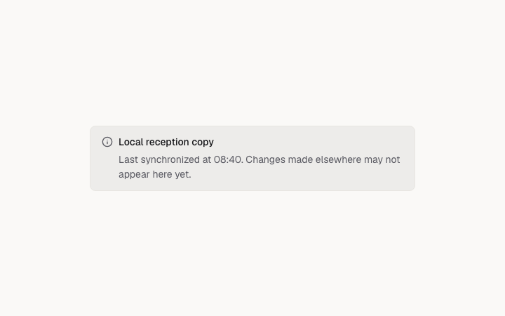
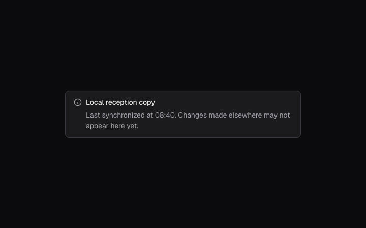
A quiet provenance message next to the data: source, freshness and limitations.
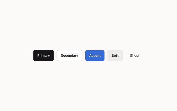
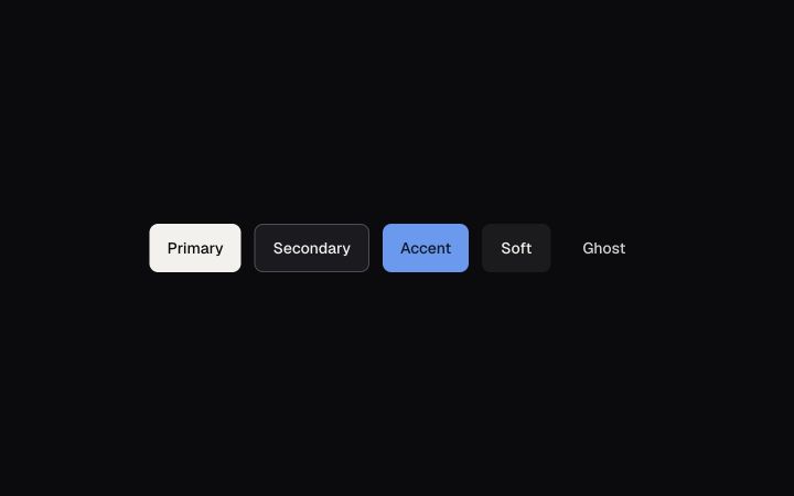
Triggers an action. Five variants, three sizes, a 44 pixel hit area at every size.
An anchor styled as a button, for navigation that should look like an action.
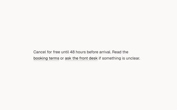
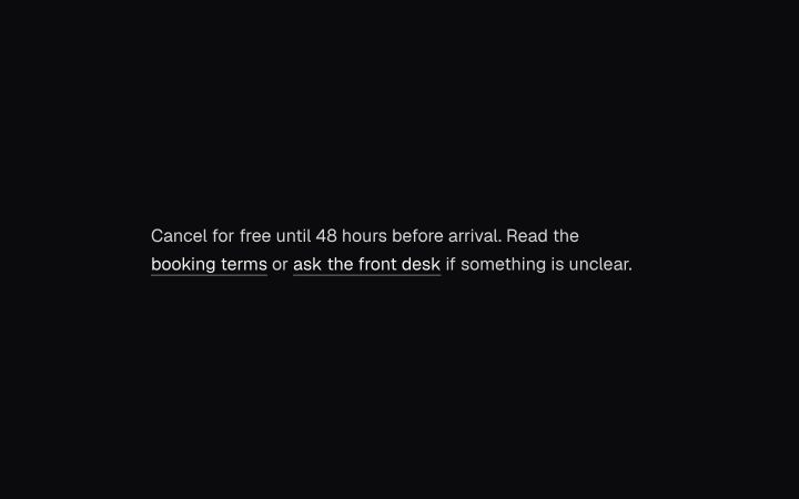
An inline link with an underline that stays visible, and a focus ring.
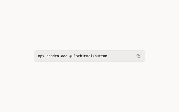
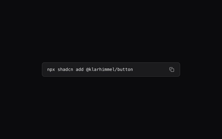
An icon button that copies a value and confirms with a check.
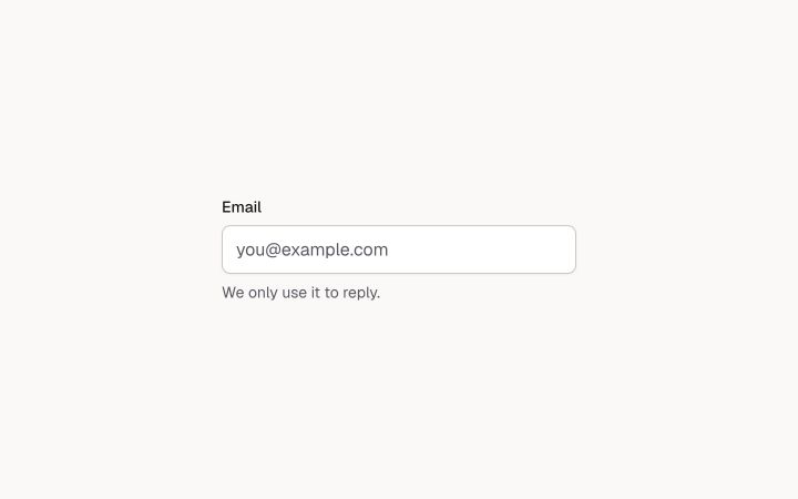
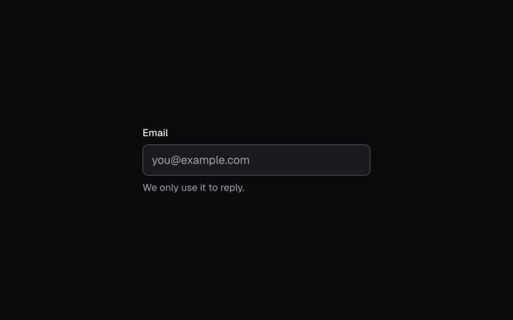
A single-line text field with the system's border, focus ring and invalid state.
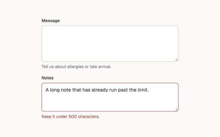
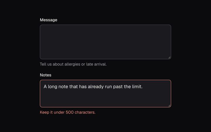
Multi-line text, resizable vertically.
Label, control and a hint or error, with the ids wired for assistive tech.
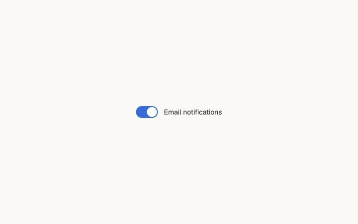
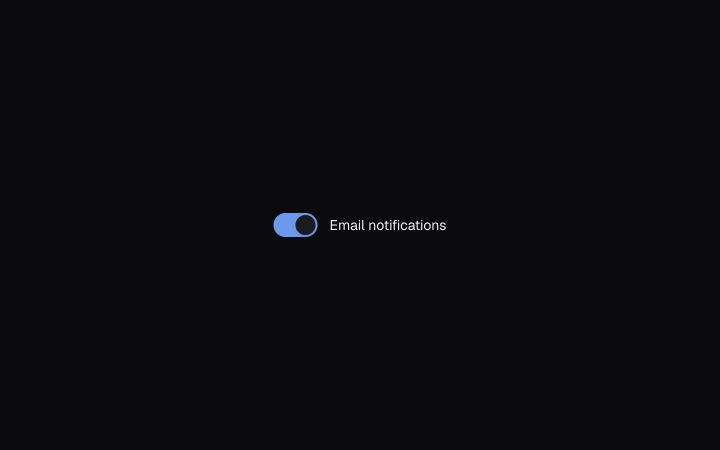
An on/off control for settings that apply right away. Built on Radix Switch.
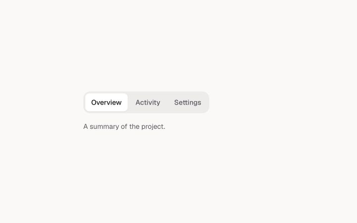
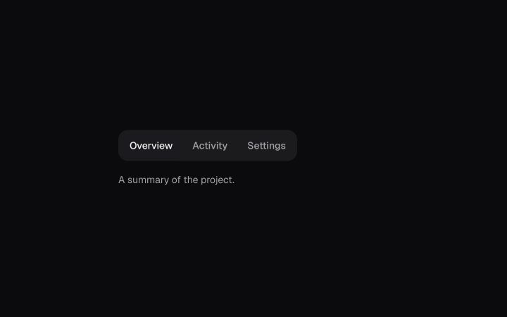
Switch between views of the same thing. Built on Radix Tabs, arrow keys move between tabs.
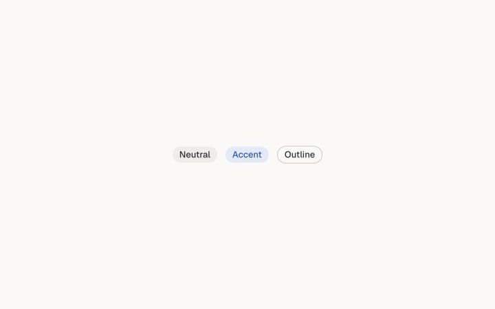
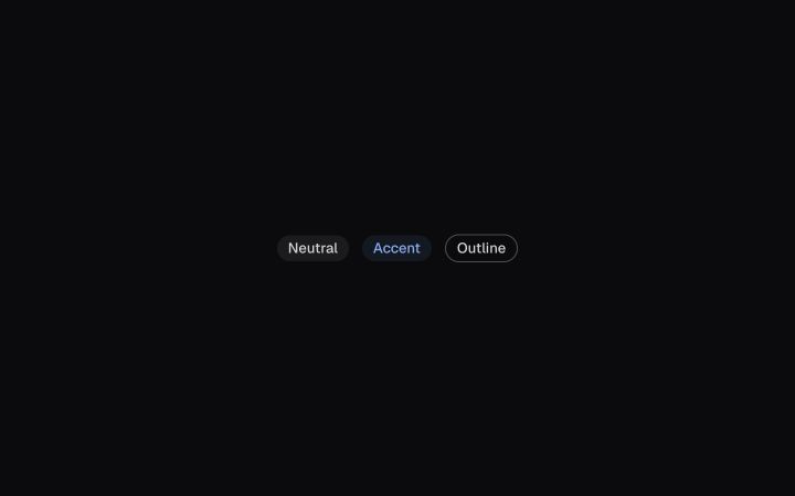
A short label for status or category.
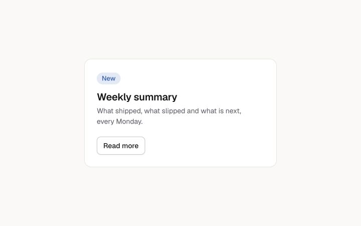
A surface that groups related content: flat, raised or sunken.
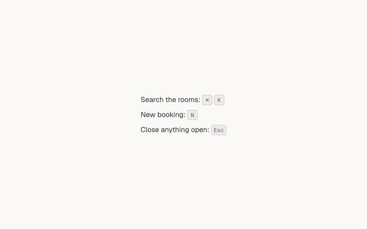
A keyboard key, for shortcuts in text and menus.
A button with only an icon. The label is its accessible name and its tooltip, so it can never be unnamed.
A person or team as a photo, or as initials on a colour picked from the name.
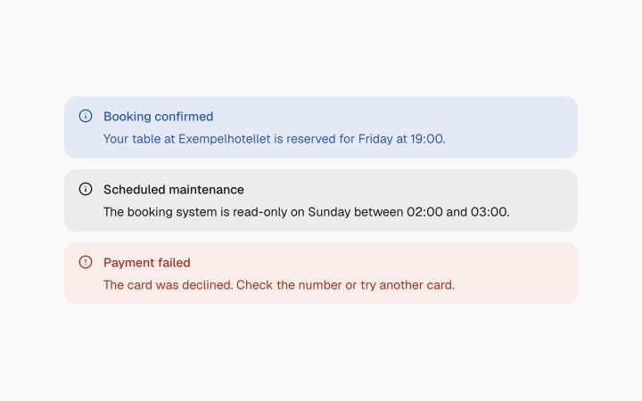
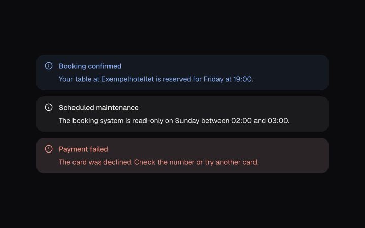
An inline message in the page flow: information, a notice or an error, with an optional next step.
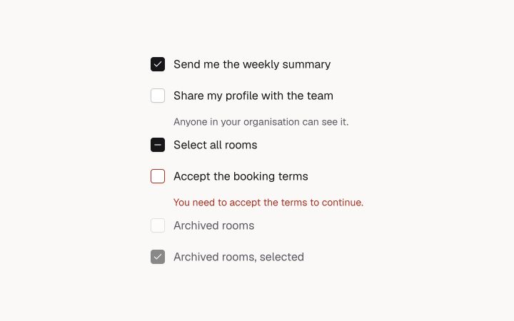
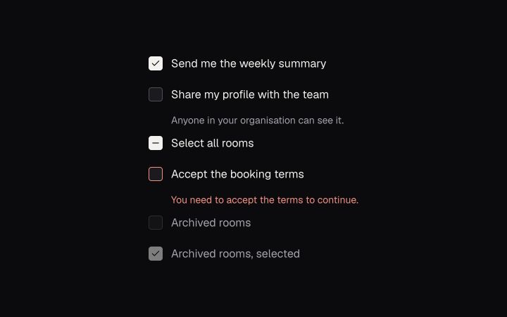
A box that is on, off or mixed, with its label inside a 44 px row. Built on Radix Checkbox.
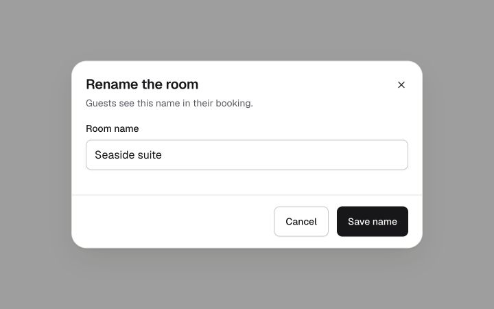
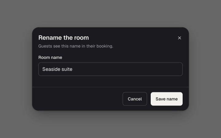
A modal window that traps focus, closes on Escape and gives focus back. Built on Radix Dialog.
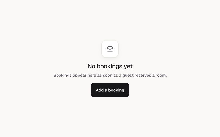
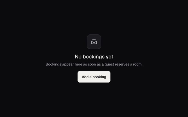
What a list or page shows when there is nothing yet: an icon, one sentence and one next step.
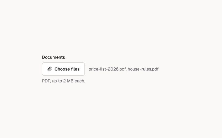
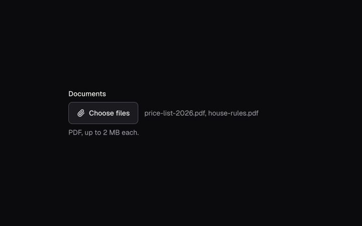
A styled file picker: label, button, the chosen names, and a hint or an error. The native input stays in the form.
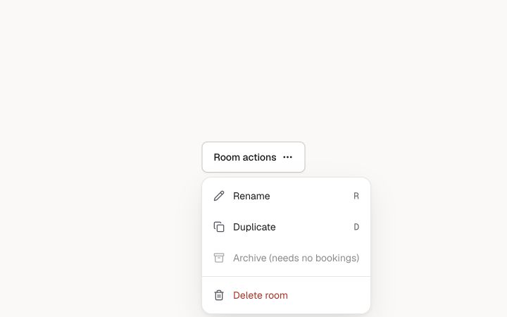
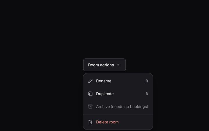
A list of actions behind a button. Arrow keys move, type-ahead jumps. Built on Radix Dropdown Menu.
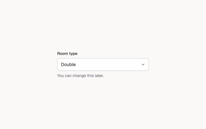
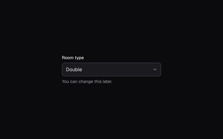
The browser's own select in the system's field style. Best on phones and for short lists.
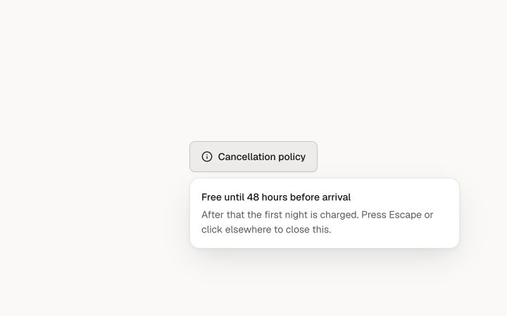
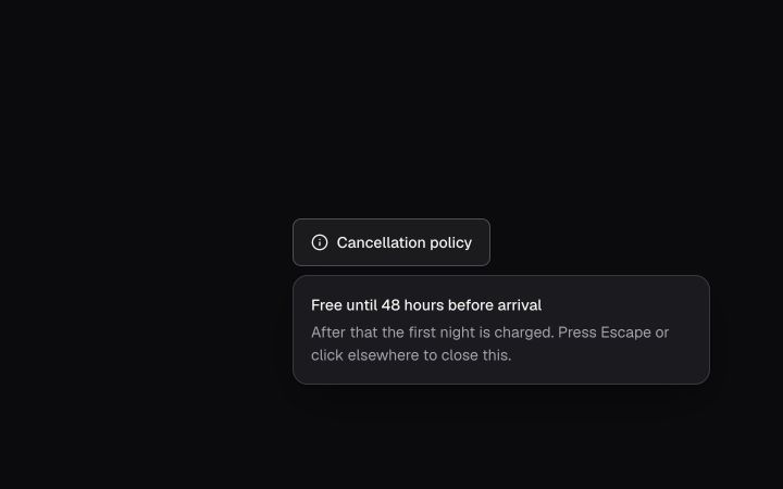
A small floating panel next to its trigger, for extra detail or a tiny form. Built on Radix Popover.
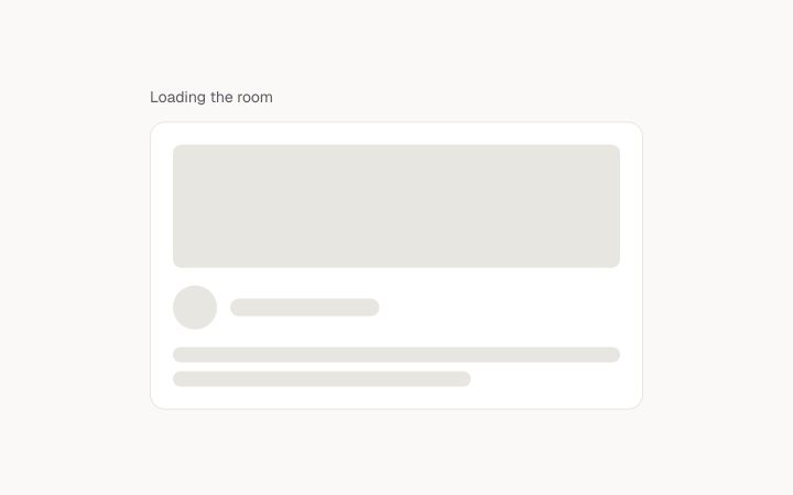
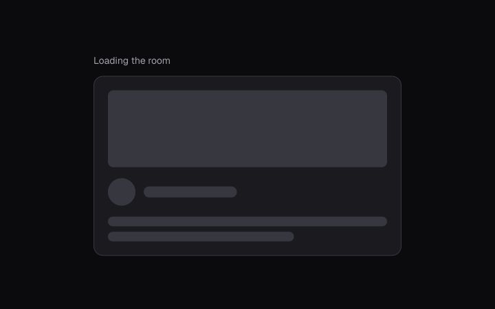
A pulsing placeholder for content that is on its way. It stops pulsing when motion is reduced.
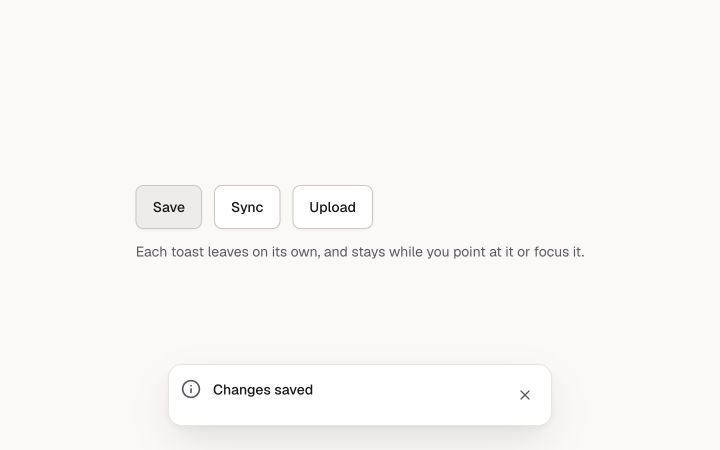
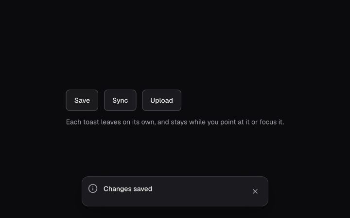
A short message that appears at the bottom, from anywhere in the app, and leaves by itself.
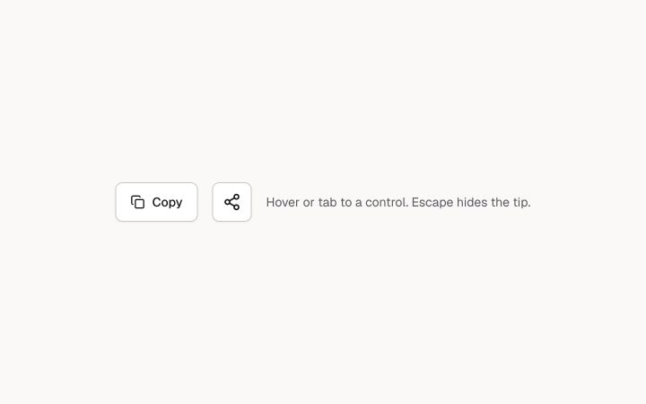
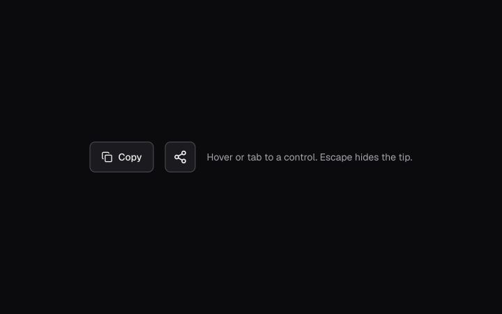
A short label for a control, shown on hover and keyboard focus. Built on Radix Tooltip.
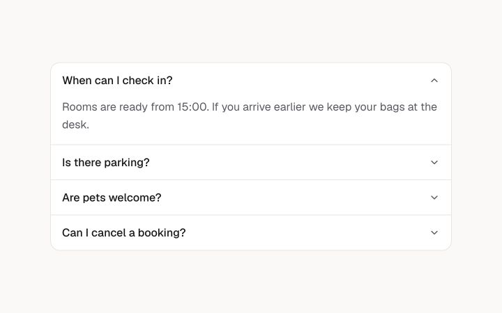
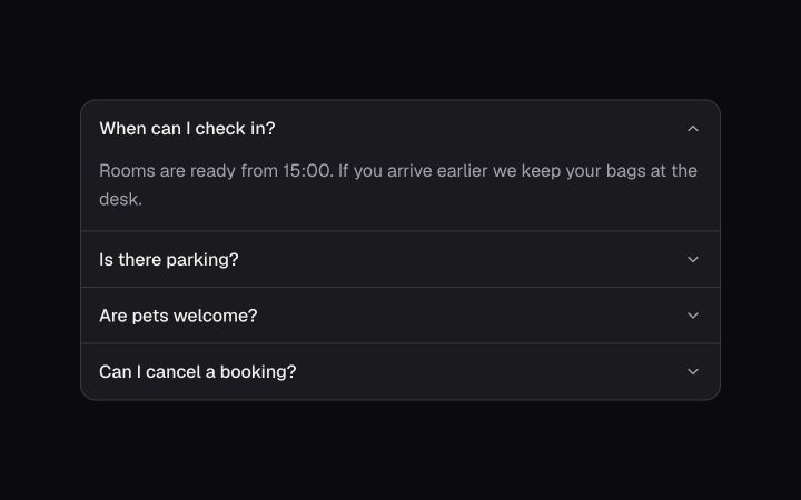
A stack of headings that each open and close a panel. One open at a time, or several.
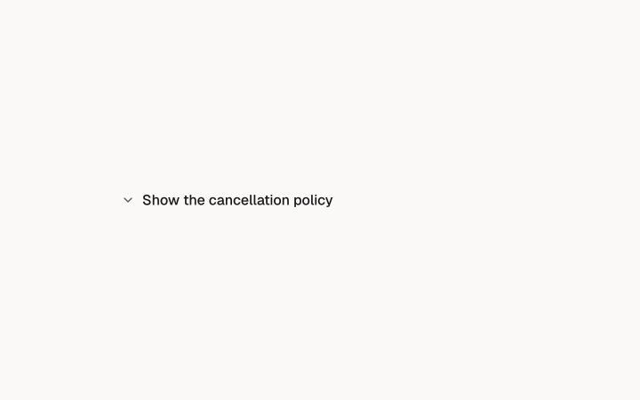
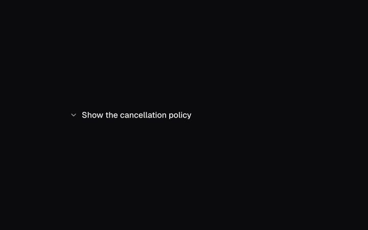
One button that shows or hides extra content below it.
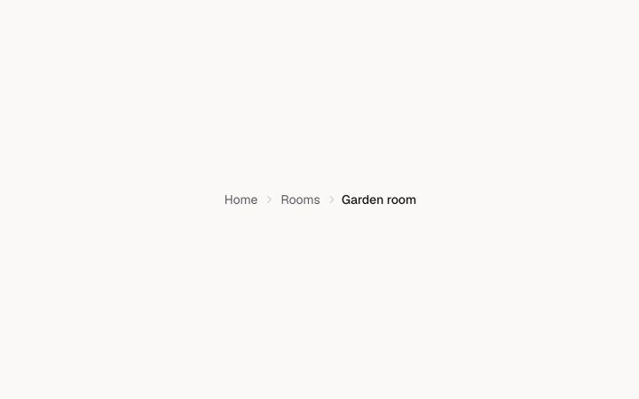
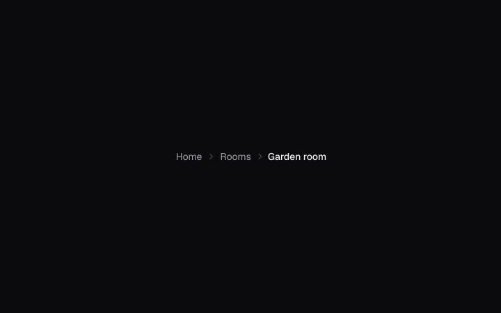
The path to the current page: links up the tree, then the page itself.
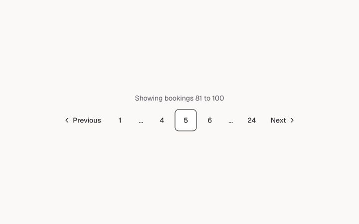
Page navigation with Previous, Next and numbered pages, as buttons or as plain links.
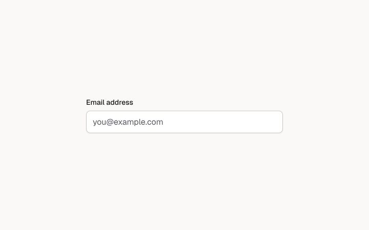
The visible text that names a form control.
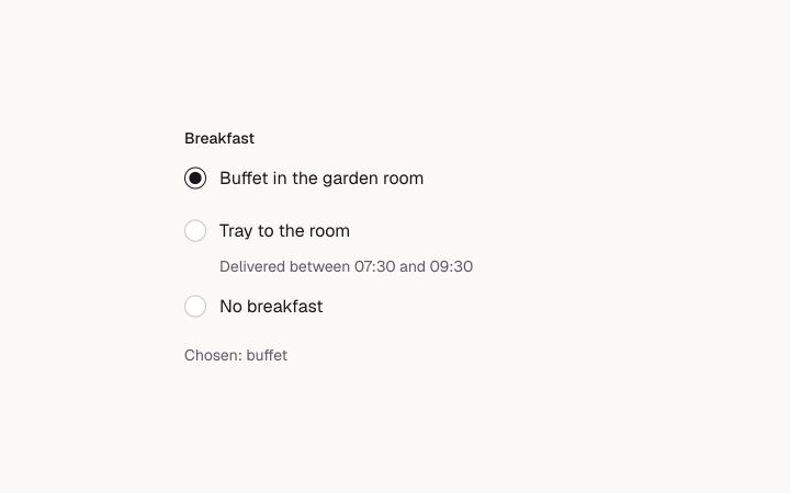
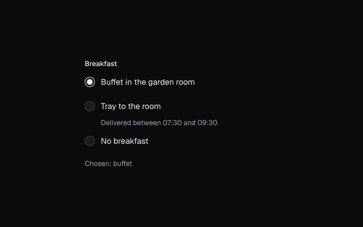
One choice from a few options that are all visible. Built on native radio inputs.
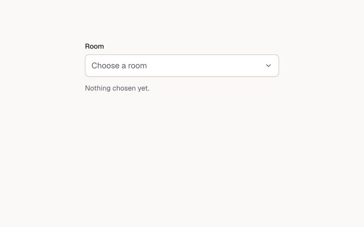
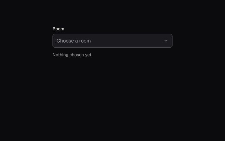
A custom dropdown with a keyboard-complete listbox, type-ahead and form value.
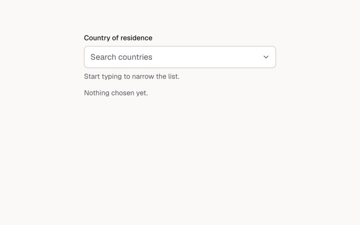
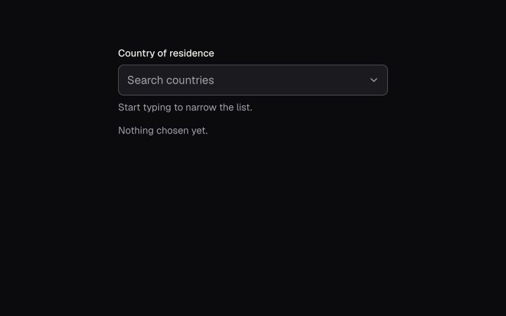
A text field that filters a list as you type and picks one option.
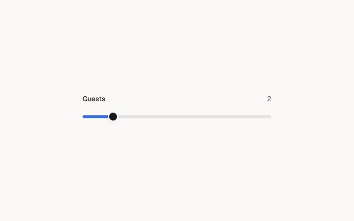
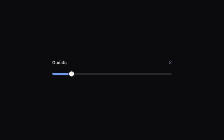
A single-value slider on the native range input.
A button that stays pressed: bold, favourite, mute.
A row of toggles that belong together: pick one, or any number.
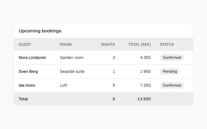
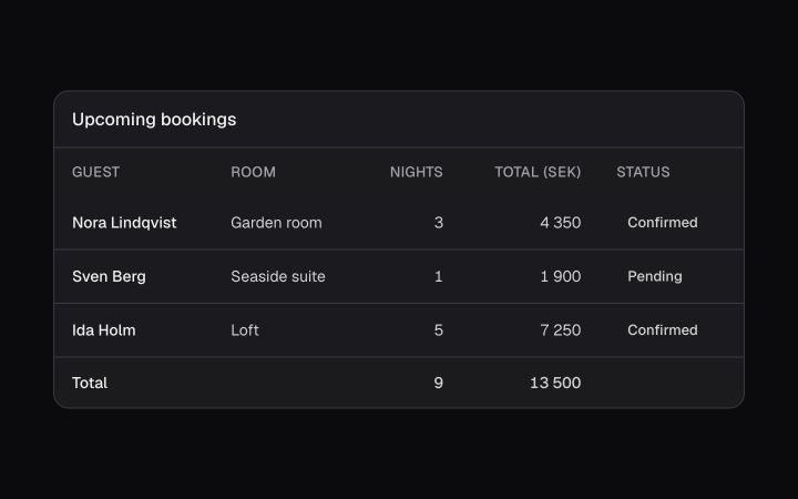
A semantic data table in a keyboard-scrollable frame, with sortable headers.
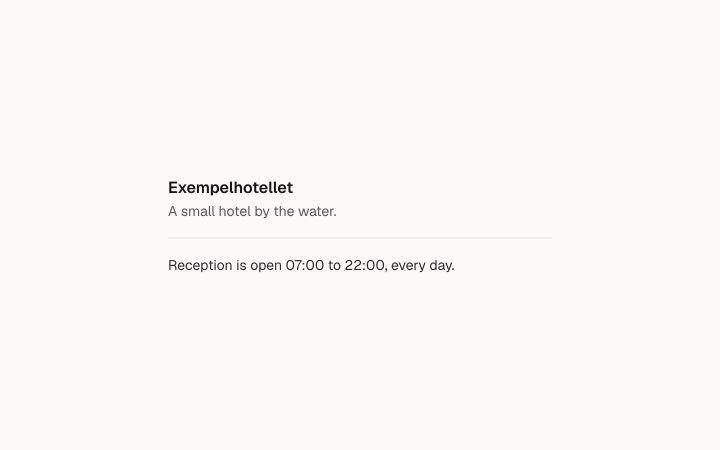
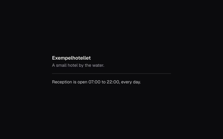
A hairline between groups, horizontal or vertical.
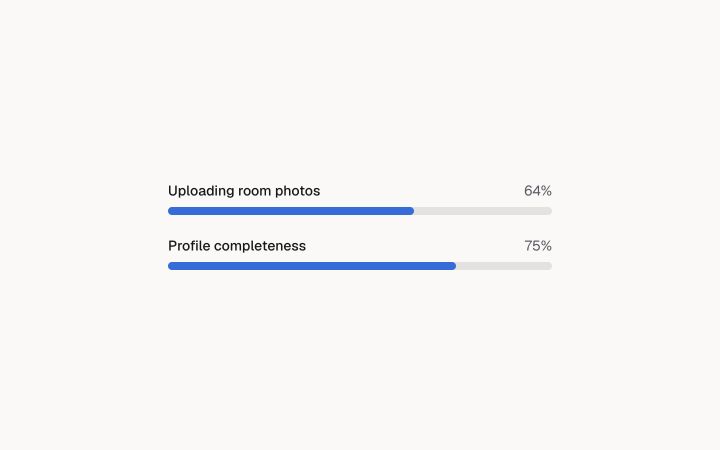
A bar for a task with a known share done, or an indeterminate one while it works.
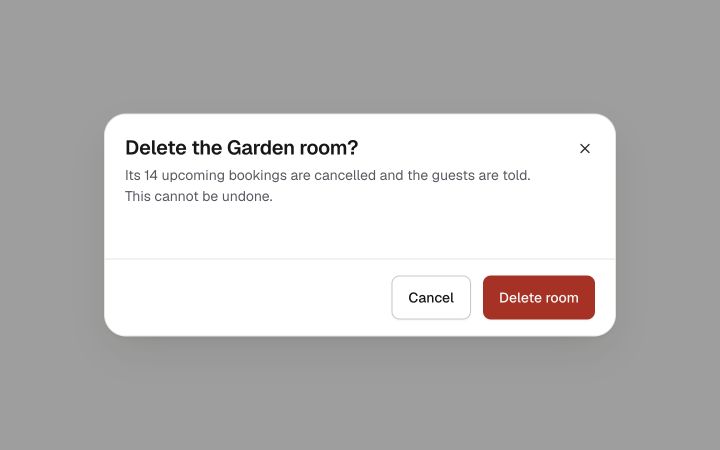
A confirmation that cannot be dismissed by accident. Built on Dialog.
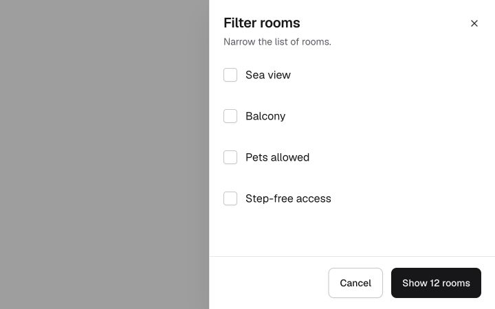
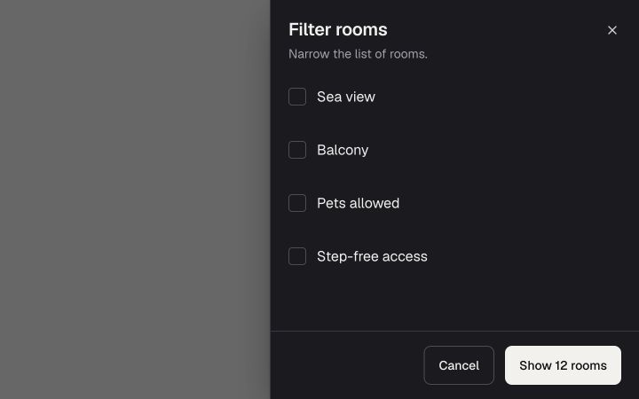
A modal side panel for a task that keeps the page in view. Built like Dialog.
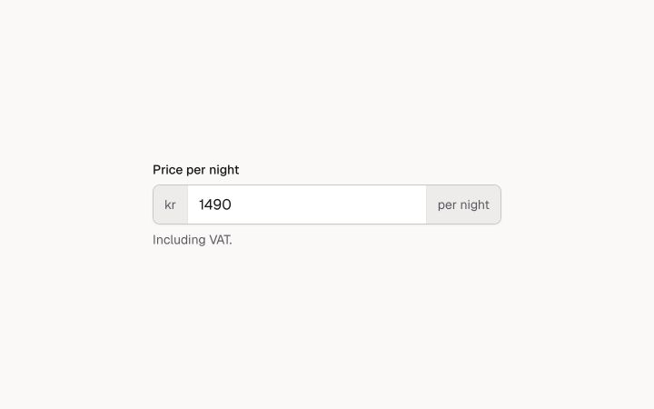
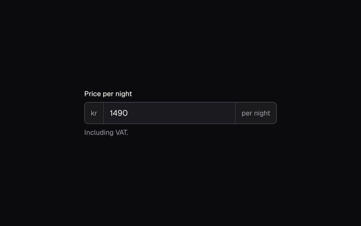
One field made of parts: a prefix or suffix, the input and a button, sharing one border and one focus ring.
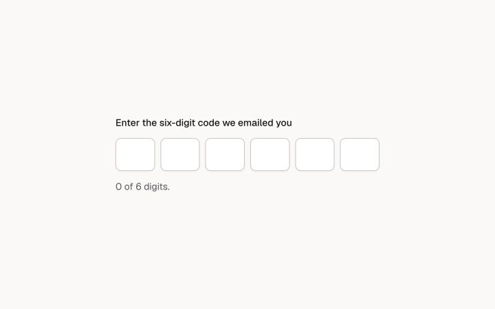
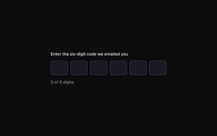
A code split into boxes that behave as one field: paste fills them all, Backspace goes back, autofill works.
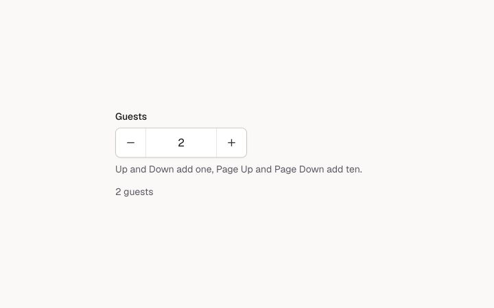
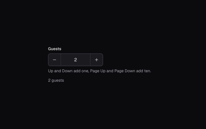
A number you can type or step, with minus and plus buttons: the WAI-ARIA spin button.
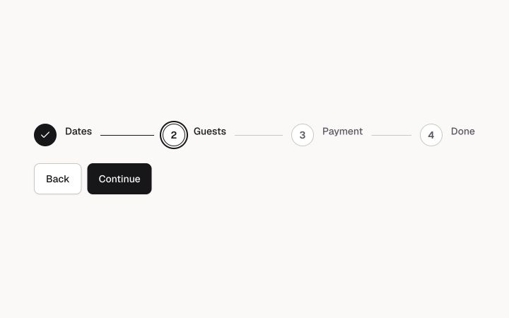
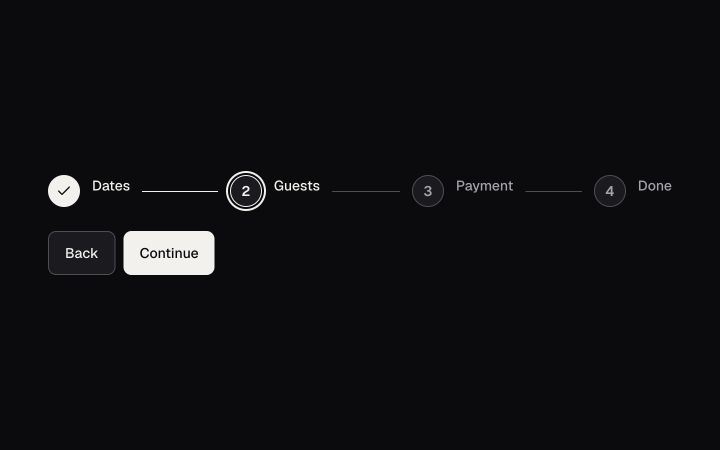
Where someone is in a flow: numbered steps, the current one marked, each step's state said in words.
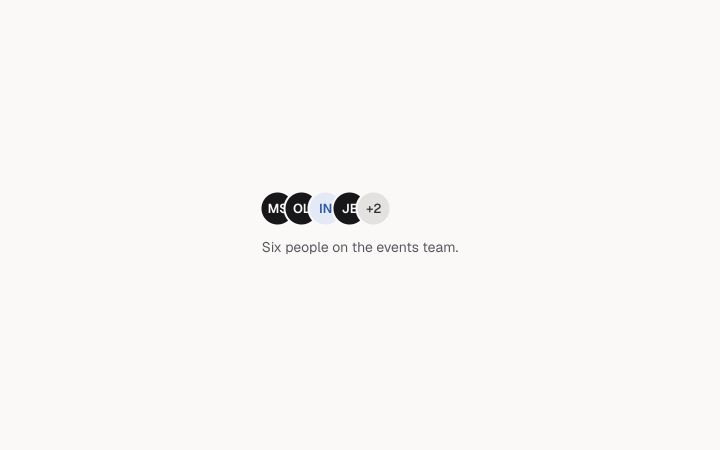
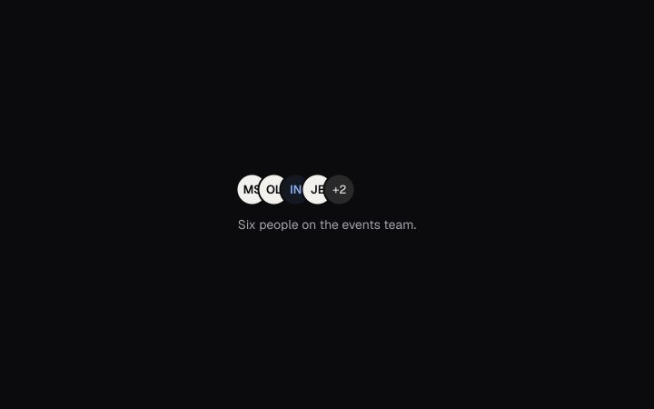
People who share something, overlapped, with the rest collapsed into a named +N chip.
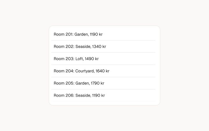
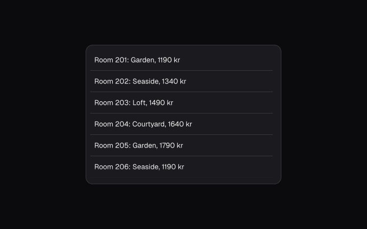
Content that scrolls inside a fixed box: a named region, a tab stop, a thin scrollbar and a soft edge where there is more.
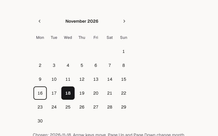
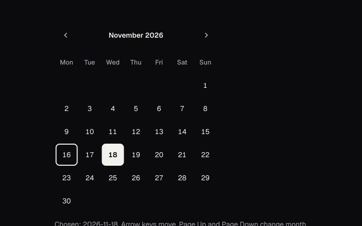
A month of days to choose from: the WAI-ARIA date picker grid, with today named and unavailable days said.
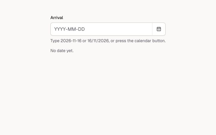
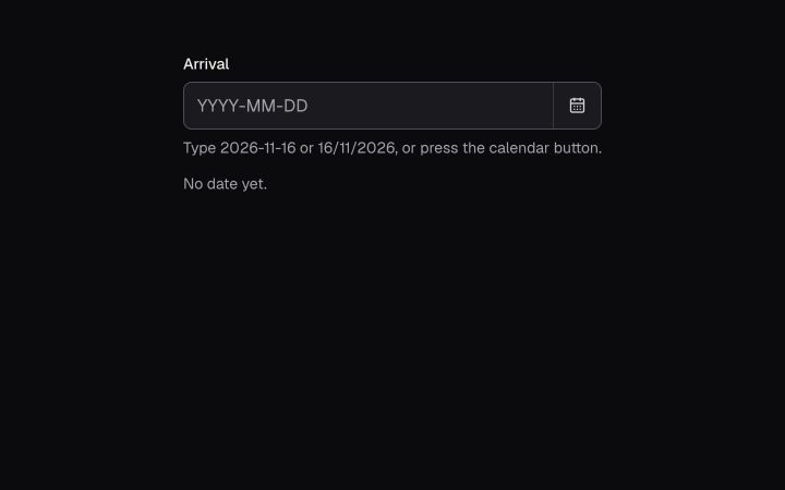
A date field you can type or pick: the text takes ISO or day-first, the button opens the calendar in a dialog.
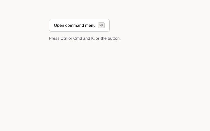
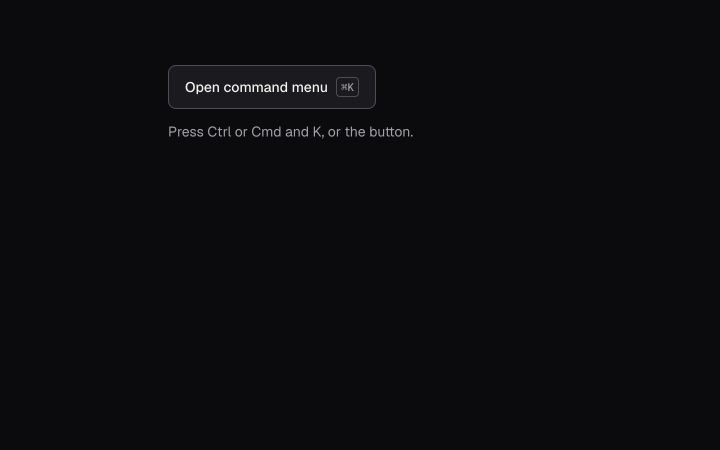
A search box over a list of actions, and the Cmd+K palette that puts it in a dialog.
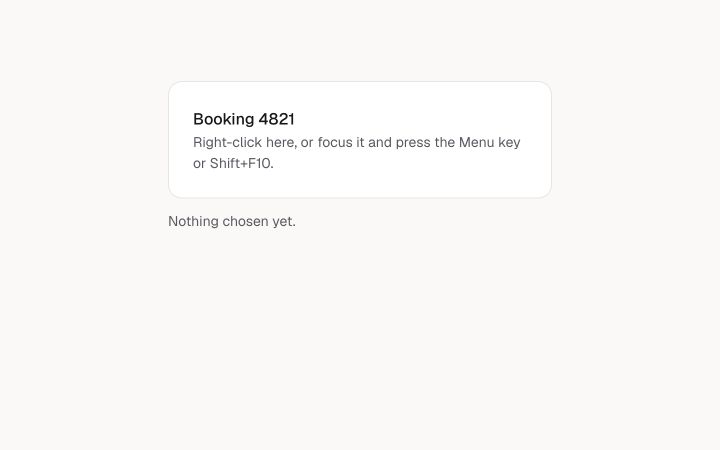
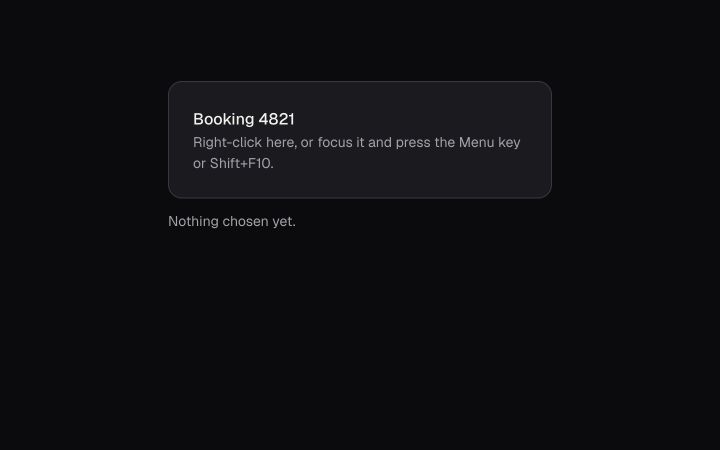
The menu that opens where you right-click, and from the keyboard with the Menu key or Shift+F10.
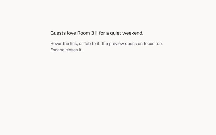
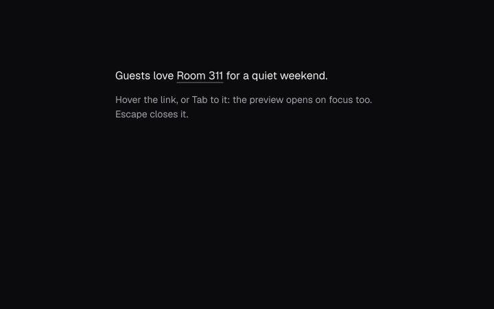
A preview of where a link goes, shown on hover and on keyboard focus, never the only copy.