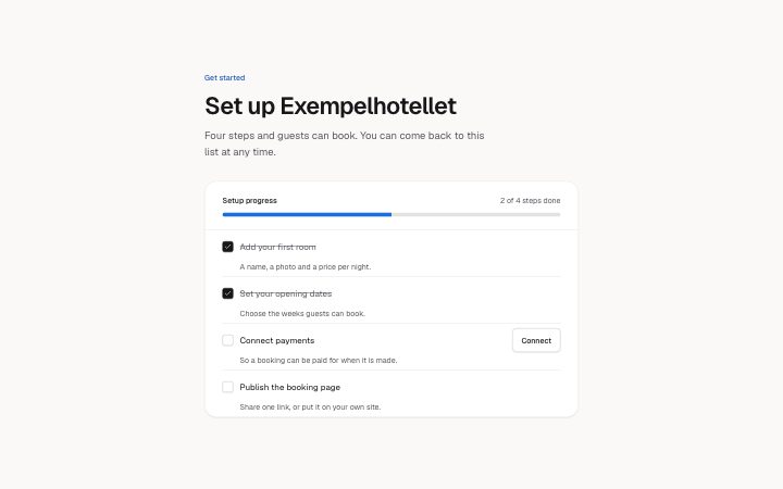
Setup checklist
Install
npx shadcn add @klarhimmel/app-onboarding-checklistUsage
import { Theme } from '@/components/klarhimmel/theme/style';
import { BlockSurface } from '@/components/klarhimmel/blocks/surface';
import AppOnboardingChecklist from '@/components/klarhimmel/blocks/app-onboarding-checklist';

export default function Section() {
  return (
    <Theme theme="brand">
      <BlockSurface>
        <AppOnboardingChecklist props={{
          "eyebrow": "Get started",
          "title": "Set up Exempelhotellet",
          "description": "Four steps and guests can book. You can come back to this list at any time.",
          "progress": {
            "label": "Setup progress",
            "of": "of",
            "suffix": "steps done"
          },
          "items": [
            {
              "title": "Add your first room",
              "description": "A name, a photo and a price per night.",
              "done": true
            },
            {
              "title": "Set your opening dates",
              "description": "Choose the weeks guests can book.",
              "done": true,
              "action": "Open calendar"
            },
            {
              "title": "Connect payments",
              "description": "So a booking can be paid for when it is made.",
              "done": false,
              "action": "Connect"
            },
            {
              "title": "Publish the booking page",
              "description": "Share one link, or put it on your own site.",
              "done": false
            }
          ],
          "complete": "Everything is set up. Guests can book now."
        }} />
      </BlockSurface>
    </Theme>
  );
}
States
setup checklist in 3 forms: just started, in progress, all done.
just started
Get started
Set up Exempelhotellet
Four steps and guests can book. You can come back to this list at any time.
0 of 4 steps done
Everything is set up. Guests can book now.
A name, a photo and a price per night.
Choose the weeks guests can book.
So a booking can be paid for when it is made.
Share one link, or put it on your own site.
in progress
Get started
Set up Exempelhotellet
Four steps and guests can book. You can come back to this list at any time.
2 of 4 steps done
Everything is set up. Guests can book now.
A name, a photo and a price per night.
Choose the weeks guests can book.
So a booking can be paid for when it is made.
Share one link, or put it on your own site.
all done
Get started
Set up Exempelhotellet
Four steps and guests can book. You can come back to this list at any time.
4 of 4 steps done
Everything is set up. Guests can book now.
A name, a photo and a price per night.
Choose the weeks guests can book.
So a booking can be paid for when it is made.
Share one link, or put it on your own site.
Notes
When to use it
A getting-started list for a new account, where each step is ticked in place and a bar shows progress. If the steps must happen in order with one shown at a time, `app-onboarding-steps` fits better; this one lets people do the steps in any order.
Writing for it
- Step titles hold 80 characters and descriptions 160. Start the title with a verb so the tick reads as a finished task. - The progress line is built from the count, progress.of and progress.suffix, as in '2 of 4 steps done'. Write the two small words so that sentence is grammatical in your language. - Use action (30) only on steps that need a button, and keep it to a verb phrase like Connect. Seven items is the cap, and two the minimum.
Watch out for
The action button of a step is hidden once that step is done, so a finished step cannot be reopened from it. The completion message (120) shows above the list only when every box is ticked, and the list stays so a step can be unticked.
Usage
The block in a page, with its default content (long lists shortened). Every prop is in the table below.
import { Theme } from '@/components/klarhimmel/theme/style';
import { BlockSurface } from '@/components/klarhimmel/blocks/surface';
import AppOnboardingChecklist from '@/components/klarhimmel/blocks/app-onboarding-checklist';

export default function Section() {
  return (
    <Theme theme="brand">
      <BlockSurface>
        <AppOnboardingChecklist props={{
          "eyebrow": "Get started",
          "title": "Set up Exempelhotellet",
          "description": "Four steps and guests can book. You can come back to this list at any time.",
          "progress": {
            "label": "Setup progress",
            "of": "of",
            "suffix": "steps done"
          },
          "items": [
            {
              "title": "Add your first room",
              "description": "A name, a photo and a price per night.",
              "done": true
            },
            {
              "title": "Set your opening dates",
              "description": "Choose the weeks guests can book.",
              "done": true,
              "action": "Open calendar"
            },
            {
              "title": "Connect payments",
              "description": "So a booking can be paid for when it is made.",
              "done": false,
              "action": "Connect"
            },
            {
              "title": "Publish the booking page",
              "description": "Share one link, or put it on your own site.",
              "done": false
            }
          ],
          "complete": "Everything is set up. Guests can book now."
        }} />
      </BlockSurface>
    </Theme>
  );
}
Props
The type, default and text limit of every prop. On a real page, over-limit text is kept and checkSections flags it (Installation, Check a page before you ship); this live preview shows the default until it fits. The panel above edits all props.
| Prop | Type | Default | Description |
|---|---|---|---|
eyebrow | string | 'Get started' | Text, up to 60 characters. Optional; empty is not rendered. |
title | string | 'Set up Exempelhotellet' | Text, up to 120 characters. |
description | string | 'Four steps and guests can book. You…' | Text, up to 300 characters. Optional; empty is not rendered. |
progress | { label, of, suffix } | {…} | Fields: label, of, suffix. |
items | { title, description, done, action }[] | 4 items | List of 2 to 7. Each item: title, description, done, action (optional). |
complete | string | 'Everything is set up. Guests can bo…' | Text, up to 120 characters. |
headingLevel | '1' | '2' | - | One of '1', '2'. Optional; empty is not rendered. |
Install
Installs
app-onboarding-checklist- Checkbox
- Button
- About
- A getting-started checklist with a progress bar and a count that follow the checkboxes. Each step has a title, a line of help and maybe one action.
- States
- Some done, none done or all done. The bar and the count follow the checkboxes; a finished list shows its completion message.