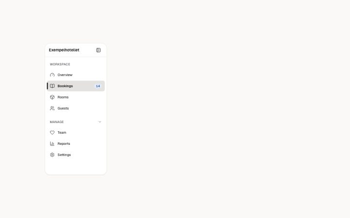
App, sidebar navigation
Install
npx shadcn add @klarhimmel/app-shell-sidebarUsage
import { Theme } from '@/components/klarhimmel/theme/style';
import { BlockSurface } from '@/components/klarhimmel/blocks/surface';
import AppShellSidebar from '@/components/klarhimmel/blocks/app-shell-sidebar';

export default function Section() {
  return (
    <Theme theme="brand">
      <BlockSurface>
        <AppShellSidebar props={{
          "brand": "Exempelhotellet",
          "navLabel": "Main navigation",
          "groups": [
            {
              "label": "Workspace",
              "collapsible": false,
              "open": true,
              "items": [
                {
                  "label": "Overview",
                  "icon": "gauge",
                  "href": "#overview"
                },
                {
                  "label": "Bookings",
                  "icon": "book",
                  "href": "#bookings",
                  "badge": "14"
                },
                {
                  "label": "Rooms",
                  "icon": "box",
                  "href": "#rooms"
                },
                {
                  "label": "Guests",
                  "icon": "users",
                  "href": "#guests"
                }
              ]
            },
            {
              "label": "Manage",
              "collapsible": true,
              "open": true,
              "items": [
                {
                  "label": "Team",
                  "icon": "heart",
                  "href": "#team"
                },
                {
                  "label": "Reports",
                  "icon": "chart",
                  "href": "#reports"
                },
                {
                  "label": "Settings",
                  "icon": "settings",
                  "href": "#settings"
                }
              ]
            }
          ],
          "active": "Bookings",
          "collapsed": false,
          "toggle": {
            "collapse": "Collapse sidebar",
            "expand": "Expand sidebar"
          }
        }} />
      </BlockSurface>
    </Theme>
  );
}
Install
Import
import Block from '@/components/klarhimmel/blocks/app-shell-sidebar';- app/shell-sidebar
- About
- The sidebar of an app: grouped links with icons and an optional count, groups that open and close, the current page marked with aria-current, and a button that folds it into an icon rail whose names appear in tooltips (on hover and…
- Category
- Interface sections for signed-in products.
Notes
When to use it
The side navigation of an app, with grouped links and a current page. Use `app-shell-topbar` with it for breadcrumbs and the account menu; a marketing site should use a navbar block, not this.
Writing for it
- Labels hold 30 characters, and the optional badge holds only 6, so write a count like 14 and not a word. - active must equal one item label exactly, or no link is marked as the current page. Keep labels unique across groups for the same reason. - Set collapsible: true only on groups that people may want to fold away, such as Manage. Up to 4 groups of 6 links keep the rail readable.
Watch out for
In the collapsed rail the labels become tooltips and the brand is hidden visually, and collapsible groups stop behaving as buttons. An item with an empty label is not drawn at all, so a blank link vanishes without a warning.
Pairs well with
Usage
The block in a page, with its default content (long lists shortened). Every prop is in the table below.
import { Theme } from '@/components/klarhimmel/theme/style';
import { BlockSurface } from '@/components/klarhimmel/blocks/surface';
import AppShellSidebar from '@/components/klarhimmel/blocks/app-shell-sidebar';

export default function Section() {
  return (
    <Theme theme="brand">
      <BlockSurface>
        <AppShellSidebar props={{
          "brand": "Exempelhotellet",
          "navLabel": "Main navigation",
          "groups": [
            {
              "label": "Workspace",
              "collapsible": false,
              "open": true,
              "items": [
                {
                  "label": "Overview",
                  "icon": "gauge",
                  "href": "#overview"
                },
                {
                  "label": "Bookings",
                  "icon": "book",
                  "href": "#bookings",
                  "badge": "14"
                }
              ]
            },
            {
              "label": "Manage",
              "collapsible": true,
              "open": true,
              "items": [
                {
                  "label": "Team",
                  "icon": "heart",
                  "href": "#team"
                },
                {
                  "label": "Reports",
                  "icon": "chart",
                  "href": "#reports"
                }
              ]
            }
          ],
          "active": "Bookings",
          "collapsed": false,
          "toggle": {
            "collapse": "Collapse sidebar",
            "expand": "Expand sidebar"
          }
        }} />
      </BlockSurface>
    </Theme>
  );
}
Props
The type, default and text limit of every prop. On a real page, over-limit text is kept and checkSections flags it (Installation, Check a page before you ship); this live preview shows the default until it fits. The panel above edits all props.
| Prop | Type | Default | Description |
|---|---|---|---|
brand | string | 'Exempelhotellet' | Text, up to 30 characters. |
navLabel | string | 'Main navigation' | Text, up to 40 characters. |
groups | { label, collapsible, open, items }[] | 2 items | List of 1 to 4. Each item: label, collapsible, open, items. |
active | string | 'Bookings' | Text, up to 30 characters. |
collapsed | boolean | false | See the type. |
toggle | { collapse, expand } | {…} | Fields: collapse, expand. |