App, danger zone
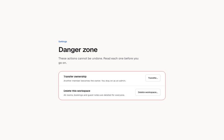
Install
npx shadcn add @klarhimmel/app-settings-dangerUsage
import { Theme } from '@/components/klarhimmel/theme/style';
import { BlockSurface } from '@/components/klarhimmel/blocks/surface';
import AppSettingsDanger from '@/components/klarhimmel/blocks/app-settings-danger';

export default function Section() {
  return (
    <Theme theme="brand">
      <BlockSurface>
        <AppSettingsDanger props={{
          "eyebrow": "Settings",
          "title": "Danger zone",
          "description": "These actions cannot be undone. Read each one before you go on.",
          "items": [
            {
              "title": "Transfer ownership",
              "description": "Another member becomes the owner. You stay on as an admin.",
              "action": "Transfer…",
              "open": false,
              "confirm": {
                "body": "The new owner can remove you. Choose someone you trust.",
                "inputLabel": "Type the workspace name to confirm",
                "phrase": "Exempelhotellet",
                "submit": "Transfer ownership",
                "cancel": "Keep ownership",
                "done": "Ownership transferred. This is a preview: nothing was changed."
              }
            },
            {
              "title": "Delete this workspace",
              "description": "All rooms, bookings and guest notes are deleted for everyone.",
              "action": "Delete workspace…",
              "open": false,
              "confirm": {
                "body": "This deletes 12 rooms and 214 bookings. There is no way back.",
                "inputLabel": "Type the workspace name to confirm",
                "phrase": "Exempelhotellet",
                "submit": "Delete workspace",
                "cancel": "Keep workspace",
                "done": "Workspace deleted. This is a preview: nothing was changed."
              }
            }
          ]
        }} />
      </BlockSurface>
    </Theme>
  );
}
Install
Import
import Block from '@/components/klarhimmel/blocks/app-settings-danger';- app/settings-danger
- About
- Irreversible actions kept apart from the rest of the settings. Each row explains the consequence; its button opens a confirmation where the person types a phrase before the destructive button is enabled.
- Category
- Interface sections for signed-in products.
Notes
When to use it
A separate section at the bottom of a settings page for actions that cannot be undone, such as deleting a workspace. It sits after `app-settings-profile` or `app-settings-notifications`, never before them; routine changes belong in those blocks.
Writing for it
- Each row's title holds 60 characters and its description 200. State the consequence in the description: what is deleted and for whom. - confirm.phrase (40) is what the person types to enable the red button, and inputLabel (80) should say exactly what to type. Use a name they can see on the page, like the workspace name. - Use a submit label (30) that repeats the action, such as Delete workspace, and a cancel label that says what is kept.
Watch out for
The block is strict, so extra or missing fields fail validation. The open flag only sets whether a row's confirmation starts open, and done is the text shown after confirming, so it should say the truth for a real action, not the preview wording.
Usage
The block in a page, with its default content (long lists shortened). Every prop is in the table below.
import { Theme } from '@/components/klarhimmel/theme/style';
import { BlockSurface } from '@/components/klarhimmel/blocks/surface';
import AppSettingsDanger from '@/components/klarhimmel/blocks/app-settings-danger';

export default function Section() {
  return (
    <Theme theme="brand">
      <BlockSurface>
        <AppSettingsDanger props={{
          "eyebrow": "Settings",
          "title": "Danger zone",
          "description": "These actions cannot be undone. Read each one before you go on.",
          "items": [
            {
              "title": "Transfer ownership",
              "description": "Another member becomes the owner. You stay on as an admin.",
              "action": "Transfer…",
              "open": false,
              "confirm": {
                "body": "The new owner can remove you. Choose someone you trust.",
                "inputLabel": "Type the workspace name to confirm",
                "phrase": "Exempelhotellet",
                "submit": "Transfer ownership",
                "cancel": "Keep ownership",
                "done": "Ownership transferred. This is a preview: nothing was changed."
              }
            }
          ]
        }} />
      </BlockSurface>
    </Theme>
  );
}
Props
The type, default and text limit of every prop. On a real page, over-limit text is kept and checkSections flags it (Installation, Check a page before you ship); this live preview shows the default until it fits. The panel above edits all props.
| Prop | Type | Default | Description |
|---|---|---|---|
eyebrow | string | 'Settings' | Text, up to 60 characters. Optional; empty is not rendered. |
title | string | 'Danger zone' | Text, up to 120 characters. |
description | string | 'These actions cannot be undone. Rea…' | Text, up to 300 characters. Optional; empty is not rendered. |
items | { title, description, action, open, confirm }[] | 2 items | List of 1 to 3. Each item: title, description, action, open, confirm. |
headingLevel | '1' | '2' | - | One of '1', '2'. Optional; empty is not rendered. |