App, assistant showcase
Install
npx shadcn add @klarhimmel/app-assistant-showcaseUsage
import { Theme } from '@/components/klarhimmel/theme/style';
import { BlockSurface } from '@/components/klarhimmel/blocks/surface';
import AppAssistantShowcase from '@/components/klarhimmel/blocks/app-assistant-showcase';

export default function Section() {
  return (
    <Theme theme="brand">
      <BlockSurface>
        <AppAssistantShowcase props={{
          "eyebrow": "Assistant",
          "title": "The screens an assistant works in",
          "description": "The thread, the composer, tool calls and approvals that give people a clear choice with a recommendation. Same tokens as the rest of the app.",
          "link": {
            "label": "See the assistant screens",
            "href": "#assistant"
          },
          "thread": [
            {
              "role": "user",
              "text": "Add a late check-in option to the booking form."
            },
            {
              "role": "assistant",
              "text": "I found the form in booking-form.tsx. There are two ways to do it."
            }
          ],
          "tool": {
            "label": "Read 2 files",
            "detail": "booking-form.tsx, rooms.ts",
            "status": "Done"
          },
          "approval": {
            "title": "Choose how guests set their arrival",
            "options": [
              {
                "label": "A time picker, 15-minute steps",
                "recommended": true
              },
              {
                "label": "A free-text note to reception",
                "recommended": false
              }
            ],
            "actions": [
              "Approve A",
              "Choose B",
              "Ask a question"
            ]
          },
          "composer": {
            "placeholder": "Ask the assistant…",
            "attach": "File",
            "send": "Send"
          }
        }} />
      </BlockSurface>
    </Theme>
  );
}
Install
Import
import Block from '@/components/klarhimmel/blocks/app-assistant-showcase';- app/assistant-showcase
- Category
- Interface sections for signed-in products.
Notes
When to use it
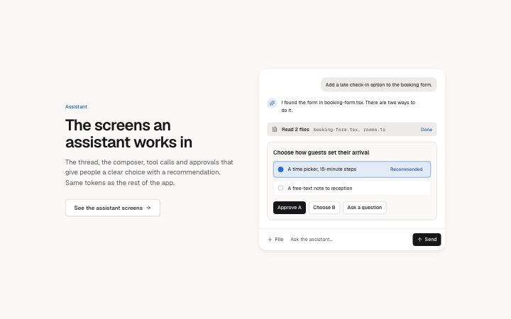
A marketing section that shows what an assistant looks like in use: heading and link on one side, a mock conversation with a tool call, an approval and a composer on the other. For a real, usable conversation use `app-assistant-thread` instead; this one is a fixture.
Writing for it
- The `thread` takes 1 to 4 messages of 200 characters each. Two or three short turns read better than a full chat, so let the last assistant message lead into the approval below. - The `approval` holds 1 to 3 options of 80 characters, and each one carries a `recommended` flag. Mark one option, because the Recommended badge is what the picture is meant to sell. - The tool line has a `label` (40), a `detail` (80) and a `status` (20); keep the detail to a real-sounding argument rather than a description of the tool.
Watch out for
None of the panel's buttons are focusable and nothing in it responds to a click, by design. Do not use it where a visitor is expected to try the controls, and note that the word Recommended on the badge is fixed text, not a field you can reword.
Pairs well with
Usage
The block in a page, with its default content (long lists shortened). Every prop is in the table below.
import { Theme } from '@/components/klarhimmel/theme/style';
import { BlockSurface } from '@/components/klarhimmel/blocks/surface';
import AppAssistantShowcase from '@/components/klarhimmel/blocks/app-assistant-showcase';

export default function Section() {
  return (
    <Theme theme="brand">
      <BlockSurface>
        <AppAssistantShowcase props={{
          "eyebrow": "Assistant",
          "title": "The screens an assistant works in",
          "description": "The thread, the composer, tool calls and approvals that give people a clear choice with a recommendation. Same tokens a…",
          "link": {
            "label": "See the assistant screens",
            "href": "#assistant"
          },
          "thread": [
            {
              "role": "user",
              "text": "Add a late check-in option to the booking form."
            },
            {
              "role": "assistant",
              "text": "I found the form in booking-form.tsx. There are two ways to do it."
            }
          ],
          "tool": {
            "label": "Read 2 files",
            "detail": "booking-form.tsx, rooms.ts",
            "status": "Done"
          },
          "approval": {
            "title": "Choose how guests set their arrival",
            "options": [
              {
                "label": "A time picker, 15-minute steps",
                "recommended": true
              },
              {
                "label": "A free-text note to reception",
                "recommended": false
              }
            ],
            "actions": [
              "Approve A",
              "Choose B"
            ]
          },
          "composer": {
            "placeholder": "Ask the assistant…",
            "attach": "File",
            "send": "Send"
          }
        }} />
      </BlockSurface>
    </Theme>
  );
}
Props
The type, default and text limit of every prop. On a real page, over-limit text is kept and checkSections flags it (Installation, Check a page before you ship); this live preview shows the default until it fits. The panel above edits all props.
| Prop | Type | Default | Description |
|---|---|---|---|
eyebrow | string | 'Assistant' | Text, up to 60 characters. |
title | string | 'The screens an assistant works in' | Text, up to 120 characters. |
description | string | 'The thread, the composer, tool call…' | Text, up to 300 characters. |
link | Link | {…} | See the type. |
thread | { role, text }[] | 2 items | List of 1 to 4. Each item: role ('user' | 'assistant'), text. |
tool | { label, detail, status } | {…} | Fields: label, detail, status. |
approval | { title, options, actions } | {…} | Fields: title, options, actions. |
composer | { placeholder, attach, send } | {…} | Fields: placeholder, attach, send. |
headingLevel | '1' | '2' | - | One of '1', '2'. Optional; empty is not rendered. |