Hero, split
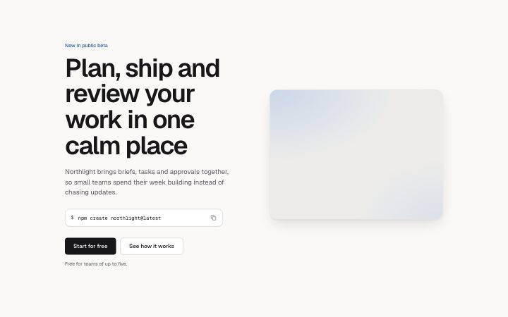
Install
npx shadcn add @klarhimmel/hero-splitUsage
import { Theme } from '@/components/klarhimmel/theme/style';
import { BlockSurface } from '@/components/klarhimmel/blocks/surface';
import HeroSplit from '@/components/klarhimmel/blocks/hero-split';

export default function Section() {
  return (
    <Theme theme="brand">
      <BlockSurface>
        <HeroSplit props={{
          "eyebrow": "Now in public beta",
          "title": "Plan, ship and review your work in one calm place",
          "description": "Northlight brings briefs, tasks and approvals together, so small teams spend their week building instead of chasing updates.",
          "primary": {
            "label": "Start for free",
            "href": "#start"
          },
          "secondary": {
            "label": "See how it works",
            "href": "#how"
          },
          "media": {
            "src": "",
            "alt": "Product screenshot showing a project board"
          },
          "command": "npm create northlight@latest",
          "note": "Free for teams of up to five."
        }} />
      </BlockSurface>
    </Theme>
  );
}
Install
Import
import Block from '@/components/klarhimmel/blocks/hero-split';- hero/split
- Category
- The first screen: what it is, who it is for, what to do next.
Notes
When to use it
An opener with text on one side and an image on the other, the usual choice when the picture explains the product. Use `hero-centered` if the image is wide, and `hero-code` if the main thing is a command.
Writing for it
- The title here is set a size smaller than in the centred heroes, so it can hold its 120 characters across several lines without dominating the image. - Command (120) is optional and adds a copyable line under the buttons, which suits a product you can try from the terminal. Leave it out for a normal marketing page. - The note holds 80 characters and is optional. Put the pricing or trial terms there, near the buttons.
Watch out for
Only command and note are optional in the schema. Empty media is still drawn as an image slot, so do not leave media out and expect the text to fill the width.
Pairs well with
Usage
The block in a page, with its default content (long lists shortened). Every prop is in the table below.
import { Theme } from '@/components/klarhimmel/theme/style';
import { BlockSurface } from '@/components/klarhimmel/blocks/surface';
import HeroSplit from '@/components/klarhimmel/blocks/hero-split';

export default function Section() {
  return (
    <Theme theme="brand">
      <BlockSurface>
        <HeroSplit props={{
          "eyebrow": "Now in public beta",
          "title": "Plan, ship and review your work in one calm place",
          "description": "Northlight brings briefs, tasks and approvals together, so small teams spend their week building instead of chasing updates.",
          "primary": {
            "label": "Start for free",
            "href": "#start"
          },
          "secondary": {
            "label": "See how it works",
            "href": "#how"
          },
          "media": {
            "src": "",
            "alt": "Product screenshot showing a project board"
          },
          "command": "npm create northlight@latest",
          "note": "Free for teams of up to five."
        }} />
      </BlockSurface>
    </Theme>
  );
}
Props
The type, default and text limit of every prop. On a real page, over-limit text is kept and checkSections flags it (Installation, Check a page before you ship); this live preview shows the default until it fits. The panel above edits all props.
| Prop | Type | Default | Description |
|---|---|---|---|
eyebrow | string | 'Now in public beta' | Text, up to 60 characters. |
title | string | 'Plan, ship and review your work in …' | Text, up to 120 characters. |
description | string | 'Northlight brings briefs, tasks and…' | Text, up to 300 characters. |
primary | Link | {…} | See the type. |
secondary | Link | {…} | See the type. |
media | Media | {…} | See the type. |
command | string | 'npm create northlight@latest' | Text, up to 120 characters. Optional; empty is not rendered. |
note | string | 'Free for teams of up to five.' | Text, up to 80 characters. Optional; empty is not rendered. |
headingLevel | '1' | '2' | - | One of '1', '2'. Optional; empty is not rendered. |