Hero, terminal
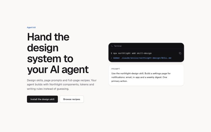
Install
npx shadcn add @klarhimmel/hero-terminalUsage
import { Theme } from '@/components/klarhimmel/theme/style';
import { BlockSurface } from '@/components/klarhimmel/blocks/surface';
import HeroTerminal from '@/components/klarhimmel/blocks/hero-terminal';

export default function Section() {
  return (
    <Theme theme="brand">
      <BlockSurface>
        <HeroTerminal props={{
          "eyebrow": "Agent kit",
          "title": "Hand the design system to your AI agent",
          "description": "Design skills, page prompts and full-page recipes. Your agent builds with Northlight components, tokens and writing rules instead of guessing.",
          "primary": {
            "label": "Install the design skill",
            "href": "#skill"
          },
          "secondary": {
            "label": "Browse recipes",
            "href": "#recipes"
          },
          "terminal": {
            "command": "npx northlight add skill-design",
            "output": "✓ Added .claude/skills/northlight-design/SKILL.md"
          },
          "prompt": {
            "label": "Prompt",
            "text": "Use the northlight-design skill. Build a settings page for notifications: email, in-app and a weekly digest. One primary action."
          }
        }} />
      </BlockSurface>
    </Theme>
  );
}
Install
Import
import Block from '@/components/klarhimmel/blocks/hero-terminal';- hero/terminal
- Category
- The first screen: what it is, who it is for, what to do next.
Notes
When to use it
An opener for products used through a command line or an AI agent, showing a command with its output next to a prompt panel. For a simpler install line use `hero-code`; for a pitch with a screenshot use `hero-split`.
Writing for it
- The terminal object takes a command (120) and an output (160). Make the output the real first result a user sees, not a placeholder line. - The prompt object has a label (20) and a text (400). The text is the longest field and should read as something a person would paste into an agent. - Both panels sit beside the copy on wide containers and below it on narrow ones, so write the headline to stand alone.
Watch out for
This is a hero and carries the page's h1. `features-terminal` shows the same two panels lower on the page, so use only one of them per page unless the content differs.
Pairs well with
Usage
The block in a page, with its default content (long lists shortened). Every prop is in the table below.
import { Theme } from '@/components/klarhimmel/theme/style';
import { BlockSurface } from '@/components/klarhimmel/blocks/surface';
import HeroTerminal from '@/components/klarhimmel/blocks/hero-terminal';

export default function Section() {
  return (
    <Theme theme="brand">
      <BlockSurface>
        <HeroTerminal props={{
          "eyebrow": "Agent kit",
          "title": "Hand the design system to your AI agent",
          "description": "Design skills, page prompts and full-page recipes. Your agent builds with Northlight components, tokens and writing rules instead of guessing.",
          "primary": {
            "label": "Install the design skill",
            "href": "#skill"
          },
          "secondary": {
            "label": "Browse recipes",
            "href": "#recipes"
          },
          "terminal": {
            "command": "npx northlight add skill-design",
            "output": "✓ Added .claude/skills/northlight-design/SKILL.md"
          },
          "prompt": {
            "label": "Prompt",
            "text": "Use the northlight-design skill. Build a settings page for notifications: email, in-app and a weekly digest. One primary action."
          }
        }} />
      </BlockSurface>
    </Theme>
  );
}
Props
The type, default and text limit of every prop. On a real page, over-limit text is kept and checkSections flags it (Installation, Check a page before you ship); this live preview shows the default until it fits. The panel above edits all props.
| Prop | Type | Default | Description |
|---|---|---|---|
eyebrow | string | 'Agent kit' | Text, up to 60 characters. |
title | string | 'Hand the design system to your AI a…' | Text, up to 120 characters. |
description | string | 'Design skills, page prompts and ful…' | Text, up to 300 characters. |
primary | Link | {…} | See the type. |
secondary | Link | {…} | See the type. |
terminal | { command, output } | {…} | Fields: command, output. |
prompt | { label, text } | {…} | Fields: label, text. |
headingLevel | '1' | '2' | - | One of '1', '2'. Optional; empty is not rendered. |