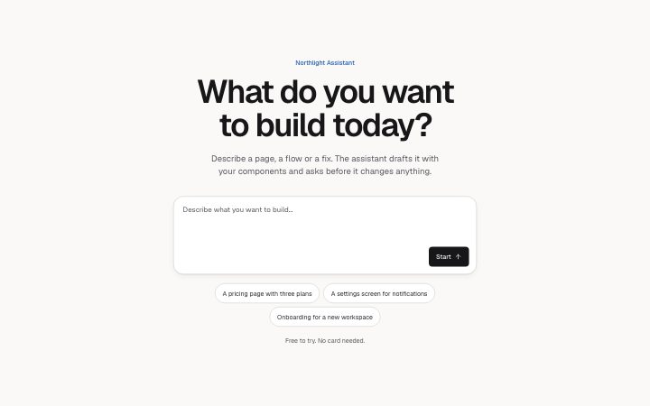
Hero, prompt
Install
npx shadcn add @klarhimmel/hero-promptUsage
import { Theme } from '@/components/klarhimmel/theme/style';
import { BlockSurface } from '@/components/klarhimmel/blocks/surface';
import HeroPrompt from '@/components/klarhimmel/blocks/hero-prompt';

export default function Section() {
  return (
    <Theme theme="brand">
      <BlockSurface>
        <HeroPrompt props={{
          "eyebrow": "Northlight Assistant",
          "title": "What do you want to build today?",
          "description": "Describe a page, a flow or a fix. The assistant drafts it with your components and asks before it changes anything.",
          "placeholder": "Describe what you want to build…",
          "submit": "Start",
          "suggestions": [
            "A pricing page with three plans",
            "A settings screen for notifications",
            "Onboarding for a new workspace"
          ],
          "note": "Free to try. No card needed.",
          "messages": {
            "sent": "Thank you. We have your request and will reply soon.",
            "error": "Something went wrong. Please try again."
          }
        }} />
      </BlockSurface>
    </Theme>
  );
}
Install
Import
import Block from '@/components/klarhimmel/blocks/hero-prompt';- hero/prompt
- Category
- The first screen: what it is, who it is for, what to do next.
Notes
When to use it
An opener built around an input: a prompt box, a site address field or a search, with suggestion chips below. It is for products where the visitor's first act is typing; for a plain pitch use `hero-centered`.
Writing for it
- Placeholder (120) and submit (20) are both required. Make the placeholder an example of a good answer, and set inputLabel (80) so the field has a proper accessible name. - Suggestions take up to five chips of 60 characters each; they should be real prompts a visitor could send as they are. - For a site address, set multiline to false and inputType to domain. The optional field adds a second labelled input under the prompt only when it has a label.
Watch out for
The sent and error states come from the status prop, which only the host can set; the block never decides on its own that a submit worked. Without action and method it does not submit natively.
Pairs well with
Usage
The block in a page, with its default content (long lists shortened). Every prop is in the table below.
import { Theme } from '@/components/klarhimmel/theme/style';
import { BlockSurface } from '@/components/klarhimmel/blocks/surface';
import HeroPrompt from '@/components/klarhimmel/blocks/hero-prompt';

export default function Section() {
  return (
    <Theme theme="brand">
      <BlockSurface>
        <HeroPrompt props={{
          "eyebrow": "Northlight Assistant",
          "title": "What do you want to build today?",
          "description": "Describe a page, a flow or a fix. The assistant drafts it with your components and asks before it changes anything.",
          "placeholder": "Describe what you want to build…",
          "submit": "Start",
          "suggestions": [
            "A pricing page with three plans",
            "A settings screen for notifications",
            "Onboarding for a new workspace"
          ],
          "note": "Free to try. No card needed.",
          "messages": {
            "sent": "Thank you. We have your request and will reply soon.",
            "error": "Something went wrong. Please try again."
          }
        }} />
      </BlockSurface>
    </Theme>
  );
}
Props
The type, default and text limit of every prop. On a real page, over-limit text is kept and checkSections flags it (Installation, Check a page before you ship); this live preview shows the default until it fits. The panel above edits all props.
| Prop | Type | Default | Description |
|---|---|---|---|
eyebrow | string | 'Northlight Assistant' | Text, up to 60 characters. |
title | string | 'What do you want to build today?' | Text, up to 120 characters. |
description | string | 'Describe a page, a flow or a fix. T…' | Text, up to 300 characters. |
descriptionPlacement | 'under-title' | 'under-note' | - | One of 'under-title', 'under-note'. Optional; empty is not rendered. |
placeholder | string | 'Describe what you want to build…' | Text, up to 120 characters. |
submit | string | 'Start' | Text, up to 20 characters. |
suggestions | string[] | 3 items | List of up to 5. |
note | string | 'Free to try. No card needed.' | Text, up to 80 characters. |
inputName | string | - | Text, up to 40 characters. Optional; empty is not rendered. |
multiline | boolean | - | Optional; empty is not rendered. |
inputType | 'text' | 'url' | 'domain' | - | One of 'text', 'url', 'domain'. Optional; empty is not rendered. |
inputLabel | string | - | Text, up to 80 characters. Optional; empty is not rendered. |
escape | Link | - | Optional; empty is not rendered. |
escapePlacement | 'inside' | 'below' | - | One of 'inside', 'below'. Optional; empty is not rendered. |
field | { label, name, placeholder, type, required, escape } | - | Fields: label (optional), name (optional), placeholder (optional), type ('text' | 'url' | 'domain') (optional), required (optional), escape (optional). Optional; empty is not rendered. |
action | string | - | Text, up to 300 characters. Optional; empty is not rendered. |
method | 'post' | 'get' | - | One of 'post', 'get'. Optional; empty is not rendered. |
hidden | { } | - | Optional; empty is not rendered. |
captcha | boolean | - | Optional; empty is not rendered. |
captchaSitekey | string | - | Text, up to 100 characters. Optional; empty is not rendered. |
status | 'idle' | 'sent' | 'error' | - | One of 'idle', 'sent', 'error'. Optional; empty is not rendered. |
messages | { sent, error } | {…} | Fields: sent, error. Optional; empty is not rendered. |
errors | { required, email, url, domain } | - | Fields: required (optional), email (optional), url (optional), domain (optional). Optional; empty is not rendered. |
headingLevel | '1' | '2' | - | One of '1', '2'. Optional; empty is not rendered. |