App, assistant composer
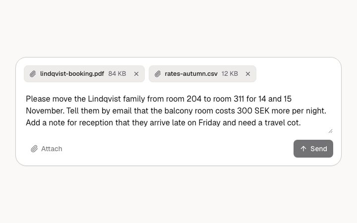
Install
npx shadcn add @klarhimmel/app-assistant-composerUsage
import { Theme } from '@/components/klarhimmel/theme/style';
import { BlockSurface } from '@/components/klarhimmel/blocks/surface';
import AppAssistantComposer from '@/components/klarhimmel/blocks/app-assistant-composer';

export default function Section() {
  return (
    <Theme theme="brand">
      <BlockSurface>
        <AppAssistantComposer props={{
          "label": "Message to the booking assistant",
          "state": "filled",
          "placeholder": "Ask about rooms, rates or bookings…",
          "value": "Please move the Lindqvist family from room 204 to room 311 for 14 and 15 November. Tell them by email that the balcony room costs 300 SEK more per night. Add a note for reception that they arrive late on Friday and need a travel cot.",
          "attachments": [
            {
              "name": "lindqvist-booking.pdf",
              "size": "84 KB"
            },
            {
              "name": "rates-autumn.csv",
              "size": "12 KB"
            }
          ],
          "attach": "Attach",
          "send": "Send",
          "stop": "Stop",
          "removeLabel": "Remove",
          "hint": "Enter sends. Shift+Enter adds a new line.",
          "counter": "233 / 200",
          "overLimit": "The message is 33 characters over the limit. Shorten it to send.",
          "notice": "This conversation is closed. Start a new one to keep going."
        }} />
      </BlockSurface>
    </Theme>
  );
}
Install
Import
import Block from '@/components/klarhimmel/blocks/app-assistant-composer';- app/assistant-composer
- About
- The box a person writes to an assistant in: labelled textarea, attachment chips, attach and send buttons. Five states set by the state prop: ready, filled, sending (send becomes stop), disabled, over the length limit.
- Category
- Interface sections for signed-in products.
Notes
When to use it
The input box at the bottom of an assistant conversation: a labelled textarea, attachment chips, an attach button and send. Use `app-assistant-thread` for the messages above it; this block only writes, it does not show replies.
Writing for it
- The `label` (40 characters) is invisible but names the textarea for screen readers, so write what the box is for, such as the question being asked, not the word Message. - Pick `state` to show one situation: filled and over-limit use `value` (up to 1200 characters) as the draft, while ready always starts empty and shows the `placeholder` (80). - At most 3 attachments, each with a name up to 40 characters and a size text of 20. Fill `counter` and `overLimit` only for the over-limit state, since they show only there.
Watch out for
Enter sends and Shift+Enter adds a line only when a host wires up `onSend`. Without it the hint line is hidden and Attach and Stop stay in the tab order but are marked aria-disabled, so the block on its own is a picture of a composer, not a working one.
Usage
The block in a page, with its default content (long lists shortened). Every prop is in the table below.
import { Theme } from '@/components/klarhimmel/theme/style';
import { BlockSurface } from '@/components/klarhimmel/blocks/surface';
import AppAssistantComposer from '@/components/klarhimmel/blocks/app-assistant-composer';

export default function Section() {
  return (
    <Theme theme="brand">
      <BlockSurface>
        <AppAssistantComposer props={{
          "label": "Message to the booking assistant",
          "state": "filled",
          "placeholder": "Ask about rooms, rates or bookings…",
          "value": "Please move the Lindqvist family from room 204 to room 311 for 14 and 15 November. Tell them by email that the balcony room costs 300 SEK more per night. Add a note for reception that they arrive late on Friday and need a travel cot.",
          "attachments": [
            {
              "name": "lindqvist-booking.pdf",
              "size": "84 KB"
            },
            {
              "name": "rates-autumn.csv",
              "size": "12 KB"
            }
          ],
          "attach": "Attach",
          "send": "Send",
          "stop": "Stop",
          "removeLabel": "Remove",
          "hint": "Enter sends. Shift+Enter adds a new line.",
          "counter": "233 / 200",
          "overLimit": "The message is 33 characters over the limit. Shorten it to send.",
          "notice": "This conversation is closed. Start a new one to keep going."
        }} />
      </BlockSurface>
    </Theme>
  );
}
Props
The type, default and text limit of every prop. On a real page, over-limit text is kept and checkSections flags it (Installation, Check a page before you ship); this live preview shows the default until it fits. The panel above edits all props.
| Prop | Type | Default | Description |
|---|---|---|---|
label | string | 'Message to the booking assistant' | Text, up to 40 characters. |
state | 'ready' | 'filled' | 'sending' | 'disabled' | 'over-limit' | 'filled' | One of 'ready', 'filled', 'sending', 'disabled', 'over-limit'. |
placeholder | string | 'Ask about rooms, rates or bookings…' | Text, up to 80 characters. |
value | string | 'Please move the Lindqvist family fr…' | Text, up to 1200 characters. |
attachments | { name, size }[] | 2 items | List of up to 3. Each item: name, size. |
attach | string | 'Attach' | Text, up to 20 characters. |
send | string | 'Send' | Text, up to 20 characters. |
stop | string | 'Stop' | Text, up to 20 characters. |
removeLabel | string | 'Remove' | Text, up to 20 characters. |
hint | string | 'Enter sends. Shift+Enter adds a new…' | Text, up to 120 characters. |
counter | string | '233 / 200' | Text, up to 20 characters. |
overLimit | string | 'The message is 33 characters over t…' | Text, up to 120 characters. |
notice | string | 'This conversation is closed. Start …' | Text, up to 120 characters. |