App, assistant approval
Install
npx shadcn add @klarhimmel/app-assistant-approvalUsage
import { Theme } from '@/components/klarhimmel/theme/style';
import { BlockSurface } from '@/components/klarhimmel/blocks/surface';
import AppAssistantApproval from '@/components/klarhimmel/blocks/app-assistant-approval';

export default function Section() {
  return (
    <Theme theme="brand">
      <BlockSurface>
        <AppAssistantApproval props={{
          "state": "pending",
          "risk": "medium",
          "title": "Cancel booking 4821 and email the guest",
          "description": "The guest asked to cancel by message. The rate is refundable until 7 November, so the full amount goes back to the card.",
          "scope": [
            {
              "label": "Touches",
              "value": "Booking 4821, room 204, 14 to 16 November"
            },
            {
              "label": "Changes",
              "value": "Frees the room and refunds 2 380 SEK"
            },
            {
              "label": "Sends",
              "value": "One cancellation email to the guest"
            },
            {
              "label": "Undo",
              "value": "The room can be booked again, the email cannot be recalled"
            }
          ],
          "action": "cancel booking 4821",
          "approve": "Approve",
          "deny": "Deny",
          "labels": {
            "approved": "Approved",
            "denied": "Denied",
            "low": "Low risk",
            "medium": "Medium risk",
            "high": "High risk"
          }
        }} />
      </BlockSurface>
    </Theme>
  );
}
Install
Import
import Block from '@/components/klarhimmel/blocks/app-assistant-approval';- app/assistant-approval
- About
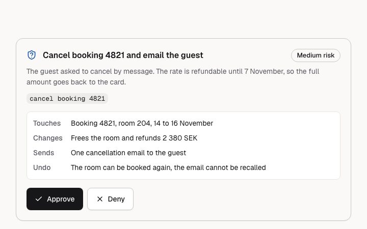
- An action the assistant wants to take and needs a person to allow: title, why, scoped detail, a risk level and Approve / Deny buttons named after the action. Pending, approved and denied via the state prop.
- Category
- Interface sections for signed-in products.
Notes
When to use it
A card where the assistant asks a person to allow one specific action before it runs, with a risk level and a scope list. For a plain status line of something the assistant already did, use `app-assistant-tool-call`; for the whole conversation, `app-assistant-thread`.
Writing for it
- Write the title as the action itself in plain words, up to 80 characters, and repeat it in `action` (60 characters): the buttons are read to screen readers as the button text plus that action. - The scope list takes 1 to 4 label and value pairs, labels up to 30 characters and values up to 300. Use labels like Touches, Changes, Sends and Undo so the person sees the blast radius before choosing. - Set `risk` to match the real consequence. High adds a warning icon beside the badge, so reserve it for things that cannot be taken back.
Watch out for
This block is strict. If any text field breaks its limit or is missing, it does not fall back to default copy: it shows a notice that the request could not be shown, with Approve and Deny disabled. Once a person decides, the buttons disappear and `resolvedNote` is shown next to the outcome.
Usage
The block in a page, with its default content (long lists shortened). Every prop is in the table below.
import { Theme } from '@/components/klarhimmel/theme/style';
import { BlockSurface } from '@/components/klarhimmel/blocks/surface';
import AppAssistantApproval from '@/components/klarhimmel/blocks/app-assistant-approval';

export default function Section() {
  return (
    <Theme theme="brand">
      <BlockSurface>
        <AppAssistantApproval props={{
          "state": "pending",
          "risk": "medium",
          "title": "Cancel booking 4821 and email the guest",
          "description": "The guest asked to cancel by message. The rate is refundable until 7 November, so the full amount goes back to the card.",
          "scope": [
            {
              "label": "Touches",
              "value": "Booking 4821, room 204, 14 to 16 November"
            },
            {
              "label": "Changes",
              "value": "Frees the room and refunds 2 380 SEK"
            },
            {
              "label": "Sends",
              "value": "One cancellation email to the guest"
            },
            {
              "label": "Undo",
              "value": "The room can be booked again, the email cannot be recalled"
            }
          ],
          "action": "cancel booking 4821",
          "approve": "Approve",
          "deny": "Deny",
          "labels": {
            "approved": "Approved",
            "denied": "Denied",
            "low": "Low risk",
            "medium": "Medium risk",
            "high": "High risk"
          }
        }} />
      </BlockSurface>
    </Theme>
  );
}
Props
The type, default and text limit of every prop. On a real page, over-limit text is kept and checkSections flags it (Installation, Check a page before you ship); this live preview shows the default until it fits. The panel above edits all props.
| Prop | Type | Default | Description |
|---|---|---|---|
state | 'pending' | 'approved' | 'denied' | 'pending' | One of 'pending', 'approved', 'denied'. |
risk | 'low' | 'medium' | 'high' | 'medium' | One of 'low', 'medium', 'high'. |
title | string | 'Cancel booking 4821 and email the g…' | Text, up to 80 characters. |
description | string | 'The guest asked to cancel by messag…' | Text, up to 240 characters. |
scope | { label, value }[] | 4 items | List of 1 to 4. Each item: label, value. |
action | string | 'cancel booking 4821' | Text, up to 60 characters. |
approve | string | 'Approve' | Text, up to 24 characters. |
deny | string | 'Deny' | Text, up to 24 characters. |
resolvedNote | string | - | Text, up to 200 characters. Optional; empty is not rendered. |
labels | { approved, denied, low, medium, high } | {…} | Fields: approved, denied, low, medium, high. |
headingLevel | '1' | '2' | - | One of '1', '2'. Optional; empty is not rendered. |