App, pagination
Install
npx shadcn add @klarhimmel/app-data-paginationUsage
import { Theme } from '@/components/klarhimmel/theme/style';
import { BlockSurface } from '@/components/klarhimmel/blocks/surface';
import AppDataPagination from '@/components/klarhimmel/blocks/app-data-pagination';

export default function Section() {
  return (
    <Theme theme="brand">
      <BlockSurface>
        <AppDataPagination props={{
          "title": "Pagination",
          "summary": {
            "showing": "Showing",
            "to": "to",
            "of": "of",
            "noun": "bookings"
          },
          "perPage": "10",
          "total": "210",
          "pages": [
            "1",
            "2",
            "3",
            "…",
            "21"
          ],
          "active": "2",
          "previous": "Previous",
          "next": "Next"
        }} />
      </BlockSurface>
    </Theme>
  );
}
Install
Import
import Block from '@/components/klarhimmel/blocks/app-data-pagination';- app/data-pagination
- About
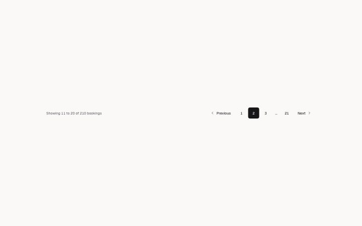
- A pagination row: a summary built from the page, rows per page and the total (it changes with the page and is read out politely), previous and next, numbered pages with a gap marker, and aria-current.
- Category
- Interface sections for signed-in products.
Notes
When to use it
A row under a list or table that shows the current range and page numbers. For narrowing a list use `app-data-filters`.
Writing for it
- The summary is built from `showing`, `to`, `of` and `noun`, plus the numbers, so write them as words that fit between numbers, like Showing, to, of and bookings. - `perPage` and `total` are numbers written as text. The range is computed from the page, so change them together with the `pages` list. - `pages` takes 3 to 9 labels and a gap is written as the ellipsis character. The `active` label must match one of the entries.
Watch out for
The `title` is not drawn. It only names the navigation landmark, so an empty one leaves the nav unnamed. The block moves the marker and the summary line but never loads rows, so the host has to swap the data.
Pairs well with
Usage
The block in a page, with its default content (long lists shortened). Every prop is in the table below.
import { Theme } from '@/components/klarhimmel/theme/style';
import { BlockSurface } from '@/components/klarhimmel/blocks/surface';
import AppDataPagination from '@/components/klarhimmel/blocks/app-data-pagination';

export default function Section() {
  return (
    <Theme theme="brand">
      <BlockSurface>
        <AppDataPagination props={{
          "title": "Pagination",
          "summary": {
            "showing": "Showing",
            "to": "to",
            "of": "of",
            "noun": "bookings"
          },
          "perPage": "10",
          "total": "210",
          "pages": [
            "1",
            "2",
            "3",
            "…",
            "21"
          ],
          "active": "2",
          "previous": "Previous",
          "next": "Next"
        }} />
      </BlockSurface>
    </Theme>
  );
}
Props
The type, default and text limit of every prop. On a real page, over-limit text is kept and checkSections flags it (Installation, Check a page before you ship); this live preview shows the default until it fits. The panel above edits all props.
| Prop | Type | Default | Description |
|---|---|---|---|
title | string | 'Pagination' | Text, up to 40 characters. |
summary | { showing, to, of, noun } | {…} | Fields: showing, to, of, noun. |
perPage | string | '10' | Text, up to 6 characters. |
total | string | '210' | Text, up to 10 characters. |
pages | string[] | 5 items | List of 3 to 9. |
active | string | '2' | Text, up to 6 characters. |
previous | string | 'Previous' | Text, up to 20 characters. |
next | string | 'Next' | Text, up to 20 characters. |