Contact, minimal
Install
npx shadcn add @klarhimmel/contact-minimalUsage
import { Theme } from '@/components/klarhimmel/theme/style';
import { BlockSurface } from '@/components/klarhimmel/blocks/surface';
import ContactMinimal from '@/components/klarhimmel/blocks/contact-minimal';

export default function Section() {
  return (
    <Theme theme="brand">
      <BlockSurface>
        <ContactMinimal props={{
          "eyebrow": "Contact",
          "title": "Say hello",
          "email": "[email protected]",
          "note": "We read everything and answer within a working day.",
          "details": [
            {
              "label": "Phone",
              "value": "+46 31 000 00 00",
              "href": "tel:+46310000000"
            },
            {
              "label": "Visit",
              "value": "Exempelgatan 12, Göteborg",
              "href": "https://example.com/map"
            },
            {
              "label": "Hours",
              "value": "Weekdays 09:00 to 17:00",
              "href": ""
            }
          ]
        }} />
      </BlockSurface>
    </Theme>
  );
}
Install
Import
import Block from '@/components/klarhimmel/blocks/contact-minimal';- contact/minimal
- Category
- A form, a booking panel or office details. The page wires the submit.
Notes
When to use it
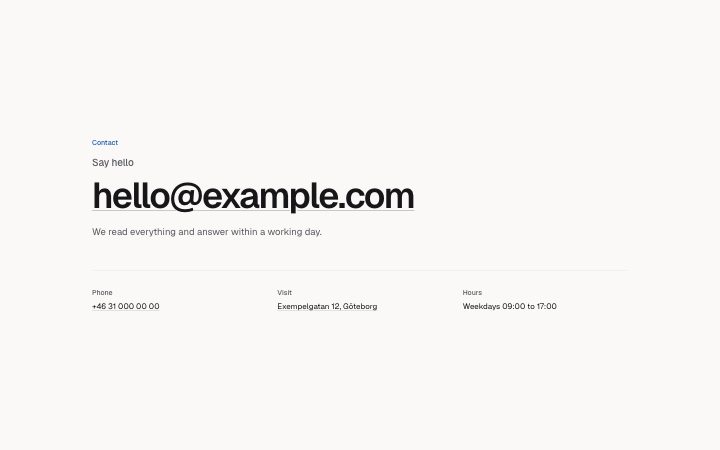
Typographic contact: one oversized email address as the call to action, then up to three quiet details in columns. No form, no map. Use `contact-form` if you want messages to arrive in a structured form.
Writing for it
- The title (100) is set small and grey, as a lead-in, while the email is the big element, so word the title as the question the email answers. - Details take label (30), value (120) and an optional href, up to three. Give the phone an href of tel and the address none. - Use the note (160) for a promise about reply time. It sits right under the email.
Watch out for
The email is wrapped as a mailto link, with break-all, so a long address will break mid-word on narrow screens. A detail with a value but no href is plain text, not a link.
Pairs well with
Usage
The block in a page, with its default content (long lists shortened). Every prop is in the table below.
import { Theme } from '@/components/klarhimmel/theme/style';
import { BlockSurface } from '@/components/klarhimmel/blocks/surface';
import ContactMinimal from '@/components/klarhimmel/blocks/contact-minimal';

export default function Section() {
  return (
    <Theme theme="brand">
      <BlockSurface>
        <ContactMinimal props={{
          "eyebrow": "Contact",
          "title": "Say hello",
          "email": "[email protected]",
          "note": "We read everything and answer within a working day.",
          "details": [
            {
              "label": "Phone",
              "value": "+46 31 000 00 00",
              "href": "tel:+46310000000"
            },
            {
              "label": "Visit",
              "value": "Exempelgatan 12, Göteborg",
              "href": "https://example.com/map"
            },
            {
              "label": "Hours",
              "value": "Weekdays 09:00 to 17:00",
              "href": ""
            }
          ]
        }} />
      </BlockSurface>
    </Theme>
  );
}
Props
The type, default and text limit of every prop. On a real page, over-limit text is kept and checkSections flags it (Installation, Check a page before you ship); this live preview shows the default until it fits. The panel above edits all props.
| Prop | Type | Default | Description |
|---|---|---|---|
eyebrow | string | 'Contact' | Text, up to 60 characters. |
title | string | 'Say hello' | Text, up to 100 characters. |
email | string | '[email protected]' | Text, up to 80 characters. |
note | string | 'We read everything and answer withi…' | Text, up to 160 characters. |
details | { label, value, href }[] | 3 items | List of up to 3. Each item: label, value, href. |
headingLevel | '1' | '2' | - | One of '1', '2'. Optional; empty is not rendered. |