Contact, form
Install
npx shadcn add @klarhimmel/contact-formUsage
import { Theme } from '@/components/klarhimmel/theme/style';
import { BlockSurface } from '@/components/klarhimmel/blocks/surface';
import ContactForm from '@/components/klarhimmel/blocks/contact-form';

export default function Section() {
  return (
    <Theme theme="brand">
      <BlockSurface>
        <ContactForm props={{
          "eyebrow": "Contact",
          "title": "Tell us what you are working on",
          "description": "We read every message and usually reply within one working day.",
          "details": [
            {
              "label": "Email",
              "value": "[email protected]"
            },
            {
              "label": "Office",
              "value": "Storgatan 12, 111 23 Stockholm"
            },
            {
              "label": "Hours",
              "value": "Monday to Friday, 9:00 to 17:00"
            }
          ],
          "nameLabel": "Name",
          "emailLabel": "Email",
          "messageLabel": "Message",
          "errors": {
            "required": "Fill in this field.",
            "email": "Enter an email address like [email protected].",
            "url": "Enter an address that starts with https://, like https://example.com.",
            "domain": "Enter a site address like yourcompany.se."
          },
          "submit": "Send message",
          "consent": "We only use your details to reply to this message.",
          "messages": {
            "sent": "Thank you. We have your message and will reply within one working day.",
            "error": "Something went wrong. Please try again, or email us."
          }
        }} />
      </BlockSurface>
    </Theme>
  );
}
Install
Import
import Block from '@/components/klarhimmel/blocks/contact-form';- contact/form
- Category
- A form, a booking panel or office details. The page wires the submit.
Notes
When to use it
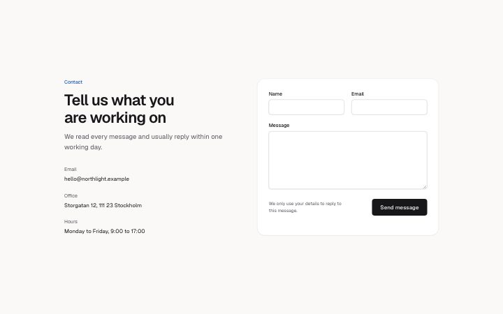
Heading and contact details on the left beside a message form on the right. Presentation only: the page wires the submit. For a list of addresses without a form, use `contact-channels` or `contact-minimal`.
Writing for it
- Details take up to four label and value pairs (40 and 120) in plain text, not links; keep to the phone, visit and hours people ask for. - Leave nameLabel empty to drop the name field and keep only email and message. messageLabel (40) names the last field. - messageType turns the last field into a single line: domain for a site address, url for a full link, email or text. Set messageName if your backend expects a field other than 'message'.
Watch out for
The sent and error texts are drawn only when the host sets status, usually after a redirect with ?sent=1. When status is sent, the fields are hidden and only the message shows. An empty messageLabel removes the last field.
Pairs well with
Usage
The block in a page, with its default content (long lists shortened). Every prop is in the table below.
import { Theme } from '@/components/klarhimmel/theme/style';
import { BlockSurface } from '@/components/klarhimmel/blocks/surface';
import ContactForm from '@/components/klarhimmel/blocks/contact-form';

export default function Section() {
  return (
    <Theme theme="brand">
      <BlockSurface>
        <ContactForm props={{
          "eyebrow": "Contact",
          "title": "Tell us what you are working on",
          "description": "We read every message and usually reply within one working day.",
          "details": [
            {
              "label": "Email",
              "value": "[email protected]"
            },
            {
              "label": "Office",
              "value": "Storgatan 12, 111 23 Stockholm"
            },
            {
              "label": "Hours",
              "value": "Monday to Friday, 9:00 to 17:00"
            }
          ],
          "nameLabel": "Name",
          "emailLabel": "Email",
          "messageLabel": "Message",
          "submit": "Send message",
          "consent": "We only use your details to reply to this message.",
          "messages": {
            "sent": "Thank you. We have your message and will reply within one working day.",
            "error": "Something went wrong. Please try again, or email us."
          },
          "errors": {
            "required": "Fill in this field.",
            "email": "Enter an email address like [email protected].",
            "url": "Enter an address that starts with https://, like https://example.com.",
            "domain": "Enter a site address like yourcompany.se."
          }
        }} />
      </BlockSurface>
    </Theme>
  );
}
Props
The type, default and text limit of every prop. On a real page, over-limit text is kept and checkSections flags it (Installation, Check a page before you ship); this live preview shows the default until it fits. The panel above edits all props.
| Prop | Type | Default | Description |
|---|---|---|---|
eyebrow | string | 'Contact' | Text, up to 60 characters. |
title | string | 'Tell us what you are working on' | Text, up to 120 characters. |
description | string | 'We read every message and usually r…' | Text, up to 300 characters. |
details | { label, value }[] | 3 items | List of up to 4. Each item: label, value. |
nameLabel | string | 'Name' | Text, up to 40 characters. Optional; empty is not rendered. |
emailLabel | string | 'Email' | Text, up to 40 characters. |
messageLabel | string | 'Message' | Text, up to 40 characters. |
messageType | 'textarea' | 'url' | 'domain' | 'email' | 'text' | - | One of 'textarea', 'url', 'domain', 'email', 'text'. Optional; empty is not rendered. |
messageName | string | - | Text, up to 40 characters. Optional; empty is not rendered. |
errors | { required, email, url, domain } | {…} | Fields: required (optional), email (optional), url (optional), domain (optional). Optional; empty is not rendered. |
submit | string | 'Send message' | Text, up to 40 characters. |
consent | string | 'We only use your details to reply t…' | Text, up to 160 characters. |
action | string | - | Text, up to 300 characters. Optional; empty is not rendered. |
method | 'post' | 'get' | - | One of 'post', 'get'. Optional; empty is not rendered. |
hidden | { } | - | Optional; empty is not rendered. |
captcha | boolean | - | Optional; empty is not rendered. |
captchaSitekey | string | - | Text, up to 100 characters. Optional; empty is not rendered. |
status | 'idle' | 'sent' | 'error' | - | One of 'idle', 'sent', 'error'. Optional; empty is not rendered. |
messages | { sent, error } | {…} | Fields: sent, error. Optional; empty is not rendered. |
headingLevel | '1' | '2' | - | One of '1', '2'. Optional; empty is not rendered. |