Error, server error
Install
npx shadcn add @klarhimmel/error-statusUsage
import { Theme } from '@/components/klarhimmel/theme/style';
import { BlockSurface } from '@/components/klarhimmel/blocks/surface';
import ErrorStatus from '@/components/klarhimmel/blocks/error-status';

export default function Section() {
  return (
    <Theme theme="brand">
      <BlockSurface>
        <ErrorStatus props={{
          "code": "500",
          "title": "Something broke on our side",
          "description": "We have been told and are looking at it. Your data is safe. Trying again in a minute often works.",
          "primary": {
            "label": "Try again",
            "href": "#"
          },
          "secondary": {
            "label": "Check system status",
            "href": "/status"
          },
          "referenceLabel": "Reference for support",
          "reference": "ERR-7F3A-91C2",
          "tipsTitle": "While you wait",
          "tips": [
            "Reload the page in a minute.",
            "Check that you are signed in.",
            "Quote the reference above if you write to us."
          ]
        }} />
      </BlockSurface>
    </Theme>
  );
}
Install
Import
import Block from '@/components/klarhimmel/blocks/error-status';- error/status
- About
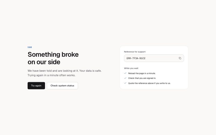
- A 500-style page for when it is our fault: plain apology, retry and status actions, and a side panel with a copyable reference id for support plus up to three things to try.
- Category
- Not found, server error and maintenance pages.
Notes
When to use it
A 500-style page for when the fault is ours, with retry and status actions and a side panel holding a copyable reference id. For a simple dead link use `error-page`.
Writing for it
- The reference holds 40 characters, with a copy button beside it. Write a real example id format so support staff can recognise it. - Tips hold 120 characters each, up to 3. Give actions the reader can take, such as retrying in a minute. - Primary and secondary are two links, usually Try again and Status page. The title is the h1 and holds 100 characters.
Watch out for
The reference id uses break-all, so a long id wraps mid-string. With no tips the tips heading is hidden too, and the reference label stays.
Pairs well with
Usage
The block in a page, with its default content (long lists shortened). Every prop is in the table below.
import { Theme } from '@/components/klarhimmel/theme/style';
import { BlockSurface } from '@/components/klarhimmel/blocks/surface';
import ErrorStatus from '@/components/klarhimmel/blocks/error-status';

export default function Section() {
  return (
    <Theme theme="brand">
      <BlockSurface>
        <ErrorStatus props={{
          "code": "500",
          "title": "Something broke on our side",
          "description": "We have been told and are looking at it. Your data is safe. Trying again in a minute often works.",
          "primary": {
            "label": "Try again",
            "href": "#"
          },
          "secondary": {
            "label": "Check system status",
            "href": "/status"
          },
          "referenceLabel": "Reference for support",
          "reference": "ERR-7F3A-91C2",
          "tipsTitle": "While you wait",
          "tips": [
            "Reload the page in a minute.",
            "Check that you are signed in.",
            "Quote the reference above if you write to us."
          ]
        }} />
      </BlockSurface>
    </Theme>
  );
}
Props
The type, default and text limit of every prop. On a real page, over-limit text is kept and checkSections flags it (Installation, Check a page before you ship); this live preview shows the default until it fits. The panel above edits all props.
| Prop | Type | Default | Description |
|---|---|---|---|
code | string | '500' | Text, up to 20 characters. |
title | string | 'Something broke on our side' | Text, up to 100 characters. |
description | string | 'We have been told and are looking a…' | Text, up to 300 characters. |
primary | Link | {…} | See the type. |
secondary | Link | {…} | See the type. |
referenceLabel | string | 'Reference for support' | Text, up to 40 characters. |
reference | string | 'ERR-7F3A-91C2' | Text, up to 40 characters. |
tipsTitle | string | 'While you wait' | Text, up to 60 characters. |
tips | string[] | 3 items | List of up to 3. |
headingLevel | '1' | '2' | - | One of '1', '2'. Optional; empty is not rendered. |