Gallery, masonry
Install
npx shadcn add @klarhimmel/gallery-masonryUsage
import { Theme } from '@/components/klarhimmel/theme/style';
import { BlockSurface } from '@/components/klarhimmel/blocks/surface';
import GalleryMasonry from '@/components/klarhimmel/blocks/gallery-masonry';

export default function Section() {
  return (
    <Theme theme="brand">
      <BlockSurface>
        <GalleryMasonry props={{
          "eyebrow": "Rooms and corners",
          "title": "A look around Exempelhotellet",
          "description": "Taken on an ordinary Tuesday in October, no styling.",
          "columns": "3",
          "items": [
            {
              "shape": "square",
              "media": {
                "src": "",
                "alt": "Double bed under a sloped ceiling"
              },
              "caption": "Room 4, garden side"
            },
            {
              "shape": "wide",
              "media": {
                "src": "",
                "alt": "Long breakfast table set for twelve"
              },
              "caption": "Breakfast room"
            },
            {
              "shape": "square",
              "media": {
                "src": "",
                "alt": "Two cups on a tray"
              },
              "caption": "Coffee at seven"
            },
            {
              "shape": "tall",
              "media": {
                "src": "",
                "alt": "Wooden staircase with a window above it"
              },
              "caption": "The staircase, morning light"
            },
            {
              "shape": "tall",
              "media": {
                "src": "",
                "alt": "Rooftop terrace overlooking a harbour"
              },
              "caption": "Harbour view from the roof"
            },
            {
              "shape": "wide",
              "media": {
                "src": "",
                "alt": "Armchair and a stack of paperbacks"
              },
              "caption": "The reading corner"
            },
            {
              "shape": "square",
              "media": {
                "src": "",
                "alt": "Green front door with a brass handle"
              },
              "caption": "Entrance"
            },
            {
              "shape": "wide",
              "media": {
                "src": "",
                "alt": "Small garden with a table and chairs"
              },
              "caption": "Garden, late summer"
            }
          ]
        }} />
      </BlockSurface>
    </Theme>
  );
}
Install
Import
import Block from '@/components/klarhimmel/blocks/gallery-masonry';- gallery/masonry
- About
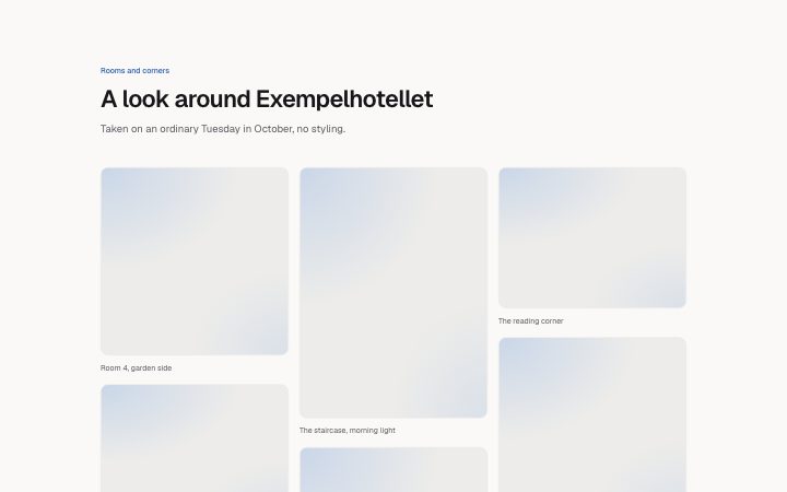
- Images in balanced columns with mixed frame shapes (wide, square, tall) and a caption under each. Use when the pictures are not all the same crop. Empty caption hides the line.
- Category
- A grid of images with captions.
Notes
When to use it
Images in balanced columns where each frame can be wide, square or tall, with a caption below. It suits photos that were not shot to one crop; `gallery-grid` is tidier when they are all the same.
Writing for it
- Set shape for each item to wide (4 to 3), square or tall (3 to 4). Alternate them, because a run of the same shape gives you a plain grid. - Choose columns '2' or '3' for the widest container. Narrower containers use fewer on their own. - Add at least two items, up to twelve. Captions of up to 120 characters count in the height balancing, so empty ones change where columns break.
Watch out for
Column breaks are computed from the shapes and whether a caption exists, so reordering items or clearing a caption can move pictures between columns. Reading order runs down each column, not across rows.
Usage
The block in a page, with its default content (long lists shortened). Every prop is in the table below.
import { Theme } from '@/components/klarhimmel/theme/style';
import { BlockSurface } from '@/components/klarhimmel/blocks/surface';
import GalleryMasonry from '@/components/klarhimmel/blocks/gallery-masonry';

export default function Section() {
  return (
    <Theme theme="brand">
      <BlockSurface>
        <GalleryMasonry props={{
          "eyebrow": "Rooms and corners",
          "title": "A look around Exempelhotellet",
          "description": "Taken on an ordinary Tuesday in October, no styling.",
          "columns": "3",
          "items": [
            {
              "shape": "square",
              "media": {
                "src": "",
                "alt": "Double bed under a sloped ceiling"
              },
              "caption": "Room 4, garden side"
            },
            {
              "shape": "wide",
              "media": {
                "src": "",
                "alt": "Long breakfast table set for twelve"
              },
              "caption": "Breakfast room"
            },
            {
              "shape": "square",
              "media": {
                "src": "",
                "alt": "Two cups on a tray"
              },
              "caption": "Coffee at seven"
            }
          ]
        }} />
      </BlockSurface>
    </Theme>
  );
}
Props
The type, default and text limit of every prop. On a real page, over-limit text is kept and checkSections flags it (Installation, Check a page before you ship); this live preview shows the default until it fits. The panel above edits all props.
| Prop | Type | Default | Description |
|---|---|---|---|
eyebrow | string | 'Rooms and corners' | Text, up to 60 characters. |
title | string | 'A look around Exempelhotellet' | Text, up to 120 characters. |
description | string | 'Taken on an ordinary Tuesday in Oct…' | Text, up to 300 characters. |
columns | '2' | '3' | '3' | One of '2', '3'. |
items | { shape, media, caption }[] | 8 items | List of 2 to 12. Each item: shape ('wide' | 'square' | 'tall'), media, caption. |
headingLevel | '1' | '2' | - | One of '1', '2'. Optional; empty is not rendered. |