Call to action, over an image
Install
npx shadcn add @klarhimmel/cta-mediaUsage
import { Theme } from '@/components/klarhimmel/theme/style';
import { BlockSurface } from '@/components/klarhimmel/blocks/surface';
import CtaMedia from '@/components/klarhimmel/blocks/cta-media';

export default function Section() {
  return (
    <Theme theme="brand">
      <BlockSurface>
        <CtaMedia props={{
          "title": "Your table is waiting by the window",
          "description": "Seven rooms and a roof terrace, ten minutes from the station. Come for one night, stay for breakfast.",
          "primary": {
            "label": "Book a room",
            "href": "#book"
          },
          "secondary": {
            "label": "See the rooms",
            "href": "#rooms"
          },
          "media": {
            "src": "",
            "alt": "The hotel terrace at dusk with string lights and the harbour behind"
          }
        }} />
      </BlockSurface>
    </Theme>
  );
}
Install
Import
import Block from '@/components/klarhimmel/blocks/cta-media';- cta/media
- About
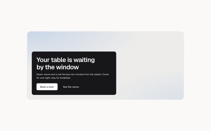
- A wide image with a solid panel laid over its lower left corner holding the headline, a sentence and two actions (stacked under the image on narrow screens).
- Category
- One clear next step near the end of a page.
Notes
When to use it
A wide photograph with a solid panel over its lower left corner holding the headline, a sentence and two buttons. The picture sets the mood; for a plain side-by-side layout, `cta-split` fits better.
Writing for it
- The title is required and holds 100 characters, the shortest limit of the CTA blocks with an image, because the overlay panel is only about 36rem wide. - The description allows 220 characters. One sentence is enough, since the panel covers part of the picture and every extra line covers more. - Choose a wide image that stays interesting with its lower left corner hidden; the media is cropped to a 16 to 7 frame at least 24rem tall.
Watch out for
The panel overlays the image only from the @3xl container width up; below that it stacks under the picture. The text sits on a solid ink panel, so the image colours cannot hurt contrast, but a missing alt text on the image is still your job.
Pairs well with
Usage
The block in a page, with its default content (long lists shortened). Every prop is in the table below.
import { Theme } from '@/components/klarhimmel/theme/style';
import { BlockSurface } from '@/components/klarhimmel/blocks/surface';
import CtaMedia from '@/components/klarhimmel/blocks/cta-media';

export default function Section() {
  return (
    <Theme theme="brand">
      <BlockSurface>
        <CtaMedia props={{
          "title": "Your table is waiting by the window",
          "description": "Seven rooms and a roof terrace, ten minutes from the station. Come for one night, stay for breakfast.",
          "primary": {
            "label": "Book a room",
            "href": "#book"
          },
          "secondary": {
            "label": "See the rooms",
            "href": "#rooms"
          },
          "media": {
            "src": "",
            "alt": "The hotel terrace at dusk with string lights and the harbour behind"
          }
        }} />
      </BlockSurface>
    </Theme>
  );
}
Props
The type, default and text limit of every prop. On a real page, over-limit text is kept and checkSections flags it (Installation, Check a page before you ship); this live preview shows the default until it fits. The panel above edits all props.
| Prop | Type | Default | Description |
|---|---|---|---|
title | string | 'Your table is waiting by the window' | Text, up to 100 characters. |
description | string | 'Seven rooms and a roof terrace, ten…' | Text, up to 220 characters. |
primary | Link | {…} | See the type. |
secondary | Link | {…} | See the type. |
media | Media | {…} | See the type. |
headingLevel | '1' | '2' | - | One of '1', '2'. Optional; empty is not rendered. |