Testimonial, quote
Install
npx shadcn add @klarhimmel/testimonial-quoteUsage
import { Theme } from '@/components/klarhimmel/theme/style';
import { BlockSurface } from '@/components/klarhimmel/blocks/surface';
import TestimonialQuote from '@/components/klarhimmel/blocks/testimonial-quote';

export default function Section() {
  return (
    <Theme theme="brand">
      <BlockSurface>
        <TestimonialQuote props={{
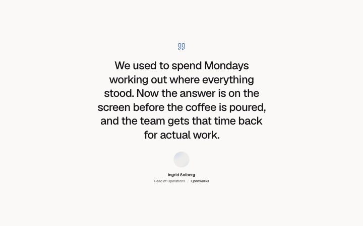
          "quote": "We used to spend Mondays working out where everything stood. Now the answer is on the screen before the coffee is poured, and the team gets that time back for actual work.",
          "name": "Ingrid Solberg",
          "role": "Head of Operations",
          "company": "Fjordworks",
          "photo": {
            "src": "",
            "alt": "Portrait of Ingrid Solberg"
          }
        }} />
      </BlockSurface>
    </Theme>
  );
}
Install
Import
import Block from '@/components/klarhimmel/blocks/testimonial-quote';- testimonials/quote
- Category
- What customers say, one quote or many.
Notes
When to use it
One large centred quote with a round portrait, name, role and company. Use it as a single moment of proof; `testimonials-grid` fits several voices and `testimonials-split` a lead voice with supporting ones.
Writing for it
- The quote holds 400 characters and is set at lead size or larger. Cut it to the one sentence that carries a claim. - Name is the only part of the caption used as the block's label, so write the full name, not a first name. - Add a role (80 characters) that tells the reader why the person knows, and a company (60 characters) which is drawn after a slash and left out when empty.
Watch out for
The portrait is drawn in a 64px circle from the photo field. With no src the circle is an empty frame, so either add a real picture or check how the block looks without one before you publish.
Pairs well with
Usage
The block in a page, with its default content (long lists shortened). Every prop is in the table below.
import { Theme } from '@/components/klarhimmel/theme/style';
import { BlockSurface } from '@/components/klarhimmel/blocks/surface';
import TestimonialQuote from '@/components/klarhimmel/blocks/testimonial-quote';

export default function Section() {
  return (
    <Theme theme="brand">
      <BlockSurface>
        <TestimonialQuote props={{
          "quote": "We used to spend Mondays working out where everything stood. Now the answer is on the screen before the coffee is poured, and the team gets that time back for actual work.",
          "name": "Ingrid Solberg",
          "role": "Head of Operations",
          "company": "Fjordworks",
          "photo": {
            "src": "",
            "alt": "Portrait of Ingrid Solberg"
          }
        }} />
      </BlockSurface>
    </Theme>
  );
}
Props
The type, default and text limit of every prop. On a real page, over-limit text is kept and checkSections flags it (Installation, Check a page before you ship); this live preview shows the default until it fits. The panel above edits all props.
| Prop | Type | Default | Description |
|---|---|---|---|
quote | string | 'We used to spend Mondays working ou…' | Text, up to 400 characters. |
name | string | 'Ingrid Solberg' | Text, up to 60 characters. |
role | string | 'Head of Operations' | Text, up to 80 characters. |
company | string | 'Fjordworks' | Text, up to 60 characters. |
photo | Media | {…} | See the type. |