Testimonials, grid
Install
npx shadcn add @klarhimmel/testimonials-gridUsage
import { Theme } from '@/components/klarhimmel/theme/style';
import { BlockSurface } from '@/components/klarhimmel/blocks/surface';
import TestimonialsGrid from '@/components/klarhimmel/blocks/testimonials-grid';

export default function Section() {
  return (
    <Theme theme="brand">
      <BlockSurface>
        <TestimonialsGrid props={{
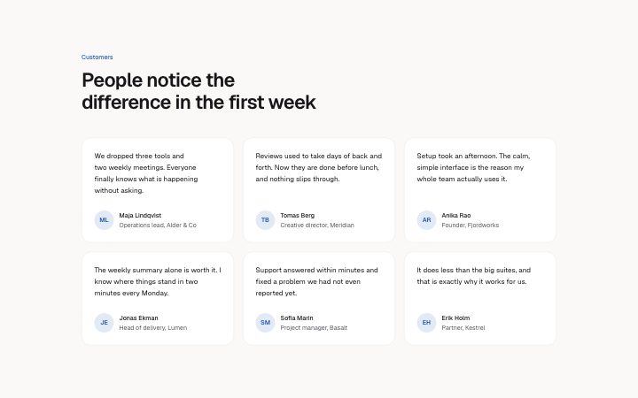
          "eyebrow": "Customers",
          "title": "People notice the difference in the first week",
          "items": [
            {
              "quote": "We dropped three tools and two weekly meetings. Everyone finally knows what is happening without asking.",
              "name": "Maja Lindqvist",
              "role": "Operations lead, Alder & Co"
            },
            {
              "quote": "Reviews used to take days of back and forth. Now they are done before lunch, and nothing slips through.",
              "name": "Tomas Berg",
              "role": "Creative director, Meridian"
            },
            {
              "quote": "Setup took an afternoon. The calm, simple interface is the reason my whole team actually uses it.",
              "name": "Anika Rao",
              "role": "Founder, Fjordworks"
            },
            {
              "quote": "The weekly summary alone is worth it. I know where things stand in two minutes every Monday.",
              "name": "Jonas Ekman",
              "role": "Head of delivery, Lumen"
            },
            {
              "quote": "Support answered within minutes and fixed a problem we had not even reported yet.",
              "name": "Sofia Marin",
              "role": "Project manager, Basalt"
            },
            {
              "quote": "It does less than the big suites, and that is exactly why it works for us.",
              "name": "Erik Holm",
              "role": "Partner, Kestrel"
            }
          ]
        }} />
      </BlockSurface>
    </Theme>
  );
}
Install
Import
import Block from '@/components/klarhimmel/blocks/testimonials-grid';- testimonials/grid
- Category
- What customers say, one quote or many.
Notes
When to use it
A heading and a grid of up to six quotes in boxed cards, each with a name and role. For many short voices without boxes use `testimonials-wall`, and for one big story `testimonial-quote`.
Writing for it
- Quotes hold 300 characters and the cards stretch to equal height, so a mix of lengths is fine. Still, cut each to the single thing the customer said that you could not have written yourself. - There is no photo field. An initials avatar is drawn from the name, so use a full name and not a team label. - Role has 80 characters and sits under the name. Use job title and company in the form 'Head of ops, Northlight' to save a separate field.
Watch out for
The grid is two columns on medium containers and three on wide ones. Five items leave a half-empty last row in both, so use four or six.
Pairs well with
Usage
The block in a page, with its default content (long lists shortened). Every prop is in the table below.
import { Theme } from '@/components/klarhimmel/theme/style';
import { BlockSurface } from '@/components/klarhimmel/blocks/surface';
import TestimonialsGrid from '@/components/klarhimmel/blocks/testimonials-grid';

export default function Section() {
  return (
    <Theme theme="brand">
      <BlockSurface>
        <TestimonialsGrid props={{
          "eyebrow": "Customers",
          "title": "People notice the difference in the first week",
          "items": [
            {
              "quote": "We dropped three tools and two weekly meetings. Everyone finally knows what is happening without asking.",
              "name": "Maja Lindqvist",
              "role": "Operations lead, Alder & Co"
            },
            {
              "quote": "Reviews used to take days of back and forth. Now they are done before lunch, and nothing slips through.",
              "name": "Tomas Berg",
              "role": "Creative director, Meridian"
            },
            {
              "quote": "Setup took an afternoon. The calm, simple interface is the reason my whole team actually uses it.",
              "name": "Anika Rao",
              "role": "Founder, Fjordworks"
            }
          ]
        }} />
      </BlockSurface>
    </Theme>
  );
}
Props
The type, default and text limit of every prop. On a real page, over-limit text is kept and checkSections flags it (Installation, Check a page before you ship); this live preview shows the default until it fits. The panel above edits all props.
| Prop | Type | Default | Description |
|---|---|---|---|
eyebrow | string | 'Customers' | Text, up to 60 characters. |
title | string | 'People notice the difference in the…' | Text, up to 120 characters. |
items | { quote, name, role }[] | 6 items | List of 1 to 6. Each item: quote, name, role. |
headingLevel | '1' | '2' | - | One of '1', '2'. Optional; empty is not rendered. |