Features, grid
Install
npx shadcn add @klarhimmel/features-gridUsage
import { Theme } from '@/components/klarhimmel/theme/style';
import { BlockSurface } from '@/components/klarhimmel/blocks/surface';
import FeaturesGrid from '@/components/klarhimmel/blocks/features-grid';

export default function Section() {
  return (
    <Theme theme="brand">
      <BlockSurface>
        <FeaturesGrid props={{
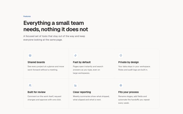
          "eyebrow": "Features",
          "title": "Everything a small team needs, nothing it does not",
          "description": "A focused set of tools that stay out of the way and keep everyone looking at the same page.",
          "columns": "3",
          "items": [
            {
              "icon": "layers",
              "title": "Shared boards",
              "description": "See every project at a glance and move work forward without a meeting."
            },
            {
              "icon": "zap",
              "title": "Fast by default",
              "description": "Pages open instantly and search answers as you type, even on large workspaces."
            },
            {
              "icon": "shield",
              "title": "Private by design",
              "description": "Your data stays in your workspace. Roles and audit logs are built in."
            },
            {
              "icon": "users",
              "title": "Built for review",
              "description": "Comment on the work itself, request changes and approve with one click."
            },
            {
              "icon": "chart",
              "title": "Clear reporting",
              "description": "Weekly summaries show what shipped, what slipped and what is next."
            },
            {
              "icon": "settings",
              "title": "Fits your process",
              "description": "Rename stages, add fields and automate the handoffs you repeat every week."
            }
          ]
        }} />
      </BlockSurface>
    </Theme>
  );
}
Install
Import
import Block from '@/components/klarhimmel/blocks/features-grid';- features/grid
- Category
- What it does, as a grid, a list, tabs or alternating rows.
Notes
When to use it
A plain grid of equal feature cards, each with an optional icon, a title and a sentence. The default for a feature overview; `features-bento` suits uneven emphasis and `features-list` suits a few items with more text.
Writing for it
- Items take one to nine, each with a title (60) and a description (200). A multiple of the column count keeps the grid even. - The columns field is 2, 3 or 4 and defaults to 3. It is a ceiling: the grid never uses more columns than there are items. - Icon is optional per item. Use icons on all items or on none, since a mix leaves the cards unaligned.
Watch out for
Item titles are h3 headings, placed under the section title. Without a section title they sit directly under whatever block comes before, which can skip a heading level.
Pairs well with
Usage
The block in a page, with its default content (long lists shortened). Every prop is in the table below.
import { Theme } from '@/components/klarhimmel/theme/style';
import { BlockSurface } from '@/components/klarhimmel/blocks/surface';
import FeaturesGrid from '@/components/klarhimmel/blocks/features-grid';

export default function Section() {
  return (
    <Theme theme="brand">
      <BlockSurface>
        <FeaturesGrid props={{
          "columns": "3",
          "eyebrow": "Features",
          "title": "Everything a small team needs, nothing it does not",
          "description": "A focused set of tools that stay out of the way and keep everyone looking at the same page.",
          "items": [
            {
              "icon": "layers",
              "title": "Shared boards",
              "description": "See every project at a glance and move work forward without a meeting."
            },
            {
              "icon": "zap",
              "title": "Fast by default",
              "description": "Pages open instantly and search answers as you type, even on large workspaces."
            },
            {
              "icon": "shield",
              "title": "Private by design",
              "description": "Your data stays in your workspace. Roles and audit logs are built in."
            }
          ]
        }} />
      </BlockSurface>
    </Theme>
  );
}
Props
The type, default and text limit of every prop. On a real page, over-limit text is kept and checkSections flags it (Installation, Check a page before you ship); this live preview shows the default until it fits. The panel above edits all props.
| Prop | Type | Default | Description |
|---|---|---|---|
eyebrow | string | 'Features' | Text, up to 60 characters. |
title | string | 'Everything a small team needs, noth…' | Text, up to 120 characters. |
description | string | 'A focused set of tools that stay ou…' | Text, up to 300 characters. |
columns | '2' | '3' | '4' | '3' | One of '2', '3', '4'. Optional; empty is not rendered. |
items | { icon, title, description }[] | 6 items | List of 1 to 9. Each item: icon ('zap' | 'shield' | 'layers' | 'globe' | 'sparkles' | 'clock' | 'code' | 'palette' | 'lock' | 'chart' | 'users' | 'mail' | 'heart' | 'rocket' | 'search' | 'settings' | 'check' | 'star' | 'book' | 'box' | 'cloud' | 'compass' | 'leaf' | 'gauge') (optional), title, description. |
headingLevel | '1' | '2' | - | One of '1', '2'. Optional; empty is not rendered. |