Features, tabs
Install
npx shadcn add @klarhimmel/features-tabsUsage
import { Theme } from '@/components/klarhimmel/theme/style';
import { BlockSurface } from '@/components/klarhimmel/blocks/surface';
import FeaturesTabs from '@/components/klarhimmel/blocks/features-tabs';

export default function Section() {
  return (
    <Theme theme="brand">
      <BlockSurface>
        <FeaturesTabs props={{
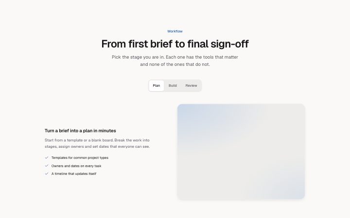
          "eyebrow": "Workflow",
          "title": "From first brief to final sign-off",
          "description": "Pick the stage you are in. Each one has the tools that matter and none of the ones that do not.",
          "tabs": [
            {
              "label": "Plan",
              "title": "Turn a brief into a plan in minutes",
              "description": "Start from a template or a blank board. Break the work into stages, assign owners and set dates that everyone can see.",
              "points": [
                "Templates for common project types",
                "Owners and dates on every task",
                "A timeline that updates itself"
              ],
              "media": {
                "src": "",
                "alt": "A project board with three stages"
              }
            },
            {
              "label": "Build",
              "title": "Keep the work and the conversation together",
              "description": "Files, comments and decisions sit on the task, so context never gets lost in a thread.",
              "points": [
                "Comments on files and tasks",
                "Version history that stays readable",
                "Mentions that notify only who they should"
              ],
              "media": {
                "src": "",
                "alt": "A task with comments and an attached file"
              }
            },
            {
              "label": "Review",
              "title": "Approve with one click, not one email chain",
              "description": "Send a review link to a client or a colleague. They comment on the work itself and you see every change request in one place.",
              "points": [
                "Review links without accounts",
                "Change requests as a checklist",
                "A clear record of who approved what"
              ],
              "media": {
                "src": "",
                "alt": "A review screen with an approve button"
              }
            }
          ]
        }} />
      </BlockSurface>
    </Theme>
  );
}
Install
Import
import Block from '@/components/klarhimmel/blocks/features-tabs';- features/tabs
- Category
- What it does, as a grid, a list, tabs or alternating rows.
Notes
When to use it
Features switched by tabs, one panel visible at a time with a title, description, points and image. It saves height compared with `features-split`, at the cost of hiding the other panels.
Writing for it
- Each tab label holds 30 characters and sits in the tab bar, so write one or two words. The panel title (80) says more. - Two to five tabs, each with up to five points of 80 characters. Keep the point count similar from tab to tab so the panel height does not jump. - All panels use a 4 to 3 image, so prepare each screenshot at that ratio.
Watch out for
Without JavaScript the tabs cannot switch, so the block shows every panel one after another with the label above and no buttons. Check that copy reads fine in that stacked form.
Pairs well with
Usage
The block in a page, with its default content (long lists shortened). Every prop is in the table below.
import { Theme } from '@/components/klarhimmel/theme/style';
import { BlockSurface } from '@/components/klarhimmel/blocks/surface';
import FeaturesTabs from '@/components/klarhimmel/blocks/features-tabs';

export default function Section() {
  return (
    <Theme theme="brand">
      <BlockSurface>
        <FeaturesTabs props={{
          "eyebrow": "Workflow",
          "title": "From first brief to final sign-off",
          "description": "Pick the stage you are in. Each one has the tools that matter and none of the ones that do not.",
          "tabs": [
            {
              "label": "Plan",
              "title": "Turn a brief into a plan in minutes",
              "description": "Start from a template or a blank board. Break the work into stages, assign owners and set dates that everyone can see.",
              "points": [
                "Templates for common project types",
                "Owners and dates on every task"
              ],
              "media": {
                "src": "",
                "alt": "A project board with three stages"
              }
            },
            {
              "label": "Build",
              "title": "Keep the work and the conversation together",
              "description": "Files, comments and decisions sit on the task, so context never gets lost in a thread.",
              "points": [
                "Comments on files and tasks",
                "Version history that stays readable"
              ],
              "media": {
                "src": "",
                "alt": "A task with comments and an attached file"
              }
            }
          ]
        }} />
      </BlockSurface>
    </Theme>
  );
}
Props
The type, default and text limit of every prop. On a real page, over-limit text is kept and checkSections flags it (Installation, Check a page before you ship); this live preview shows the default until it fits. The panel above edits all props.
| Prop | Type | Default | Description |
|---|---|---|---|
eyebrow | string | 'Workflow' | Text, up to 60 characters. |
title | string | 'From first brief to final sign-off' | Text, up to 120 characters. |
description | string | 'Pick the stage you are in. Each one…' | Text, up to 300 characters. |
tabs | { label, title, description, points, media }[] | 3 items | List of 2 to 5. Each item: label, title, description, points, media. |
headingLevel | '1' | '2' | - | One of '1', '2'. Optional; empty is not rendered. |