Call to action, by audience
Install
npx shadcn add @klarhimmel/cta-audiencesUsage
import { Theme } from '@/components/klarhimmel/theme/style';
import { BlockSurface } from '@/components/klarhimmel/blocks/surface';
import CtaAudiences from '@/components/klarhimmel/blocks/cta-audiences';

export default function Section() {
  return (
    <Theme theme="brand">
      <BlockSurface>
        <CtaAudiences props={{
          "eyebrow": "Where do you fit?",
          "title": "Two ways in, depending on who you are",
          "description": "Pick the one that sounds like you. You can always switch later.",
          "audiences": [
            {
              "name": "I run a hotel",
              "description": "Your own booking page, live today, with the calendar you already use.",
              "points": [
                "Free for 30 days",
                "Import your rooms in minutes"
              ],
              "cta": {
                "label": "Start free",
                "href": "#start"
              }
            },
            {
              "name": "I am planning a stay",
              "description": "Find small hotels that answer the phone and show their real prices.",
              "points": [
                "No booking fees",
                "Free cancellation on most rooms"
              ],
              "cta": {
                "label": "Find a room",
                "href": "#rooms"
              }
            },
            {
              "name": "I build for hotels",
              "description": "An API and white-label pages for agencies and developers.",
              "points": [
                "Documented REST API",
                "Partner pricing"
              ],
              "cta": {
                "label": "Read the docs",
                "href": "#docs"
              }
            }
          ]
        }} />
      </BlockSurface>
    </Theme>
  );
}
Install
Import
import Block from '@/components/klarhimmel/blocks/cta-audiences';- cta/audiences
- About
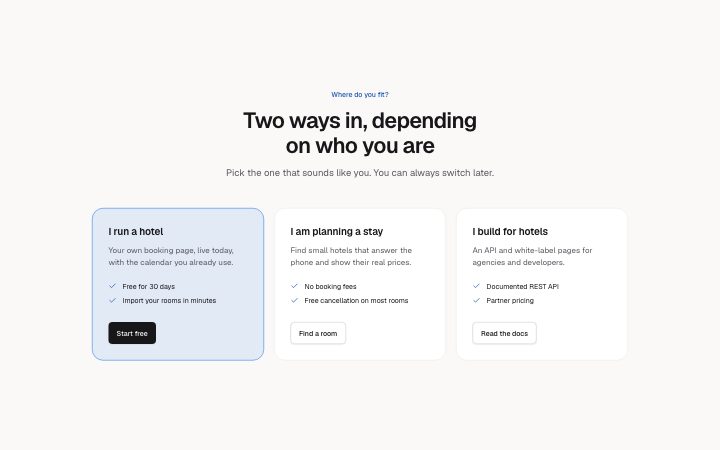
- Two or three side-by-side cards, one per kind of visitor (for guests, for owners, for agencies), each with its own short pitch, up to three points and its own action. The first card is filled. For a site with more than one front door.
- Category
- One clear next step near the end of a page.
Notes
When to use it
Two or three cards, each for a different kind of visitor, with its own pitch, up to three points and an action. Use it when the site has several front doors. With a single audience, `cta-card` is the simpler close.
Writing for it
- The audience name is required and holds 40 characters; write it as the visitor ('For guests', 'For owners'), not as your product tier. - Each description takes 160 characters and each of the up to three points 80. Make the points differ between cards, since identical lists make the split pointless. - The cta on every card has its own label and href, so send each to a page made for that audience rather than to one shared form.
Watch out for
Only the first card is styled as the main one: accent border, tinted background and a primary button. Order the audiences so the group you most want comes first. The schema allows two or three cards, never one or four.
Pairs well with
Usage
The block in a page, with its default content (long lists shortened). Every prop is in the table below.
import { Theme } from '@/components/klarhimmel/theme/style';
import { BlockSurface } from '@/components/klarhimmel/blocks/surface';
import CtaAudiences from '@/components/klarhimmel/blocks/cta-audiences';

export default function Section() {
  return (
    <Theme theme="brand">
      <BlockSurface>
        <CtaAudiences props={{
          "eyebrow": "Where do you fit?",
          "title": "Two ways in, depending on who you are",
          "description": "Pick the one that sounds like you. You can always switch later.",
          "audiences": [
            {
              "name": "I run a hotel",
              "description": "Your own booking page, live today, with the calendar you already use.",
              "points": [
                "Free for 30 days",
                "Import your rooms in minutes"
              ],
              "cta": {
                "label": "Start free",
                "href": "#start"
              }
            },
            {
              "name": "I am planning a stay",
              "description": "Find small hotels that answer the phone and show their real prices.",
              "points": [
                "No booking fees",
                "Free cancellation on most rooms"
              ],
              "cta": {
                "label": "Find a room",
                "href": "#rooms"
              }
            },
            {
              "name": "I build for hotels",
              "description": "An API and white-label pages for agencies and developers.",
              "points": [
                "Documented REST API",
                "Partner pricing"
              ],
              "cta": {
                "label": "Read the docs",
                "href": "#docs"
              }
            }
          ]
        }} />
      </BlockSurface>
    </Theme>
  );
}
Props
The type, default and text limit of every prop. On a real page, over-limit text is kept and checkSections flags it (Installation, Check a page before you ship); this live preview shows the default until it fits. The panel above edits all props.
| Prop | Type | Default | Description |
|---|---|---|---|
eyebrow | string | 'Where do you fit?' | Text, up to 60 characters. |
title | string | 'Two ways in, depending on who you a…' | Text, up to 120 characters. |
description | string | 'Pick the one that sounds like you. …' | Text, up to 300 characters. |
audiences | { name, description, points, cta }[] | 3 items | List of 2 to 3. Each item: name, description, points, cta. |
headingLevel | '1' | '2' | - | One of '1', '2'. Optional; empty is not rendered. |