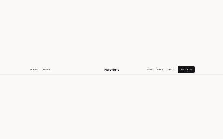
Brand centred with the links split either side, a secondary link and one call to action. Collapses to a menu in narrow containers.
Light · Dark
Brand centred with the links split either side, a secondary link and one call to action. Collapses to a menu in narrow containers.
Light · Dark
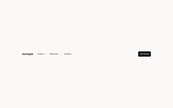
Brand, up to four link groups that open a panel of described links, and one call to action. Panels become sections of the mobile menu.
Light · Dark
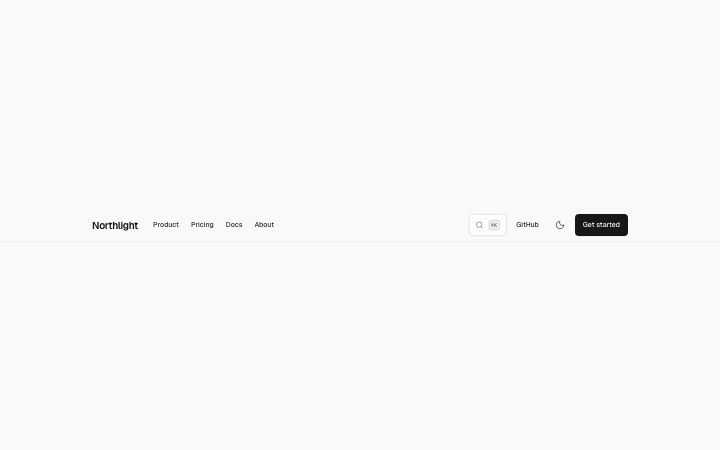
Brand on the left, up to eight links, an optional search trigger, secondary link and theme toggle, and one call to action.
Light · Dark
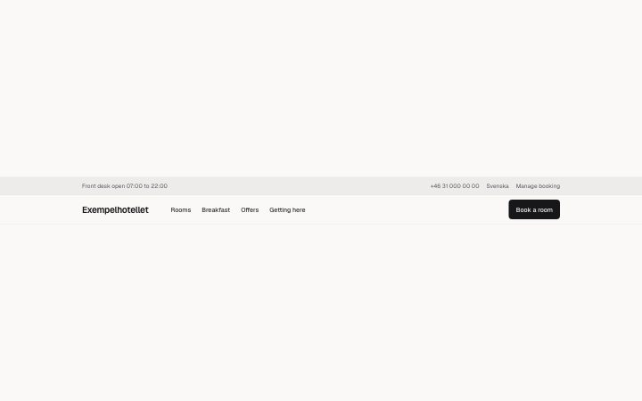
Two rows: a slim tinted utility bar (a note on the left, phone, language or sign-in links on the right) above the main row with brand, up to six links and one…
Light · Dark