Navbar, menu panels
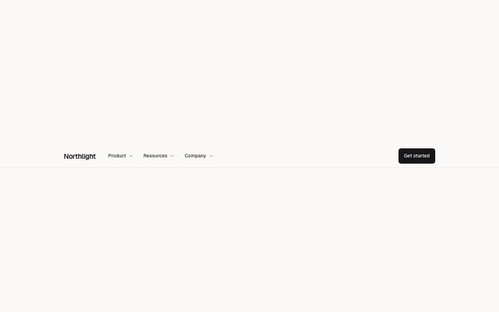
Install
npx shadcn add @klarhimmel/navbar-menuUsage
import { Theme } from '@/components/klarhimmel/theme/style';
import { BlockSurface } from '@/components/klarhimmel/blocks/surface';
import NavbarMenu from '@/components/klarhimmel/blocks/navbar-menu';

export default function Section() {
  return (
    <Theme theme="brand">
      <BlockSurface>
        <NavbarMenu props={{
          "brand": "Northlight",
          "groups": [
            {
              "label": "Product",
              "links": [
                {
                  "label": "Planning",
                  "description": "Plan the week around real capacity.",
                  "href": "#planning"
                },
                {
                  "label": "Reviews",
                  "description": "A fifteen minute weekly review, built in.",
                  "href": "#reviews"
                },
                {
                  "label": "Workload",
                  "description": "See who has room before you assign.",
                  "href": "#workload"
                },
                {
                  "label": "Integrations",
                  "description": "Connect the tools your team already uses.",
                  "href": "#integrations"
                }
              ]
            },
            {
              "label": "Resources",
              "links": [
                {
                  "label": "Guides",
                  "description": "Practical writing on working well.",
                  "href": "#guides"
                },
                {
                  "label": "Docs",
                  "description": "Everything about setup and the API.",
                  "href": "#docs"
                },
                {
                  "label": "Changelog",
                  "description": "What shipped and when.",
                  "href": "#changelog"
                }
              ]
            },
            {
              "label": "Company",
              "links": [
                {
                  "label": "About",
                  "description": "Who we are and how we work.",
                  "href": "#about"
                },
                {
                  "label": "Careers",
                  "description": "Small team, remote, calm pace.",
                  "href": "#careers"
                }
              ]
            }
          ],
          "cta": {
            "label": "Get started",
            "href": "#start"
          }
        }} />
      </BlockSurface>
    </Theme>
  );
}
Install
Import
import Block from '@/components/klarhimmel/blocks/navbar-menu';- header/menu
- Category
- The bar at the top of every page: brand, links, one action.
Notes
When to use it
A header for sites with enough pages that links need grouping, where each group opens a panel of links with a short description. For a flat list of a few links, use `navbar-simple` instead.
Writing for it
- Each group label holds 24 characters and the block takes one to four groups. The label is the only thing visible until the panel opens, so name it by the reader's task. - Every link in a panel has a label (40) and a description (100). Write the description as what the reader gets on that page, not a repeat of the label. - A group takes one to six links, but the panel lays them out in two or three columns on wide containers, so aim for an even count.
Watch out for
There is no plain link slot: every top-level entry is a group that must hold at least one link, so a single page such as Pricing has to be tucked into a group or left out.
Pairs well with
Usage
The block in a page, with its default content (long lists shortened). Every prop is in the table below.
import { Theme } from '@/components/klarhimmel/theme/style';
import { BlockSurface } from '@/components/klarhimmel/blocks/surface';
import NavbarMenu from '@/components/klarhimmel/blocks/navbar-menu';

export default function Section() {
  return (
    <Theme theme="brand">
      <BlockSurface>
        <NavbarMenu props={{
          "brand": "Northlight",
          "groups": [
            {
              "label": "Product",
              "links": [
                {
                  "label": "Planning",
                  "description": "Plan the week around real capacity.",
                  "href": "#planning"
                },
                {
                  "label": "Reviews",
                  "description": "A fifteen minute weekly review, built in.",
                  "href": "#reviews"
                }
              ]
            },
            {
              "label": "Resources",
              "links": [
                {
                  "label": "Guides",
                  "description": "Practical writing on working well.",
                  "href": "#guides"
                },
                {
                  "label": "Docs",
                  "description": "Everything about setup and the API.",
                  "href": "#docs"
                }
              ]
            }
          ],
          "cta": {
            "label": "Get started",
            "href": "#start"
          }
        }} />
      </BlockSurface>
    </Theme>
  );
}
Props
The type, default and text limit of every prop. On a real page, over-limit text is kept and checkSections flags it (Installation, Check a page before you ship); this live preview shows the default until it fits. The panel above edits all props.
| Prop | Type | Default | Description |
|---|---|---|---|
brand | string | 'Northlight' | Text, up to 40 characters. |
brandHref | string | - | Text, up to 300 characters. Optional; empty is not rendered. |
groups | { label, links }[] | 3 items | List of 1 to 4. Each item: label, links. |
cta | Link | {…} | See the type. |