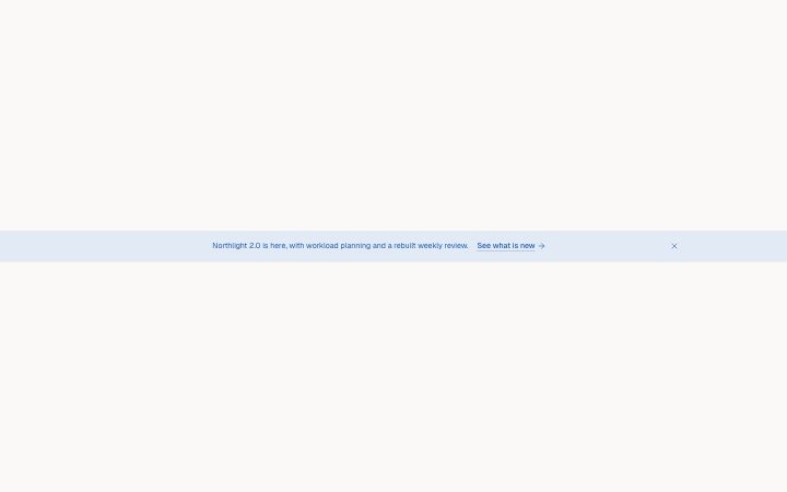
Banner, announcement
Install
npx shadcn add @klarhimmel/banner-announcementUsage
import { Theme } from '@/components/klarhimmel/theme/style';
import { BlockSurface } from '@/components/klarhimmel/blocks/surface';
import BannerAnnouncement from '@/components/klarhimmel/blocks/banner-announcement';

export default function Section() {
  return (
    <Theme theme="brand">
      <BlockSurface>
        <BannerAnnouncement props={{
          "text": "Northlight 2.0 is here, with workload planning and a rebuilt weekly review.",
          "link": {
            "label": "See what is new",
            "href": "#changelog"
          },
          "dismissLabel": "Dismiss"
        }} />
      </BlockSurface>
    </Theme>
  );
}
Install
Import
import Block from '@/components/klarhimmel/blocks/banner-announcement';- banner/announcement
- Category
- Announcement bars and the cookie notice.
Notes
When to use it
A slim bar above the navbar that says one thing about the site, such as a release or an event, and can be dismissed. For a campaign with a discount code use `banner-promo`; for consent use `banner-cookie`.
Writing for it
- The text holds 140 characters and should be a single sentence that stands alone, since the link label sits right after it. - The link label should say where the reader lands, such as See what is new, because the bar shows an arrow and nothing else about the target. - dismissLabel is required (24 characters) and is read aloud by screen readers; visible text appears only while editing.
Watch out for
Dismissing only hides the bar for that visit, held in component state. Nothing is stored, so it comes back on the next page load and on every other page that includes it.
Pairs well with
Usage
The block in a page, with its default content (long lists shortened). Every prop is in the table below.
import { Theme } from '@/components/klarhimmel/theme/style';
import { BlockSurface } from '@/components/klarhimmel/blocks/surface';
import BannerAnnouncement from '@/components/klarhimmel/blocks/banner-announcement';

export default function Section() {
  return (
    <Theme theme="brand">
      <BlockSurface>
        <BannerAnnouncement props={{
          "text": "Northlight 2.0 is here, with workload planning and a rebuilt weekly review.",
          "link": {
            "label": "See what is new",
            "href": "#changelog"
          },
          "dismissLabel": "Dismiss"
        }} />
      </BlockSurface>
    </Theme>
  );
}
Props
The type, default and text limit of every prop. On a real page, over-limit text is kept and checkSections flags it (Installation, Check a page before you ship); this live preview shows the default until it fits. The panel above edits all props.
| Prop | Type | Default | Description |
|---|---|---|---|
text | string | 'Northlight 2.0 is here, with worklo…' | Text, up to 140 characters. |
link | Link | {…} | See the type. |
dismissLabel | string | 'Dismiss' | Text, up to 24 characters. |