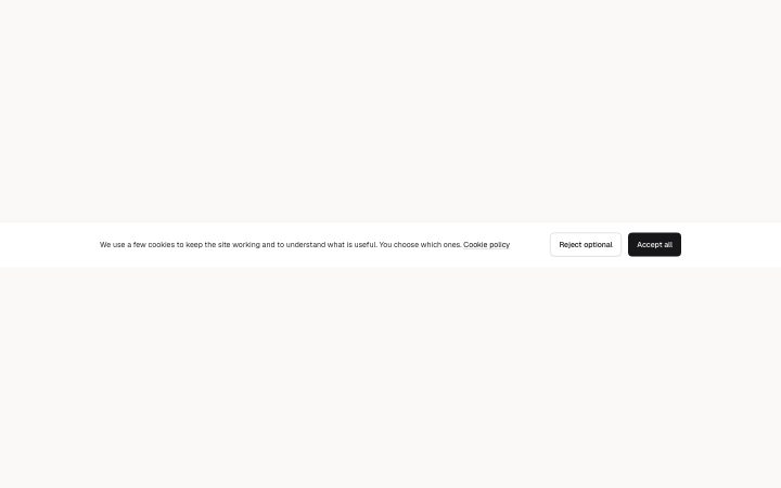
Banner, cookie notice
Install
npx shadcn add @klarhimmel/banner-cookieUsage
import { Theme } from '@/components/klarhimmel/theme/style';
import { BlockSurface } from '@/components/klarhimmel/blocks/surface';
import BannerCookie from '@/components/klarhimmel/blocks/banner-cookie';

export default function Section() {
  return (
    <Theme theme="brand">
      <BlockSurface>
        <BannerCookie props={{
          "text": "We use a few cookies to keep the site working and to understand what is useful. You choose which ones.",
          "accept": "Accept all",
          "reject": "Reject optional",
          "policy": {
            "label": "Cookie policy",
            "href": "#cookies"
          }
        }} />
      </BlockSurface>
    </Theme>
  );
}
Install
Import
import Block from '@/components/klarhimmel/blocks/banner-cookie';- banner/cookie
- Category
- Announcement bars and the cookie notice.
Notes
When to use it
A consent notice with two buttons and a link to the policy, placed at the foot of the page. It is for consent only; use `banner-announcement` for news and `banner-cta-bar` for a closing nudge.
Writing for it
- The text field holds 240 characters, enough for two plain sentences about what the cookies do. Name the purpose rather than saying we value your privacy. - Accept and reject are both required and capped at 24 characters. Keep them the same length and weight so neither choice looks like the preferred one. - The policy link is a single link field; fill it, because the sentence ends right before the link label.
Watch out for
Both buttons only close the notice in component state. The block does not set a cookie, record a choice or switch any script on or off, so the host page has to wire that up itself.
Pairs well with
Usage
The block in a page, with its default content (long lists shortened). Every prop is in the table below.
import { Theme } from '@/components/klarhimmel/theme/style';
import { BlockSurface } from '@/components/klarhimmel/blocks/surface';
import BannerCookie from '@/components/klarhimmel/blocks/banner-cookie';

export default function Section() {
  return (
    <Theme theme="brand">
      <BlockSurface>
        <BannerCookie props={{
          "text": "We use a few cookies to keep the site working and to understand what is useful. You choose which ones.",
          "accept": "Accept all",
          "reject": "Reject optional",
          "policy": {
            "label": "Cookie policy",
            "href": "#cookies"
          }
        }} />
      </BlockSurface>
    </Theme>
  );
}
Props
The type, default and text limit of every prop. On a real page, over-limit text is kept and checkSections flags it (Installation, Check a page before you ship); this live preview shows the default until it fits. The panel above edits all props.
| Prop | Type | Default | Description |
|---|---|---|---|
text | string | 'We use a few cookies to keep the si…' | Text, up to 240 characters. |
accept | string | 'Accept all' | Text, up to 24 characters. |
reject | string | 'Reject optional' | Text, up to 24 characters. |
policy | Link | {…} | See the type. |