Banner, call-to-action bar
Install
npx shadcn add @klarhimmel/banner-cta-barUsage
import { Theme } from '@/components/klarhimmel/theme/style';
import { BlockSurface } from '@/components/klarhimmel/blocks/surface';
import BannerCtaBar from '@/components/klarhimmel/blocks/banner-cta-bar';

export default function Section() {
  return (
    <Theme theme="brand">
      <BlockSurface>
        <BannerCtaBar props={{
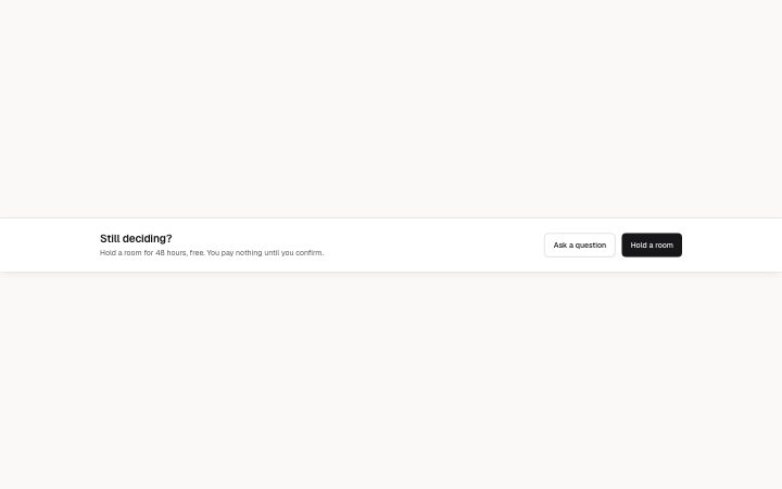
          "title": "Still deciding?",
          "description": "Hold a room for 48 hours, free. You pay nothing until you confirm.",
          "primary": {
            "label": "Hold a room",
            "href": "/hold"
          },
          "secondary": {
            "label": "Ask a question",
            "href": "/contact"
          }
        }} />
      </BlockSurface>
    </Theme>
  );
}
Install
Import
import Block from '@/components/klarhimmel/blocks/banner-cta-bar';- banner/cta-bar
- Category
- Announcement bars and the cookie notice.
Notes
When to use it
A bar at the end of the page that gives a last prompt after the reader has seen everything. It is a nudge, not a notice; for a full-width section with more room use `cta-band`.
Writing for it
- The title holds 80 characters and works best as a question or a small hesitation you can answer, like Still deciding?. - The description holds 160 characters. Spend them on removing risk, such as what is free and when the reader pays. - Primary and secondary are separate link fields. Give the primary the commitment and the secondary a lower-cost step, such as asking a question.
Watch out for
An empty secondary label drops that button and leaves one action. The docs only promise this for the secondary, so to get a single-button bar clear the secondary and keep the primary filled.
Pairs well with
Usage
The block in a page, with its default content (long lists shortened). Every prop is in the table below.
import { Theme } from '@/components/klarhimmel/theme/style';
import { BlockSurface } from '@/components/klarhimmel/blocks/surface';
import BannerCtaBar from '@/components/klarhimmel/blocks/banner-cta-bar';

export default function Section() {
  return (
    <Theme theme="brand">
      <BlockSurface>
        <BannerCtaBar props={{
          "title": "Still deciding?",
          "description": "Hold a room for 48 hours, free. You pay nothing until you confirm.",
          "primary": {
            "label": "Hold a room",
            "href": "/hold"
          },
          "secondary": {
            "label": "Ask a question",
            "href": "/contact"
          }
        }} />
      </BlockSurface>
    </Theme>
  );
}
Props
The type, default and text limit of every prop. On a real page, over-limit text is kept and checkSections flags it (Installation, Check a page before you ship); this live preview shows the default until it fits. The panel above edits all props.
| Prop | Type | Default | Description |
|---|---|---|---|
title | string | 'Still deciding?' | Text, up to 80 characters. |
description | string | 'Hold a room for 48 hours, free. You…' | Text, up to 160 characters. |
primary | Link | {…} | See the type. |
secondary | Link | {…} | See the type. |
headingLevel | '1' | '2' | - | One of '1', '2'. Optional; empty is not rendered. |