Navbar, utility bar
Install
npx shadcn add @klarhimmel/navbar-utilityUsage
import { Theme } from '@/components/klarhimmel/theme/style';
import { BlockSurface } from '@/components/klarhimmel/blocks/surface';
import NavbarUtility from '@/components/klarhimmel/blocks/navbar-utility';

export default function Section() {
  return (
    <Theme theme="brand">
      <BlockSurface>
        <NavbarUtility props={{
          "brand": "Exempelhotellet",
          "note": "Front desk open 07:00 to 22:00",
          "utility": [
            {
              "label": "+46 31 000 00 00",
              "href": "tel:+46310000000"
            },
            {
              "label": "Svenska",
              "href": "/sv"
            },
            {
              "label": "Manage booking",
              "href": "/booking"
            }
          ],
          "links": [
            {
              "label": "Rooms",
              "href": "#rooms"
            },
            {
              "label": "Breakfast",
              "href": "#breakfast"
            },
            {
              "label": "Offers",
              "href": "#offers"
            },
            {
              "label": "Getting here",
              "href": "#directions"
            }
          ],
          "cta": {
            "label": "Book a room",
            "href": "#book"
          }
        }} />
      </BlockSurface>
    </Theme>
  );
}
Install
Import
import Block from '@/components/klarhimmel/blocks/navbar-utility';- header/utility
- About
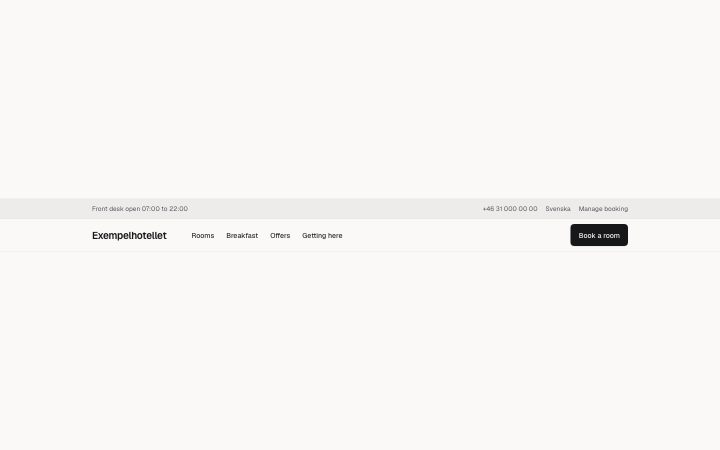
- Two rows: a slim tinted utility bar (a note on the left, phone, language or sign-in links on the right) above the main row with brand, up to six links and one call to action.
- Category
- The bar at the top of every page: brand, links, one action.
Notes
When to use it
A two-row header for businesses with practical facts to show at all times, such as opening hours, a phone number or a language switch. If you have nothing to put in the thin top row, `navbar-simple` is cleaner.
Writing for it
- The note holds 80 characters on the left of the top row. Put one fact there, like delivery terms or opening hours, and leave it empty to hide it. - Utility takes up to three quiet links, such as a tel: link, a language link and a booking link. Short labels keep them on one line. - The brand is optional here (40 characters), which suits a site where a logo image is added by the host page instead.
Watch out for
The utility row is not part of the collapsing menu. In narrow containers the main row folds into a menu button while the top row stays, so a long note and three links can crowd a phone screen.
Pairs well with
Usage
The block in a page, with its default content (long lists shortened). Every prop is in the table below.
import { Theme } from '@/components/klarhimmel/theme/style';
import { BlockSurface } from '@/components/klarhimmel/blocks/surface';
import NavbarUtility from '@/components/klarhimmel/blocks/navbar-utility';

export default function Section() {
  return (
    <Theme theme="brand">
      <BlockSurface>
        <NavbarUtility props={{
          "brand": "Exempelhotellet",
          "note": "Front desk open 07:00 to 22:00",
          "utility": [
            {
              "label": "+46 31 000 00 00",
              "href": "tel:+46310000000"
            },
            {
              "label": "Svenska",
              "href": "/sv"
            },
            {
              "label": "Manage booking",
              "href": "/booking"
            }
          ],
          "links": [
            {
              "label": "Rooms",
              "href": "#rooms"
            },
            {
              "label": "Breakfast",
              "href": "#breakfast"
            },
            {
              "label": "Offers",
              "href": "#offers"
            },
            {
              "label": "Getting here",
              "href": "#directions"
            }
          ],
          "cta": {
            "label": "Book a room",
            "href": "#book"
          }
        }} />
      </BlockSurface>
    </Theme>
  );
}
Props
The type, default and text limit of every prop. On a real page, over-limit text is kept and checkSections flags it (Installation, Check a page before you ship); this live preview shows the default until it fits. The panel above edits all props.
| Prop | Type | Default | Description |
|---|---|---|---|
brand | string | 'Exempelhotellet' | Text, up to 40 characters. |
brandHref | string | - | Text, up to 300 characters. Optional; empty is not rendered. |
note | string | 'Front desk open 07:00 to 22:00' | Text, up to 80 characters. |
utility | Link[] | 3 items | List of up to 3. |
links | Link[] | 4 items | List of up to 6. |
current | string | - | Text, up to 300 characters. Optional; empty is not rendered. |
cta | Link | {…} | See the type. |