Newsletter, inline
Install
npx shadcn add @klarhimmel/newsletter-inlineUsage
import { Theme } from '@/components/klarhimmel/theme/style';
import { BlockSurface } from '@/components/klarhimmel/blocks/surface';
import NewsletterInline from '@/components/klarhimmel/blocks/newsletter-inline';

export default function Section() {
  return (
    <Theme theme="brand">
      <BlockSurface>
        <NewsletterInline props={{
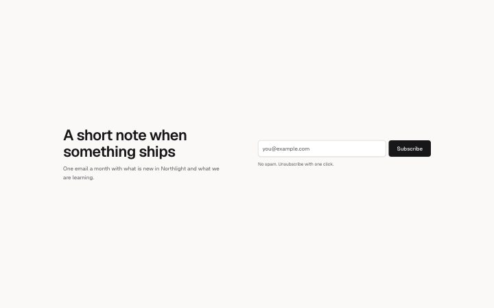
          "title": "A short note when something ships",
          "description": "One email a month with what is new in Northlight and what we are learning.",
          "placeholder": "[email protected]",
          "submit": "Subscribe",
          "consent": "No spam. Unsubscribe with one click."
        }} />
      </BlockSurface>
    </Theme>
  );
}
Install
Import
import Block from '@/components/klarhimmel/blocks/newsletter-inline';- newsletter/inline
- Category
- An email sign-up, inline or as a card.
Notes
When to use it
A one-row sign-up: headline and description on one side, email field and button on the other, with no card and no image. If the newsletter needs a reason to subscribe, use `newsletter-split`.
Writing for it
- There is no eyebrow and no media, so the title (100) does all the work. State the content, not the act of subscribing. - The description (240) is capped to a lead-width column and works best as a single sentence about frequency. - The consent text (160) goes under the field. Use it for what you will do with the address, since there is no space for anything else.
Watch out for
The two halves sit side by side only from the @3xl container width; below it they stack, and the form lands under the description. The title is an h2 sized as a heading on small containers and as a title on wide ones.
Pairs well with
Usage
The block in a page, with its default content (long lists shortened). Every prop is in the table below.
import { Theme } from '@/components/klarhimmel/theme/style';
import { BlockSurface } from '@/components/klarhimmel/blocks/surface';
import NewsletterInline from '@/components/klarhimmel/blocks/newsletter-inline';

export default function Section() {
  return (
    <Theme theme="brand">
      <BlockSurface>
        <NewsletterInline props={{
          "title": "A short note when something ships",
          "description": "One email a month with what is new in Northlight and what we are learning.",
          "placeholder": "[email protected]",
          "submit": "Subscribe",
          "consent": "No spam. Unsubscribe with one click."
        }} />
      </BlockSurface>
    </Theme>
  );
}
Props
The type, default and text limit of every prop. On a real page, over-limit text is kept and checkSections flags it (Installation, Check a page before you ship); this live preview shows the default until it fits. The panel above edits all props.
| Prop | Type | Default | Description |
|---|---|---|---|
title | string | 'A short note when something ships' | Text, up to 100 characters. |
description | string | 'One email a month with what is new …' | Text, up to 240 characters. |
placeholder | string | '[email protected]' | Text, up to 60 characters. |
submit | string | 'Subscribe' | Text, up to 24 characters. |
consent | string | 'No spam. Unsubscribe with one click.' | Text, up to 160 characters. |
action | string | - | Text, up to 300 characters. Optional; empty is not rendered. |
method | 'post' | 'get' | - | One of 'post', 'get'. Optional; empty is not rendered. |
hidden | { } | - | Optional; empty is not rendered. |
captcha | boolean | - | Optional; empty is not rendered. |
captchaSitekey | string | - | Text, up to 100 characters. Optional; empty is not rendered. |
headingLevel | '1' | '2' | - | One of '1', '2'. Optional; empty is not rendered. |