Snapshot, progress
Install
npx shadcn add @klarhimmel/snapshot-progressUsage
import { Theme } from '@/components/klarhimmel/theme/style';
import { BlockSurface } from '@/components/klarhimmel/blocks/surface';
import SnapshotProgress from '@/components/klarhimmel/blocks/snapshot-progress';

export default function Section() {
  return (
    <Theme theme="brand">
      <BlockSurface>
        <SnapshotProgress props={{
          "site": "acme.example",
          "status": "running",
          "queuedNote": "",
          "lines": [
            {
              "at": "2026-10-10T09:12:00Z",
              "text": "Reading /"
            },
            {
              "at": "2026-10-10T09:12:04Z",
              "text": "Reading /pricing"
            },
            {
              "at": "2026-10-10T09:12:09Z",
              "module": "competitors",
              "text": "Searching: accountants in Leeds"
            },
            {
              "at": "2026-10-10T09:12:15Z",
              "module": "seo_aeo",
              "text": "Asking an AI assistant: who is the best accountant for a small business in Leeds?"
            }
          ],
          "words": {
            "heading": "Reading",
            "queued": "Queued",
            "running": "Working",
            "done": "Done",
            "showAll": "Show all",
            "latest": "Latest"
          },
          "moduleWords": {
            "competitors": "Competitors",
            "audience": "Audience",
            "seo_aeo": "Search and AI answers",
            "growth": "Growth"
          }
        }} />
      </BlockSurface>
    </Theme>
  );
}
Install
Import
import Block from '@/components/klarhimmel/blocks/snapshot-progress';- snapshot/progress
- About
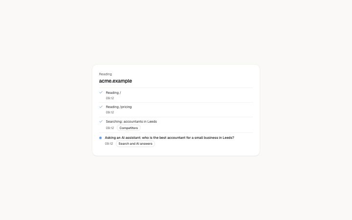
- The live narration of a snapshot: the site being read and its status, the newest line pulsing (motion-safe) and older lines ticked, at most eight in view with the rest under a native "Show all".
- Category
- The live snapshot of a site: progress narration, the profile, one card per research module and the numbered sources behind it. Rendered in a page island that re-renders on each poll.
Notes
When to use it
The live narration while a snapshot is being researched: the address being read, its status and the latest lines. It sits first on the page and gives way to `snapshot-profile` and the `snapshot-module` cards once the work is done.
Writing for it
- The site field is required (300 characters) and is the h2, shown as the person typed it. Each line needs text (400 characters), and an ISO time in at is shown as HH:MM. - Give a line a module id such as competitors, audience, seo_aeo or growth to get a badge. Rename the badges with moduleWords if the page is in another language. - Set queuedNote (400 characters) when status is queued, for example when the day's budget is used up. Lines are not drawn while the job is queued.
Watch out for
Only the newest eight lines are in view and the older ones sit under a native Show all with a count. Send lines oldest first, because the last one is the pulsing line and the one announced to screen readers.
Pairs well with
Usage
The block in a page, with its default content (long lists shortened). Every prop is in the table below.
import { Theme } from '@/components/klarhimmel/theme/style';
import { BlockSurface } from '@/components/klarhimmel/blocks/surface';
import SnapshotProgress from '@/components/klarhimmel/blocks/snapshot-progress';

export default function Section() {
  return (
    <Theme theme="brand">
      <BlockSurface>
        <SnapshotProgress props={{
          "site": "acme.example",
          "status": "running",
          "queuedNote": "",
          "lines": [
            {
              "at": "2026-10-10T09:12:00Z",
              "text": "Reading /"
            },
            {
              "at": "2026-10-10T09:12:04Z",
              "text": "Reading /pricing"
            },
            {
              "at": "2026-10-10T09:12:09Z",
              "module": "competitors",
              "text": "Searching: accountants in Leeds"
            },
            {
              "at": "2026-10-10T09:12:15Z",
              "module": "seo_aeo",
              "text": "Asking an AI assistant: who is the best accountant for a small business in Leeds?"
            }
          ],
          "words": {
            "heading": "Reading",
            "queued": "Queued",
            "running": "Working",
            "done": "Done",
            "showAll": "Show all",
            "latest": "Latest"
          },
          "moduleWords": {
            "competitors": "Competitors",
            "audience": "Audience",
            "seo_aeo": "Search and AI answers",
            "growth": "Growth"
          }
        }} />
      </BlockSurface>
    </Theme>
  );
}
Props
The type, default and text limit of every prop. On a real page, over-limit text is kept and checkSections flags it (Installation, Check a page before you ship); this live preview shows the default until it fits. The panel above edits all props.
| Prop | Type | Default | Description |
|---|---|---|---|
site | string | 'acme.example' | Text, up to 300 characters. |
status | 'queued' | 'running' | 'done' | 'running' | One of 'queued', 'running', 'done'. |
queuedNote | string | '' | Text, up to 400 characters. |
lines | { at, module, text }[] | 4 items | List of up to 300. Each item: at, module (optional), text. |
words | { heading, queued, running, done, showAll, latest } | {…} | Fields: heading (optional), queued (optional), running (optional), done (optional), showAll (optional), latest (optional). Optional; empty is not rendered. |
moduleWords | { competitors, audience, seo_aeo, growth } | {…} | Fields: competitors (optional), audience (optional), seo_aeo (optional), growth (optional). Optional; empty is not rendered. |
headingLevel | '1' | '2' | - | One of '1', '2'. Optional; empty is not rendered. |