Steps, with image
Install
npx shadcn add @klarhimmel/steps-mediaUsage
import { Theme } from '@/components/klarhimmel/theme/style';
import { BlockSurface } from '@/components/klarhimmel/blocks/surface';
import StepsMedia from '@/components/klarhimmel/blocks/steps-media';

export default function Section() {
  return (
    <Theme theme="brand">
      <BlockSurface>
        <StepsMedia props={{
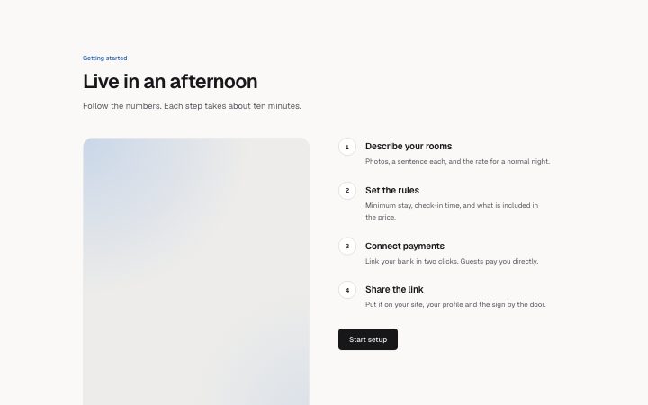
          "eyebrow": "Getting started",
          "title": "Live in an afternoon",
          "description": "Follow the numbers. Each step takes about ten minutes.",
          "media": {
            "src": "",
            "alt": "The booking page editor with a room being edited"
          },
          "steps": [
            {
              "title": "Describe your rooms",
              "description": "Photos, a sentence each, and the rate for a normal night."
            },
            {
              "title": "Set the rules",
              "description": "Minimum stay, check-in time, and what is included in the price."
            },
            {
              "title": "Connect payments",
              "description": "Link your bank in two clicks. Guests pay you directly."
            },
            {
              "title": "Share the link",
              "description": "Put it on your site, your profile and the sign by the door."
            }
          ],
          "cta": {
            "label": "Start setup",
            "href": "/signup"
          }
        }} />
      </BlockSurface>
    </Theme>
  );
}
Install
Import
import Block from '@/components/klarhimmel/blocks/steps-media';- steps/media
- Category
- How it works, in numbered steps or a timeline.
Notes
When to use it
Pairs one tall picture with three to six numbered steps, for flows that a single screenshot or photo can explain. Choose `steps-horizontal` when there is no image, and `steps-numbered` when steps carry code.
Writing for it
- The media is drawn at a 4 to 5 portrait ratio with rounded corners, so pick a screenshot cropped to that shape instead of a wide banner that will be cut. - Step titles hold 80 characters and descriptions 240. Number them in your head first, because the circle numbers are added for you and should not be typed into the title. - Write the alt text of the media (200 characters) as what the picture shows at the end of the flow, since it is the only description of the image for screen readers.
Watch out for
On wide containers the picture is sticky and stays in view while the steps scroll past it. A list of six long steps beside a short picture works well, but three tiny steps leave the picture with nothing to be sticky against.
Pairs well with
Usage
The block in a page, with its default content (long lists shortened). Every prop is in the table below.
import { Theme } from '@/components/klarhimmel/theme/style';
import { BlockSurface } from '@/components/klarhimmel/blocks/surface';
import StepsMedia from '@/components/klarhimmel/blocks/steps-media';

export default function Section() {
  return (
    <Theme theme="brand">
      <BlockSurface>
        <StepsMedia props={{
          "eyebrow": "Getting started",
          "title": "Live in an afternoon",
          "description": "Follow the numbers. Each step takes about ten minutes.",
          "media": {
            "src": "",
            "alt": "The booking page editor with a room being edited"
          },
          "steps": [
            {
              "title": "Describe your rooms",
              "description": "Photos, a sentence each, and the rate for a normal night."
            },
            {
              "title": "Set the rules",
              "description": "Minimum stay, check-in time, and what is included in the price."
            },
            {
              "title": "Connect payments",
              "description": "Link your bank in two clicks. Guests pay you directly."
            },
            {
              "title": "Share the link",
              "description": "Put it on your site, your profile and the sign by the door."
            }
          ],
          "cta": {
            "label": "Start setup",
            "href": "/signup"
          }
        }} />
      </BlockSurface>
    </Theme>
  );
}
Props
The type, default and text limit of every prop. On a real page, over-limit text is kept and checkSections flags it (Installation, Check a page before you ship); this live preview shows the default until it fits. The panel above edits all props.
| Prop | Type | Default | Description |
|---|---|---|---|
eyebrow | string | 'Getting started' | Text, up to 60 characters. |
title | string | 'Live in an afternoon' | Text, up to 120 characters. |
description | string | 'Follow the numbers. Each step takes…' | Text, up to 300 characters. |
media | Media | {…} | See the type. |
steps | { title, description }[] | 4 items | List of 3 to 6. Each item: title, description. |
cta | Link | {…} | See the type. |
headingLevel | '1' | '2' | - | One of '1', '2'. Optional; empty is not rendered. |