Steps, timeline
Install
npx shadcn add @klarhimmel/steps-timelineUsage
import { Theme } from '@/components/klarhimmel/theme/style';
import { BlockSurface } from '@/components/klarhimmel/blocks/surface';
import StepsTimeline from '@/components/klarhimmel/blocks/steps-timeline';

export default function Section() {
  return (
    <Theme theme="brand">
      <BlockSurface>
        <StepsTimeline props={{
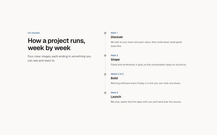
          "eyebrow": "Our process",
          "title": "How a project runs, week by week",
          "description": "Four clear stages, each ending in something you can see and react to.",
          "items": [
            {
              "label": "Week 1",
              "title": "Discover",
              "description": "We talk to your team and your users, then write down what good looks like."
            },
            {
              "label": "Week 2",
              "title": "Shape",
              "description": "Flows and wireframes in grey, so the conversation stays on structure."
            },
            {
              "label": "Weeks 3 to 5",
              "title": "Build",
              "description": "Working software every Friday, in a link you can click and share."
            },
            {
              "label": "Week 6",
              "title": "Launch",
              "description": "We ship, watch the first days with you and hand over the source."
            }
          ]
        }} />
      </BlockSurface>
    </Theme>
  );
}
Install
Import
import Block from '@/components/klarhimmel/blocks/steps-timeline';- steps/timeline
- Category
- How it works, in numbered steps or a timeline.
Notes
When to use it
A vertical, labelled timeline with a sticky heading on the left, for onboarding, a delivery process or a roadmap with up to eight stages. For three to five very short steps `steps-horizontal` is quicker to scan, and for company history by year use `about-timeline`.
Writing for it
- The label (30 characters) is the stage marker, like 'Week 1' or 'Q3'. Keep the labels the same kind of thing all the way down, either times or phases, not a mix. - A description may run to 240 characters and is drawn in a prose-width line, so one or two sentences on what the customer sees at that stage is enough. - The heading is in a column of its own, so a title near the 120 character limit gets tall beside the list. Say the topic in a line and put the detail in the steps.
Watch out for
There is no call to action in this block. If the process ends in a decision, put a `cta-minimal` or `cta-band` right after it, because the timeline just stops at the last item.
Pairs well with
Usage
The block in a page, with its default content (long lists shortened). Every prop is in the table below.
import { Theme } from '@/components/klarhimmel/theme/style';
import { BlockSurface } from '@/components/klarhimmel/blocks/surface';
import StepsTimeline from '@/components/klarhimmel/blocks/steps-timeline';

export default function Section() {
  return (
    <Theme theme="brand">
      <BlockSurface>
        <StepsTimeline props={{
          "eyebrow": "Our process",
          "title": "How a project runs, week by week",
          "description": "Four clear stages, each ending in something you can see and react to.",
          "items": [
            {
              "label": "Week 1",
              "title": "Discover",
              "description": "We talk to your team and your users, then write down what good looks like."
            },
            {
              "label": "Week 2",
              "title": "Shape",
              "description": "Flows and wireframes in grey, so the conversation stays on structure."
            },
            {
              "label": "Weeks 3 to 5",
              "title": "Build",
              "description": "Working software every Friday, in a link you can click and share."
            },
            {
              "label": "Week 6",
              "title": "Launch",
              "description": "We ship, watch the first days with you and hand over the source."
            }
          ]
        }} />
      </BlockSurface>
    </Theme>
  );
}
Props
The type, default and text limit of every prop. On a real page, over-limit text is kept and checkSections flags it (Installation, Check a page before you ship); this live preview shows the default until it fits. The panel above edits all props.
| Prop | Type | Default | Description |
|---|---|---|---|
eyebrow | string | 'Our process' | Text, up to 60 characters. |
title | string | 'How a project runs, week by week' | Text, up to 120 characters. |
description | string | 'Four clear stages, each ending in s…' | Text, up to 300 characters. |
items | { label, title, description }[] | 4 items | List of 1 to 8. Each item: label, title, description. |
headingLevel | '1' | '2' | - | One of '1', '2'. Optional; empty is not rendered. |