Stats row
Install
npx shadcn add @klarhimmel/stats-rowUsage
import { Theme } from '@/components/klarhimmel/theme/style';
import { BlockSurface } from '@/components/klarhimmel/blocks/surface';
import StatsRow from '@/components/klarhimmel/blocks/stats-row';

export default function Section() {
  return (
    <Theme theme="brand">
      <BlockSurface>
        <StatsRow props={{
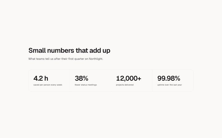
          "title": "Small numbers that add up",
          "description": "What teams tell us after their first quarter on Northlight.",
          "items": [
            {
              "value": "4.2 h",
              "label": "saved per person every week"
            },
            {
              "value": "38%",
              "label": "fewer status meetings"
            },
            {
              "value": "12,000+",
              "label": "projects delivered"
            },
            {
              "value": "99.98%",
              "label": "uptime over the last year"
            }
          ]
        }} />
      </BlockSurface>
    </Theme>
  );
}
Install
Import
import Block from '@/components/klarhimmel/blocks/stats-row';- stats/row
- Category
- A few numbers that prove the point.
Notes
When to use it
A short heading and two to four large figures with labels, in a plain hairline grid. It is the quiet default for company numbers; take `stats-band` when you want a loud single band or `stats-split` if one number leads.
Writing for it
- Values hold 16 characters and labels 60, so a value is a figure and a label says what is counted. 'Founded in 2014' is a label, '2014' is a value. - Both title and description are optional here, so for a bare strip of numbers you can empty them and let the figures stand alone. - Stick to equal weight. If one of your four numbers is far more important than the others, move to `stats-split` instead of making it longer.
Watch out for
The grid is two columns on medium containers and four on wide ones, so with three items the last cell is empty on wide screens. Use exactly two or four figures if you want a clean row.
Pairs well with
Usage
The block in a page, with its default content (long lists shortened). Every prop is in the table below.
import { Theme } from '@/components/klarhimmel/theme/style';
import { BlockSurface } from '@/components/klarhimmel/blocks/surface';
import StatsRow from '@/components/klarhimmel/blocks/stats-row';

export default function Section() {
  return (
    <Theme theme="brand">
      <BlockSurface>
        <StatsRow props={{
          "title": "Small numbers that add up",
          "description": "What teams tell us after their first quarter on Northlight.",
          "items": [
            {
              "value": "4.2 h",
              "label": "saved per person every week"
            },
            {
              "value": "38%",
              "label": "fewer status meetings"
            },
            {
              "value": "12,000+",
              "label": "projects delivered"
            },
            {
              "value": "99.98%",
              "label": "uptime over the last year"
            }
          ]
        }} />
      </BlockSurface>
    </Theme>
  );
}
Props
The type, default and text limit of every prop. On a real page, over-limit text is kept and checkSections flags it (Installation, Check a page before you ship); this live preview shows the default until it fits. The panel above edits all props.
| Prop | Type | Default | Description |
|---|---|---|---|
title | string | 'Small numbers that add up' | Text, up to 120 characters. |
description | string | 'What teams tell us after their firs…' | Text, up to 300 characters. |
items | { value, label }[] | 4 items | List of 2 to 4. Each item: value, label. |
headingLevel | '1' | '2' | - | One of '1', '2'. Optional; empty is not rendered. |