Logos, with results
Install
npx shadcn add @klarhimmel/logos-resultsUsage
import { Theme } from '@/components/klarhimmel/theme/style';
import { BlockSurface } from '@/components/klarhimmel/blocks/surface';
import LogosResults from '@/components/klarhimmel/blocks/logos-results';

export default function Section() {
  return (
    <Theme theme="brand">
      <BlockSurface>
        <LogosResults props={{
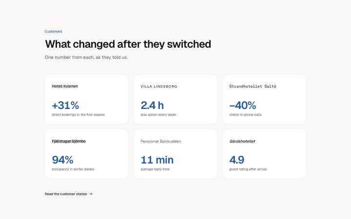
          "eyebrow": "Customers",
          "title": "What changed after they switched",
          "description": "One number from each, as they told us.",
          "items": [
            {
              "name": "Hotell Kvarnen",
              "media": {
                "src": "",
                "alt": "Hotell Kvarnen logo"
              },
              "figure": "+31%",
              "label": "direct bookings in the first season"
            },
            {
              "name": "Villa Lindeborg",
              "media": {
                "src": "",
                "alt": "Villa Lindeborg logo"
              },
              "figure": "2.4 h",
              "label": "less admin every week"
            },
            {
              "name": "Strandhotellet Saltö",
              "media": {
                "src": "",
                "alt": "Strandhotellet Saltö logo"
              },
              "figure": "−40%",
              "label": "check-in phone calls"
            },
            {
              "name": "Fjällstugan Björnbo",
              "media": {
                "src": "",
                "alt": "Fjällstugan Björnbo logo"
              },
              "figure": "94%",
              "label": "occupancy in winter weeks"
            },
            {
              "name": "Pensionat Björkudden",
              "media": {
                "src": "",
                "alt": "Pensionat Björkudden logo"
              },
              "figure": "11 min",
              "label": "average reply time"
            },
            {
              "name": "Gårdshotellet",
              "media": {
                "src": "",
                "alt": "Gårdshotellet logo"
              },
              "figure": "4.9",
              "label": "guest rating after arrival"
            }
          ],
          "more": {
            "label": "Read the customer stories",
            "href": "/customers"
          }
        }} />
      </BlockSurface>
    </Theme>
  );
}
Install
Import
import Block from '@/components/klarhimmel/blocks/logos-results';- logo-cloud/results
- Category
- Who already uses it, as a quiet row or grid of logos.
Notes
When to use it
A row of customers where each logo comes with one result figure, such as a percentage or a time saved. Use `logos-grid` if you have no numbers, and `case-study-metrics` if one customer needs a full breakdown.
Writing for it
- Each item pairs a figure (20) with a label (80). Keep the figure to the number itself, such as 38%, and let the label say of what. - Three to six items are allowed. Pick results that use the same kind of measure, since readers will compare them. - The more link points to the full stories. With an empty label it is not shown, so only fill it when those pages exist.
Watch out for
Without an image the customer name appears as a text wordmark, and with one the name is kept only for screen readers. Check that the image alt and name agree.
Pairs well with
Usage
The block in a page, with its default content (long lists shortened). Every prop is in the table below.
import { Theme } from '@/components/klarhimmel/theme/style';
import { BlockSurface } from '@/components/klarhimmel/blocks/surface';
import LogosResults from '@/components/klarhimmel/blocks/logos-results';

export default function Section() {
  return (
    <Theme theme="brand">
      <BlockSurface>
        <LogosResults props={{
          "eyebrow": "Customers",
          "title": "What changed after they switched",
          "description": "One number from each, as they told us.",
          "items": [
            {
              "name": "Hotell Kvarnen",
              "media": {
                "src": "",
                "alt": "Hotell Kvarnen logo"
              },
              "figure": "+31%",
              "label": "direct bookings in the first season"
            },
            {
              "name": "Villa Lindeborg",
              "media": {
                "src": "",
                "alt": "Villa Lindeborg logo"
              },
              "figure": "2.4 h",
              "label": "less admin every week"
            },
            {
              "name": "Strandhotellet Saltö",
              "media": {
                "src": "",
                "alt": "Strandhotellet Saltö logo"
              },
              "figure": "−40%",
              "label": "check-in phone calls"
            }
          ],
          "more": {
            "label": "Read the customer stories",
            "href": "/customers"
          }
        }} />
      </BlockSurface>
    </Theme>
  );
}
Props
The type, default and text limit of every prop. On a real page, over-limit text is kept and checkSections flags it (Installation, Check a page before you ship); this live preview shows the default until it fits. The panel above edits all props.
| Prop | Type | Default | Description |
|---|---|---|---|
eyebrow | string | 'Customers' | Text, up to 60 characters. |
title | string | 'What changed after they switched' | Text, up to 120 characters. |
description | string | 'One number from each, as they told …' | Text, up to 300 characters. |
items | { name, media, figure, label }[] | 6 items | List of 3 to 6. Each item: name, media, figure, label. |
more | Link | {…} | See the type. |
headingLevel | '1' | '2' | - | One of '1', '2'. Optional; empty is not rendered. |