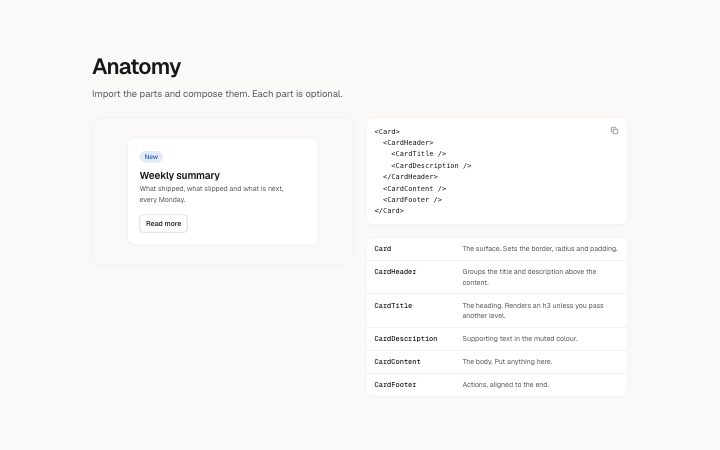
A diagram or live demo beside the part tree and part list of a compound component.
Light · Dark
A diagram or live demo beside the part tree and part list of a compound component.
Light · Dark
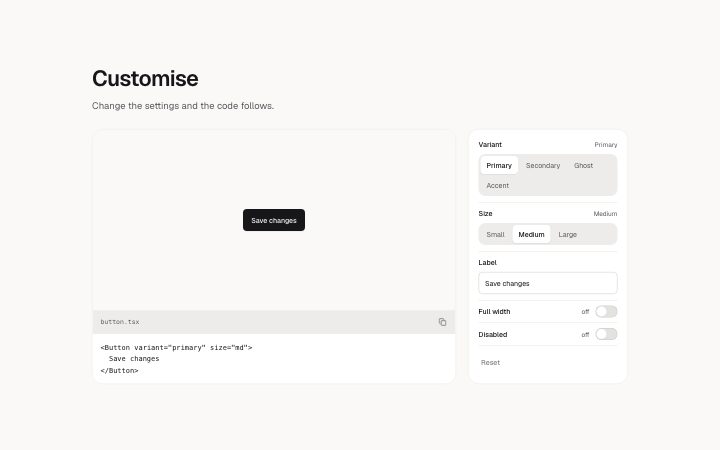
The component-page customise panel: a stage and its code beside a list of controls (select, toggle, text).
Light · Dark
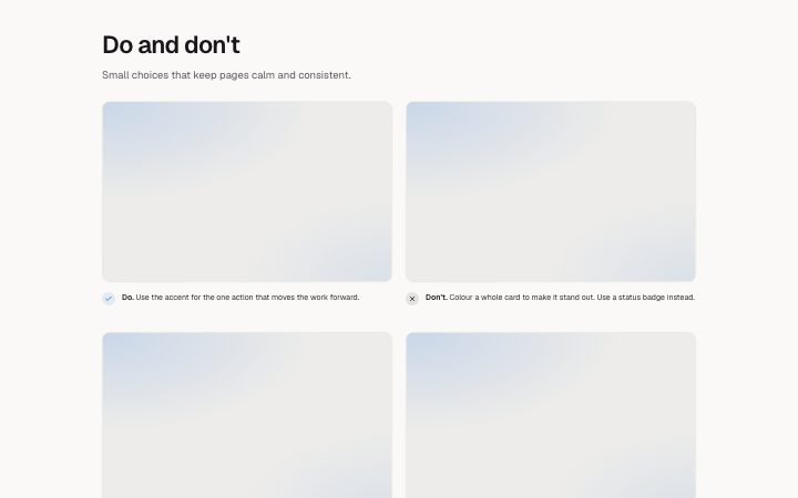
Side-by-side do and don't pairs, each with a short rule and an example image.
Light · Dark
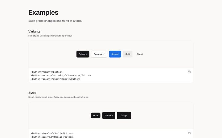
Named example groups (Variants, Sizes, States, With icon, Composition), each a stage (live demo or image) with optional code beneath.
Light · Dark
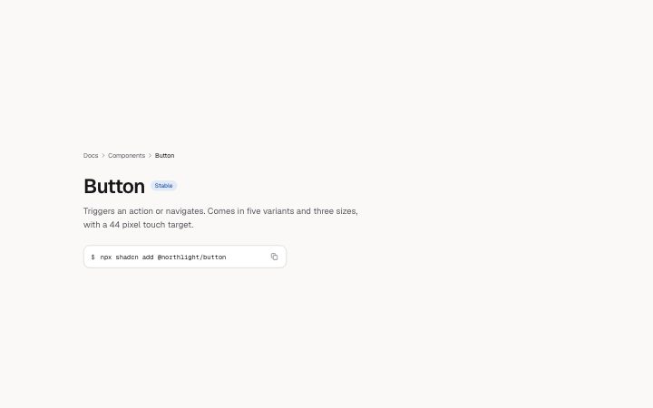
Breadcrumbs, title and description, with an optional status badge, install command and result preview (demo or image). Opens a documentation page.
Light · Dark
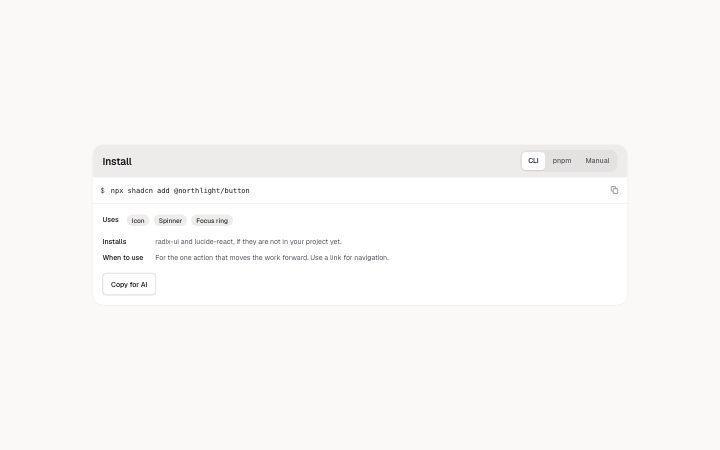
An install panel: tabs of copyable code (CLI, Manual, Download), an optional "Uses" chip row, short labelled facts and actions. A tab with no code is left out.
Light · Dark
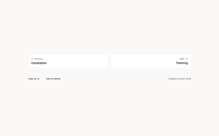
Previous and next cards that close a documentation page, with optional actions (Copy for AI, Edit on GitHub) and a last-updated line.
Light · Dark
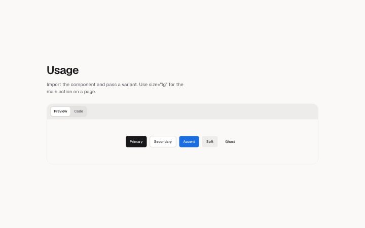
A framed live stage and its code, with Preview and Code tabs when both are present.
Light · Dark
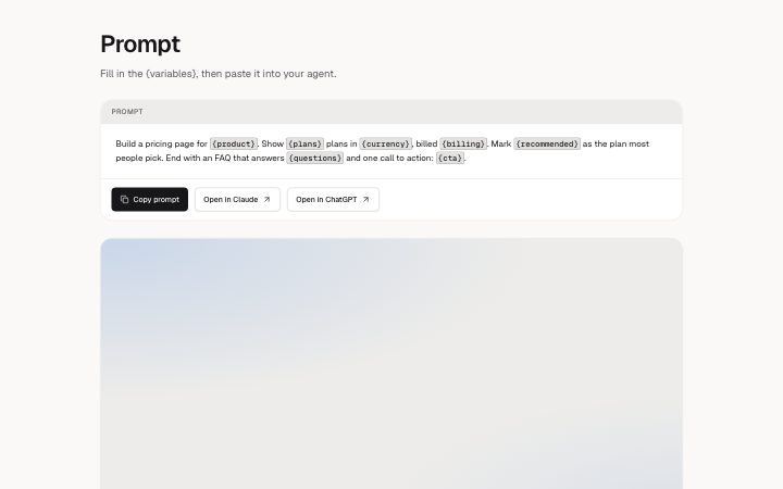
A prompt to copy, with {variables} highlighted. The first action copies the prompt; the others are links (Open in Claude, ChatGPT, v0).
Light · Dark
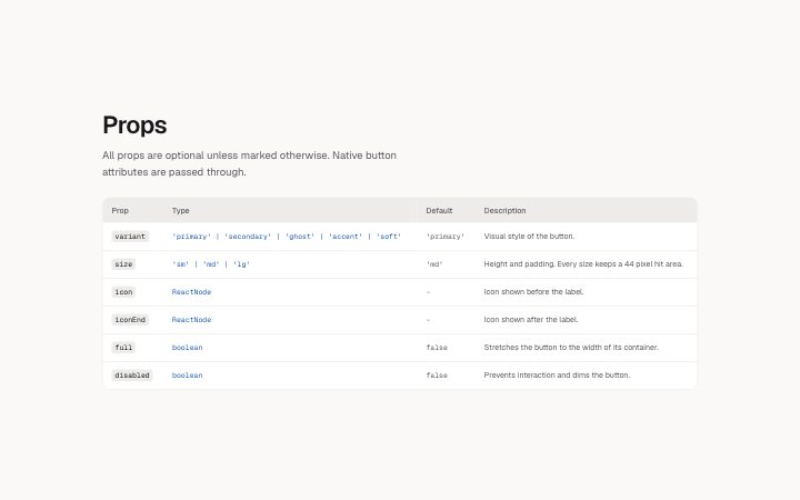
A table of a component API: name, type, default and description. Scrolls sideways in narrow containers.
Light · Dark
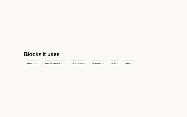
A titled row of link chips: the blocks a page uses, related components.
Light · Dark
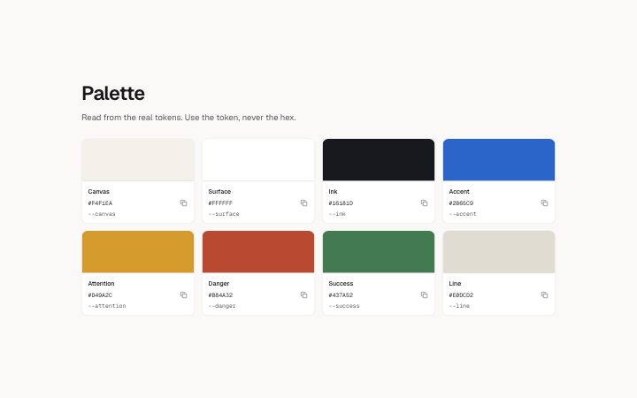
A grid of colour swatches with name, hex value and token. The colour foundation specimen. Only hex values paint a swatch.
Light · Dark
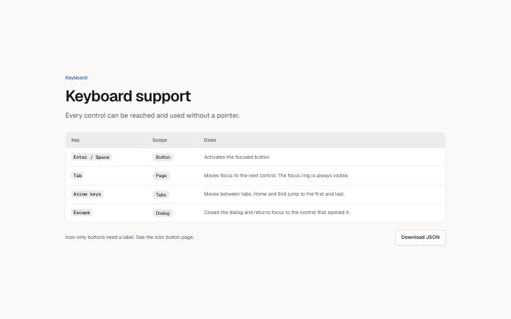
A titled table with free columns (tokens, keyboard keys, variables, changelog).
Light · Dark