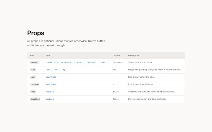
Docs, props table
Install
npx shadcn add @klarhimmel/docs-props-tableUsage
import { Theme } from '@/components/klarhimmel/theme/style';
import { BlockSurface } from '@/components/klarhimmel/blocks/surface';
import DocsPropsTable from '@/components/klarhimmel/blocks/docs-props-table';

export default function Section() {
  return (
    <Theme theme="brand">
      <BlockSurface>
        <DocsPropsTable props={{
          "title": "Props",
          "description": "All props are optional unless marked otherwise. Native button attributes are passed through.",
          "rows": [
            {
              "name": "variant",
              "type": "'primary' | 'secondary' | 'ghost' | 'accent' | 'soft'",
              "fallback": "'primary'",
              "description": "Visual style of the button."
            },
            {
              "name": "size",
              "type": "'sm' | 'md' | 'lg'",
              "fallback": "'md'",
              "description": "Height and padding. Every size keeps a 44 pixel hit area."
            },
            {
              "name": "icon",
              "type": "ReactNode",
              "fallback": "-",
              "description": "Icon shown before the label."
            },
            {
              "name": "iconEnd",
              "type": "ReactNode",
              "fallback": "-",
              "description": "Icon shown after the label."
            },
            {
              "name": "full",
              "type": "boolean",
              "fallback": "false",
              "description": "Stretches the button to the width of its container."
            },
            {
              "name": "disabled",
              "type": "boolean",
              "fallback": "false",
              "description": "Prevents interaction and dims the button."
            }
          ]
        }} />
      </BlockSurface>
    </Theme>
  );
}
Install
Import
import Block from '@/components/klarhimmel/blocks/docs-props-table';- docs/props-table
- Category
- Documentation sections: headers, install panels, props tables, previews.
Notes
When to use it
A table of a component API with name, type, default and description columns. For tables with other columns, such as keys or tokens, use `docs-table`.
Writing for it
- Rows hold a name of 40 characters, a type of 80, a default of 40 and a description of 400. Write the type as it appears in the source. - Write a dash or the literal default in the default column. Do not leave it blank, because the column is always drawn. - Keep the description to what the prop does, and list required props first; the table allows 1 to 30 rows.
Watch out for
The table is at least 40rem wide, so a narrow container scrolls it sideways. The scroll area can be focused by keyboard, and a hint line shows only on narrow containers.
Pairs well with
Usage
The block in a page, with its default content (long lists shortened). Every prop is in the table below.
import { Theme } from '@/components/klarhimmel/theme/style';
import { BlockSurface } from '@/components/klarhimmel/blocks/surface';
import DocsPropsTable from '@/components/klarhimmel/blocks/docs-props-table';

export default function Section() {
  return (
    <Theme theme="brand">
      <BlockSurface>
        <DocsPropsTable props={{
          "title": "Props",
          "description": "All props are optional unless marked otherwise. Native button attributes are passed through.",
          "rows": [
            {
              "name": "variant",
              "type": "'primary' | 'secondary' | 'ghost' | 'accent' | 'soft'",
              "fallback": "'primary'",
              "description": "Visual style of the button."
            },
            {
              "name": "size",
              "type": "'sm' | 'md' | 'lg'",
              "fallback": "'md'",
              "description": "Height and padding. Every size keeps a 44 pixel hit area."
            },
            {
              "name": "icon",
              "type": "ReactNode",
              "fallback": "-",
              "description": "Icon shown before the label."
            },
            {
              "name": "iconEnd",
              "type": "ReactNode",
              "fallback": "-",
              "description": "Icon shown after the label."
            },
            {
              "name": "full",
              "type": "boolean",
              "fallback": "false",
              "description": "Stretches the button to the width of its container."
            },
            {
              "name": "disabled",
              "type": "boolean",
              "fallback": "false",
              "description": "Prevents interaction and dims the button."
            }
          ]
        }} />
      </BlockSurface>
    </Theme>
  );
}
Props
The type, default and text limit of every prop. On a real page, over-limit text is kept and checkSections flags it (Installation, Check a page before you ship); this live preview shows the default until it fits. The panel above edits all props.
| Prop | Type | Default | Description |
|---|---|---|---|
title | string | 'Props' | Text, up to 80 characters. |
description | string | 'All props are optional unless marke…' | Text, up to 300 characters. |
rows | { name, type, fallback, description }[] | 6 items | List of 1 to 30. Each item: name, type, fallback, description. |
headingLevel | '1' | '2' | - | One of '1', '2'. Optional; empty is not rendered. |