Docs, pager
Install
npx shadcn add @klarhimmel/docs-pagerUsage
import { Theme } from '@/components/klarhimmel/theme/style';
import { BlockSurface } from '@/components/klarhimmel/blocks/surface';
import DocsPager from '@/components/klarhimmel/blocks/docs-pager';

export default function Section() {
  return (
    <Theme theme="brand">
      <BlockSurface>
        <DocsPager props={{
          "prev": {
            "label": "Previous",
            "title": "Installation",
            "href": "#installation"
          },
          "next": {
            "label": "Next",
            "title": "Theming",
            "href": "#theming"
          },
          "actions": [
            {
              "label": "Copy for AI",
              "href": "#copy"
            },
            {
              "label": "Edit on GitHub",
              "href": "#edit"
            }
          ],
          "updated": "Updated October 2026"
        }} />
      </BlockSurface>
    </Theme>
  );
}
Install
Import
import Block from '@/components/klarhimmel/blocks/docs-pager';- docs/pager
- Category
- Documentation sections: headers, install panels, props tables, previews.
Notes
When to use it
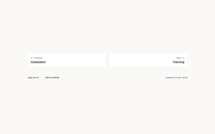
Closes a documentation page with previous and next cards, plus optional actions and a last-updated line. It does not list related content; for that use `docs-related`.
Writing for it
- Each step has a label of 20 characters, a title of 80 and a link. Make the title the name of the destination page, not a verb. - Actions take up to 3 links, drawn as ghost buttons; Copy for AI and Edit on GitHub are the typical pair. - The updated line holds 40 characters. Put a month and year in it, so a reader can judge how stale the page may be.
Watch out for
A step card with an empty title is not drawn at all. On the first page, leave prev blank and the next card stays on the right half of the grid, rather than jumping to the left.
Pairs well with
Usage
The block in a page, with its default content (long lists shortened). Every prop is in the table below.
import { Theme } from '@/components/klarhimmel/theme/style';
import { BlockSurface } from '@/components/klarhimmel/blocks/surface';
import DocsPager from '@/components/klarhimmel/blocks/docs-pager';

export default function Section() {
  return (
    <Theme theme="brand">
      <BlockSurface>
        <DocsPager props={{
          "prev": {
            "label": "Previous",
            "title": "Installation",
            "href": "#installation"
          },
          "next": {
            "label": "Next",
            "title": "Theming",
            "href": "#theming"
          },
          "actions": [
            {
              "label": "Copy for AI",
              "href": "#copy"
            },
            {
              "label": "Edit on GitHub",
              "href": "#edit"
            }
          ],
          "updated": "Updated October 2026"
        }} />
      </BlockSurface>
    </Theme>
  );
}
Props
The type, default and text limit of every prop. On a real page, over-limit text is kept and checkSections flags it (Installation, Check a page before you ship); this live preview shows the default until it fits. The panel above edits all props.
| Prop | Type | Default | Description |
|---|---|---|---|
prev | { label, title, href } | {…} | Fields: label, title, href. |
next | { label, title, href } | {…} | Fields: label, title, href. |
actions | Link[] | 2 items | List of up to 3. |
updated | string | 'Updated October 2026' | Text, up to 40 characters. |