Docs, preview frame
Install
npx shadcn add @klarhimmel/docs-preview-frameUsage
import { Theme } from '@/components/klarhimmel/theme/style';
import { BlockSurface } from '@/components/klarhimmel/blocks/surface';
import DocsPreviewFrame from '@/components/klarhimmel/blocks/docs-preview-frame';

export default function Section() {
  return (
    <Theme theme="brand">
      <BlockSurface>
        <DocsPreviewFrame props={{
          "title": "Usage",
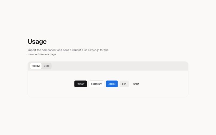
          "description": "Import the component and pass a variant. Use size=\"lg\" for the main action on a page.",
          "preview": {
            "src": "",
            "alt": "The button in its primary, secondary and ghost variants"
          },
          "demo": "button-variants",
          "filename": "page.tsx",
          "code": "import { Button } from '@northlight/ui';\n\nexport function Actions() {\n  return (\n    <div className=\"flex gap-3\">\n      <Button>Save changes</Button>\n      <Button variant=\"secondary\">Cancel</Button>\n    </div>\n  );\n}"
        }} />
      </BlockSurface>
    </Theme>
  );
}
Install
Import
import Block from '@/components/klarhimmel/blocks/docs-preview-frame';- docs/preview-frame
- About
- A framed live stage and its code, with Preview and Code tabs when both are present. The stage is a live demo (demo id) or an image; either part may be left out (code-only SKILL.md, preview-only expected result).
- Category
- Documentation sections: headers, install panels, props tables, previews.
Notes
When to use it
A single framed stage with its code, switching between Preview and Code tabs when both exist. Use `docs-examples` for several named variations and `docs-anatomy` when the parts need explaining.
Writing for it
- Title is capped at 80 characters and the description at 300. Say what the reader is looking at, such as the finished page or the file to save. - Code holds 2000 characters and an optional filename of 60; give the filename when the file location matters, such as a skill or config file. - Set a demo id for a live stage or an image for a static one. Either part can be left out for a code-only or preview-only frame.
Watch out for
The tab switch appears only when both a stage and code exist. With only one of them the frame shows it plainly, and if neither is set the frame is empty.
Pairs well with
Usage
The block in a page, with its default content (long lists shortened). Every prop is in the table below.
import { Theme } from '@/components/klarhimmel/theme/style';
import { BlockSurface } from '@/components/klarhimmel/blocks/surface';
import DocsPreviewFrame from '@/components/klarhimmel/blocks/docs-preview-frame';

export default function Section() {
  return (
    <Theme theme="brand">
      <BlockSurface>
        <DocsPreviewFrame props={{
          "title": "Usage",
          "description": "Import the component and pass a variant. Use size=\"lg\" for the main action on a page.",
          "preview": {
            "src": "",
            "alt": "The button in its primary, secondary and ghost variants"
          },
          "demo": "button-variants",
          "filename": "page.tsx",
          "code": "import { Button } from '@northlight/ui';\n\nexport function Actions() {\n  return (\n    <div className=\"flex gap-3\">\n      <Button>Save changes</Button>\n      <Button variant=\"secondary\">Cancel</Button>\n    </div>\n  );\n}"
        }} />
      </BlockSurface>
    </Theme>
  );
}
Props
The type, default and text limit of every prop. On a real page, over-limit text is kept and checkSections flags it (Installation, Check a page before you ship); this live preview shows the default until it fits. The panel above edits all props.
| Prop | Type | Default | Description |
|---|---|---|---|
title | string | 'Usage' | Text, up to 80 characters. |
description | string | 'Import the component and pass a var…' | Text, up to 300 characters. |
preview | Media | {…} | Optional; empty is not rendered. |
demo | string | 'button-variants' | Text, up to 80 characters. Optional; empty is not rendered. |
filename | string | 'page.tsx' | Text, up to 60 characters. Optional; empty is not rendered. |
code | string | 'import { Button } from '@northlight…' | Text, up to 2000 characters. Optional; empty is not rendered. |
headingLevel | '1' | '2' | - | One of '1', '2'. Optional; empty is not rendered. |