Docs, prompt
Install
npx shadcn add @klarhimmel/docs-promptUsage
import { Theme } from '@/components/klarhimmel/theme/style';
import { BlockSurface } from '@/components/klarhimmel/blocks/surface';
import DocsPrompt from '@/components/klarhimmel/blocks/docs-prompt';

export default function Section() {
  return (
    <Theme theme="brand">
      <BlockSurface>
        <DocsPrompt props={{
          "title": "Prompt",
          "description": "Fill in the {variables}, then paste it into your agent.",
          "label": "Prompt",
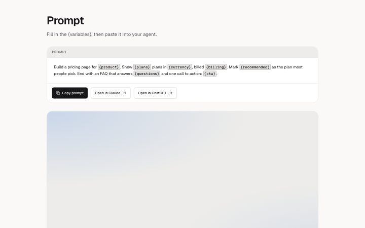
          "prompt": "Build a pricing page for {product}. Show {plans} plans in {currency}, billed {billing}. Mark {recommended} as the plan most people pick. End with an FAQ that answers {questions} and one call to action: {cta}.",
          "actions": [
            {
              "label": "Copy prompt",
              "href": ""
            },
            {
              "label": "Open in Claude",
              "href": "#claude"
            },
            {
              "label": "Open in ChatGPT",
              "href": "#chatgpt"
            }
          ],
          "result": {
            "src": "",
            "alt": "A pricing page with three plans, the recommended one marked"
          },
          "resultCaption": "A good run: three plans, one marked, prices with the VAT basis."
        }} />
      </BlockSurface>
    </Theme>
  );
}
Install
Import
import Block from '@/components/klarhimmel/blocks/docs-prompt';- docs/prompt
- About
- A prompt to copy, with {variables} highlighted. The first action copies the prompt; the others are links (Open in Claude, ChatGPT, v0). An optional result image shows what it produced.
- Category
- Documentation sections: headers, install panels, props tables, previews.
Notes
When to use it
A prompt a reader copies into an AI tool, with {variables} highlighted. For a shell command to copy, use `docs-install`.
Writing for it
- The prompt holds 1500 characters and line breaks are kept. Wrap the parts a reader must change in curly braces so they are highlighted as variables. - The first action is the copy button and the other links, up to 4 in all, open the prompt in outside tools. Label the first one Copy prompt, not a link text. - The label above the prompt holds 20 characters. Add a result image and a caption of 160 characters to show what the prompt produces.
Watch out for
The copy button copies the raw prompt text, braces included, not the highlighted version. While editing, the variable highlight is switched off so the text can be changed.
Pairs well with
Usage
The block in a page, with its default content (long lists shortened). Every prop is in the table below.
import { Theme } from '@/components/klarhimmel/theme/style';
import { BlockSurface } from '@/components/klarhimmel/blocks/surface';
import DocsPrompt from '@/components/klarhimmel/blocks/docs-prompt';

export default function Section() {
  return (
    <Theme theme="brand">
      <BlockSurface>
        <DocsPrompt props={{
          "title": "Prompt",
          "description": "Fill in the {variables}, then paste it into your agent.",
          "label": "Prompt",
          "prompt": "Build a pricing page for {product}. Show {plans} plans in {currency}, billed {billing}. Mark {recommended} as the plan most people pick. End with an FAQ that answers {questions} and one call to action: {cta}.",
          "actions": [
            {
              "label": "Copy prompt",
              "href": ""
            },
            {
              "label": "Open in Claude",
              "href": "#claude"
            },
            {
              "label": "Open in ChatGPT",
              "href": "#chatgpt"
            }
          ],
          "result": {
            "src": "",
            "alt": "A pricing page with three plans, the recommended one marked"
          },
          "resultCaption": "A good run: three plans, one marked, prices with the VAT basis."
        }} />
      </BlockSurface>
    </Theme>
  );
}
Props
The type, default and text limit of every prop. On a real page, over-limit text is kept and checkSections flags it (Installation, Check a page before you ship); this live preview shows the default until it fits. The panel above edits all props.
| Prop | Type | Default | Description |
|---|---|---|---|
title | string | 'Prompt' | Text, up to 60 characters. |
description | string | 'Fill in the {variables}, then paste…' | Text, up to 300 characters. |
label | string | 'Prompt' | Text, up to 20 characters. |
prompt | string | 'Build a pricing page for {product}.…' | Text, up to 1500 characters. |
actions | Link[] | 3 items | List of up to 4. |
result | Media | {…} | See the type. |
resultCaption | string | 'A good run: three plans, one marked…' | Text, up to 160 characters. |
headingLevel | '1' | '2' | - | One of '1', '2'. Optional; empty is not rendered. |