Docs, anatomy
Install
npx shadcn add @klarhimmel/docs-anatomyUsage
import { Theme } from '@/components/klarhimmel/theme/style';
import { BlockSurface } from '@/components/klarhimmel/blocks/surface';
import DocsAnatomy from '@/components/klarhimmel/blocks/docs-anatomy';

export default function Section() {
  return (
    <Theme theme="brand">
      <BlockSurface>
        <DocsAnatomy props={{
          "title": "Anatomy",
          "description": "Import the parts and compose them. Each part is optional.",
          "preview": {
            "src": "",
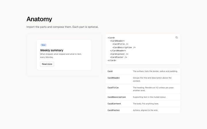
            "alt": "A card with its header, title, description and content parts labelled"
          },
          "demo": "card-basic",
          "tree": "<Card>\n  <CardHeader>\n    <CardTitle />\n    <CardDescription />\n  </CardHeader>\n  <CardContent />\n  <CardFooter />\n</Card>",
          "parts": [
            {
              "name": "Card",
              "description": "The surface. Sets the border, radius and padding."
            },
            {
              "name": "CardHeader",
              "description": "Groups the title and description above the content."
            },
            {
              "name": "CardTitle",
              "description": "The heading. Renders an h3 unless you pass another level."
            },
            {
              "name": "CardDescription",
              "description": "Supporting text in the muted colour."
            },
            {
              "name": "CardContent",
              "description": "The body. Put anything here."
            },
            {
              "name": "CardFooter",
              "description": "Actions, aligned to the end."
            }
          ]
        }} />
      </BlockSurface>
    </Theme>
  );
}
Install
Import
import Block from '@/components/klarhimmel/blocks/docs-anatomy';- docs/anatomy
- Category
- Documentation sections: headers, install panels, props tables, previews.
Notes
When to use it
Shows how a compound component is built: a diagram or live demo on one side, the part tree and a list of part names on the other. When one setup or one set of variants is the point, `docs-examples` or `docs-preview-frame` fits better.
Writing for it
- The tree is a code panel of up to 600 characters, so list each part once with its nesting and leave props out; the parts list below carries the explanation. - Each part has a name of 40 characters and a description of 160. Start the description with what the part does, for example where it sits or what it groups. - Fill the demo field with a registered demo id when you have one. It wins over the preview image, and the image alt text should name the labelled parts.
Watch out for
The parts list allows 12 entries and is drawn only when it has at least one, outside the editor. The name column is a fixed 10rem wide on wider containers, so a long compound name wraps inside it instead of widening the column.
Pairs well with
Usage
The block in a page, with its default content (long lists shortened). Every prop is in the table below.
import { Theme } from '@/components/klarhimmel/theme/style';
import { BlockSurface } from '@/components/klarhimmel/blocks/surface';
import DocsAnatomy from '@/components/klarhimmel/blocks/docs-anatomy';

export default function Section() {
  return (
    <Theme theme="brand">
      <BlockSurface>
        <DocsAnatomy props={{
          "title": "Anatomy",
          "description": "Import the parts and compose them. Each part is optional.",
          "preview": {
            "src": "",
            "alt": "A card with its header, title, description and content parts labelled"
          },
          "demo": "card-basic",
          "tree": "<Card>\n  <CardHeader>\n    <CardTitle />\n    <CardDescription />\n  </CardHeader>\n  <CardContent />\n  <CardFooter />\n</Card>",
          "parts": [
            {
              "name": "Card",
              "description": "The surface. Sets the border, radius and padding."
            },
            {
              "name": "CardHeader",
              "description": "Groups the title and description above the content."
            },
            {
              "name": "CardTitle",
              "description": "The heading. Renders an h3 unless you pass another level."
            },
            {
              "name": "CardDescription",
              "description": "Supporting text in the muted colour."
            },
            {
              "name": "CardContent",
              "description": "The body. Put anything here."
            },
            {
              "name": "CardFooter",
              "description": "Actions, aligned to the end."
            }
          ]
        }} />
      </BlockSurface>
    </Theme>
  );
}
Props
The type, default and text limit of every prop. On a real page, over-limit text is kept and checkSections flags it (Installation, Check a page before you ship); this live preview shows the default until it fits. The panel above edits all props.
| Prop | Type | Default | Description |
|---|---|---|---|
title | string | 'Anatomy' | Text, up to 60 characters. |
description | string | 'Import the parts and compose them. …' | Text, up to 200 characters. |
preview | Media | {…} | Optional; empty is not rendered. |
demo | string | 'card-basic' | Text, up to 80 characters. Optional; empty is not rendered. |
tree | string | '<Card>
<CardHeader>
<CardTitl…' | Text, up to 600 characters. |
parts | { name, description }[] | 6 items | List of up to 12. Each item: name, description. |
headingLevel | '1' | '2' | - | One of '1', '2'. Optional; empty is not rendered. |