Docs, do and don't
Install
npx shadcn add @klarhimmel/docs-do-dontUsage
import { Theme } from '@/components/klarhimmel/theme/style';
import { BlockSurface } from '@/components/klarhimmel/blocks/surface';
import DocsDoDont from '@/components/klarhimmel/blocks/docs-do-dont';

export default function Section() {
  return (
    <Theme theme="brand">
      <BlockSurface>
        <DocsDoDont props={{
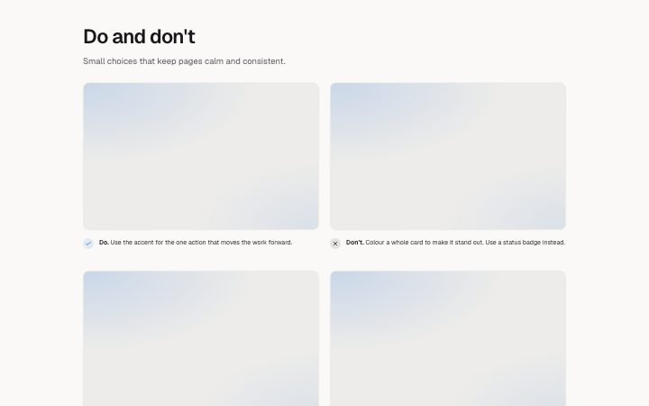
          "title": "Do and don't",
          "description": "Small choices that keep pages calm and consistent.",
          "pairs": [
            {
              "doText": "Use the accent for the one action that moves the work forward.",
              "doMedia": {
                "src": "",
                "alt": "A card with one accent button"
              },
              "dontText": "Colour a whole card to make it stand out. Use a status badge instead.",
              "dontMedia": {
                "src": "",
                "alt": "A card filled with the accent colour"
              }
            },
            {
              "doText": "Write labels that say what happens: \"Save changes\".",
              "doMedia": {
                "src": "",
                "alt": "A button labelled Save changes"
              },
              "dontText": "Use vague labels such as \"Submit\" or \"OK\".",
              "dontMedia": {
                "src": "",
                "alt": "A button labelled Submit"
              }
            }
          ]
        }} />
      </BlockSurface>
    </Theme>
  );
}
Install
Import
import Block from '@/components/klarhimmel/blocks/docs-do-dont';- docs/do-dont
- Category
- Documentation sections: headers, install panels, props tables, previews.
Notes
When to use it
Pairs a correct and an incorrect way to use something, each with a picture, to settle the small judgment calls on a docs page. For a single recommended setup, `docs-preview-frame` is enough.
Writing for it
- Give one pair per rule, from one to four pairs. Both texts hold 200 characters, enough for the rule and a short reason. - The block already prints the words Do and Don't in front of each text, so start the sentence with the instruction itself and do not repeat the label. - Make the two images the same subject and size, differing only in the thing the rule is about, and write alt text that says what is wrong in the wrong one.
Watch out for
An image slot with no source is hidden outside the editor, leaving the text alone on one side. If only one side of a pair has a picture, the two columns look uneven, so fill both or neither.
Pairs well with
Usage
The block in a page, with its default content (long lists shortened). Every prop is in the table below.
import { Theme } from '@/components/klarhimmel/theme/style';
import { BlockSurface } from '@/components/klarhimmel/blocks/surface';
import DocsDoDont from '@/components/klarhimmel/blocks/docs-do-dont';

export default function Section() {
  return (
    <Theme theme="brand">
      <BlockSurface>
        <DocsDoDont props={{
          "title": "Do and don't",
          "description": "Small choices that keep pages calm and consistent.",
          "pairs": [
            {
              "doText": "Use the accent for the one action that moves the work forward.",
              "doMedia": {
                "src": "",
                "alt": "A card with one accent button"
              },
              "dontText": "Colour a whole card to make it stand out. Use a status badge instead.",
              "dontMedia": {
                "src": "",
                "alt": "A card filled with the accent colour"
              }
            },
            {
              "doText": "Write labels that say what happens: \"Save changes\".",
              "doMedia": {
                "src": "",
                "alt": "A button labelled Save changes"
              },
              "dontText": "Use vague labels such as \"Submit\" or \"OK\".",
              "dontMedia": {
                "src": "",
                "alt": "A button labelled Submit"
              }
            }
          ]
        }} />
      </BlockSurface>
    </Theme>
  );
}
Props
The type, default and text limit of every prop. On a real page, over-limit text is kept and checkSections flags it (Installation, Check a page before you ship); this live preview shows the default until it fits. The panel above edits all props.
| Prop | Type | Default | Description |
|---|---|---|---|
title | string | 'Do and don't' | Text, up to 60 characters. |
description | string | 'Small choices that keep pages calm …' | Text, up to 200 characters. |
pairs | { doText, doMedia, dontText, dontMedia }[] | 2 items | List of 1 to 4. Each item: doText, doMedia, dontText, dontMedia. |
headingLevel | '1' | '2' | - | One of '1', '2'. Optional; empty is not rendered. |