Docs, colour swatches
Install
npx shadcn add @klarhimmel/docs-swatchesUsage
import { Theme } from '@/components/klarhimmel/theme/style';
import { BlockSurface } from '@/components/klarhimmel/blocks/surface';
import DocsSwatches from '@/components/klarhimmel/blocks/docs-swatches';

export default function Section() {
  return (
    <Theme theme="brand">
      <BlockSurface>
        <DocsSwatches props={{
          "title": "Palette",
          "description": "Read from the real tokens. Use the token, never the hex.",
          "swatches": [
            {
              "name": "Canvas",
              "value": "#F4F1EA",
              "token": "--canvas"
            },
            {
              "name": "Surface",
              "value": "#FFFFFF",
              "token": "--surface"
            },
            {
              "name": "Ink",
              "value": "#16181D",
              "token": "--ink"
            },
            {
              "name": "Accent",
              "value": "#2B65C9",
              "token": "--accent"
            },
            {
              "name": "Attention",
              "value": "#D49A2C",
              "token": "--attention"
            },
            {
              "name": "Danger",
              "value": "#B84A32",
              "token": "--danger"
            },
            {
              "name": "Success",
              "value": "#437A52",
              "token": "--success"
            },
            {
              "name": "Line",
              "value": "#E0DCD2",
              "token": "--line"
            }
          ]
        }} />
      </BlockSurface>
    </Theme>
  );
}
Install
Import
import Block from '@/components/klarhimmel/blocks/docs-swatches';- docs/swatches
- Category
- Documentation sections: headers, install panels, props tables, previews.
Notes
When to use it
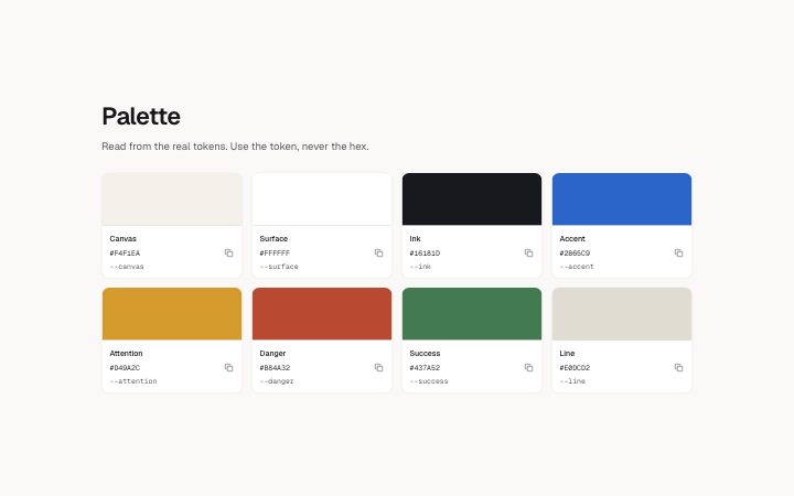
The colour foundation specimen: a grid of swatches with name, hex value and token. For non-colour tokens such as spacing or radius use `docs-table`.
Writing for it
- Each swatch has a name of 30 characters, a value of 16 and a token of 30. Write the value as a full hex code, such as #1F6FEB. - Name swatches by role, like Accent or Surface, and keep the token to the exact variable name, since a reader will copy it. - A grid takes 1 to 16 swatches. Keep related colours together, because the grid is two columns wide on narrow containers and four on wide ones.
Watch out for
Only a hex value paints a swatch. A value such as rgb(0, 0, 0) or a colour name is shown as text but the swatch stays empty, and in the wireframe theme every swatch is blank.
Pairs well with
Usage
The block in a page, with its default content (long lists shortened). Every prop is in the table below.
import { Theme } from '@/components/klarhimmel/theme/style';
import { BlockSurface } from '@/components/klarhimmel/blocks/surface';
import DocsSwatches from '@/components/klarhimmel/blocks/docs-swatches';

export default function Section() {
  return (
    <Theme theme="brand">
      <BlockSurface>
        <DocsSwatches props={{
          "title": "Palette",
          "description": "Read from the real tokens. Use the token, never the hex.",
          "swatches": [
            {
              "name": "Canvas",
              "value": "#F4F1EA",
              "token": "--canvas"
            },
            {
              "name": "Surface",
              "value": "#FFFFFF",
              "token": "--surface"
            },
            {
              "name": "Ink",
              "value": "#16181D",
              "token": "--ink"
            },
            {
              "name": "Accent",
              "value": "#2B65C9",
              "token": "--accent"
            },
            {
              "name": "Attention",
              "value": "#D49A2C",
              "token": "--attention"
            },
            {
              "name": "Danger",
              "value": "#B84A32",
              "token": "--danger"
            },
            {
              "name": "Success",
              "value": "#437A52",
              "token": "--success"
            },
            {
              "name": "Line",
              "value": "#E0DCD2",
              "token": "--line"
            }
          ]
        }} />
      </BlockSurface>
    </Theme>
  );
}
Props
The type, default and text limit of every prop. On a real page, over-limit text is kept and checkSections flags it (Installation, Check a page before you ship); this live preview shows the default until it fits. The panel above edits all props.
| Prop | Type | Default | Description |
|---|---|---|---|
title | string | 'Palette' | Text, up to 60 characters. |
description | string | 'Read from the real tokens. Use the …' | Text, up to 200 characters. |
swatches | { name, value, token }[] | 8 items | List of 1 to 16. Each item: name, value, token. |
headingLevel | '1' | '2' | - | One of '1', '2'. Optional; empty is not rendered. |