Report, callout
Install
npx shadcn add @klarhimmel/report-calloutUsage
import { Theme } from '@/components/klarhimmel/theme/style';
import { BlockSurface } from '@/components/klarhimmel/blocks/surface';
import ReportCallout from '@/components/klarhimmel/blocks/report-callout';

export default function Section() {
  return (
    <Theme theme="brand">
      <BlockSurface>
        <ReportCallout props={{
          "tone": "warning",
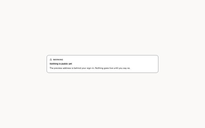
          "title": "Nothing is public yet",
          "text": "The preview address is behind your sign-in. Nothing goes live until you say so."
        }} />
      </BlockSurface>
    </Theme>
  );
}
Install
Import
import Block from '@/components/klarhimmel/blocks/report-callout';- report/callout
- Category
- A document for a reader: key figures, decisions with a recommended default, long-cell tables, timelines, callouts, sources and prose. Rendered to one HTML file by kh-report.
Notes
When to use it
A boxed aside inside a report, for one thing the reader should not miss: a note, a tip, a warning or an important point. If the point is a list of questions for the reader, `report-decisions` fits better, and a long explanation belongs in `report-prose`.
Writing for it
- Pick the tone by what the reader should do. Warning means stop and check, important means act on it, tip and note are optional reading. - The title holds 80 characters and is optional. Use it as a one-line verdict, and let the text field, which allows 1500 characters, carry the reason. - The text is required and supports bold, code and links, so put the one command or address the reader needs inside it instead of describing it.
Watch out for
The kind label (Note, Tip, Warning, Important) and its icon are fixed by the tone and cannot be reworded. An unknown tone falls back to Note, so a typo in the tone silently softens a warning.
Pairs well with
Usage
The block in a page, with its default content (long lists shortened). Every prop is in the table below.
import { Theme } from '@/components/klarhimmel/theme/style';
import { BlockSurface } from '@/components/klarhimmel/blocks/surface';
import ReportCallout from '@/components/klarhimmel/blocks/report-callout';

export default function Section() {
  return (
    <Theme theme="brand">
      <BlockSurface>
        <ReportCallout props={{
          "tone": "warning",
          "title": "Nothing is public yet",
          "text": "The preview address is behind your sign-in. Nothing goes live until you say so."
        }} />
      </BlockSurface>
    </Theme>
  );
}
Props
The type, default and text limit of every prop. On a real page, over-limit text is kept and checkSections flags it (Installation, Check a page before you ship); this live preview shows the default until it fits. The panel above edits all props.
| Prop | Type | Default | Description |
|---|---|---|---|
tone | 'note' | 'tip' | 'warning' | 'important' | 'warning' | One of 'note', 'tip', 'warning', 'important'. |
title | string | 'Nothing is public yet' | Text, up to 80 characters. |
text | string | 'The preview address is behind your …' | Text, up to 1500 characters. |