Report, sources
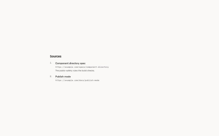
Install
npx shadcn add @klarhimmel/report-sourcesUsage
import { Theme } from '@/components/klarhimmel/theme/style';
import { BlockSurface } from '@/components/klarhimmel/blocks/surface';
import ReportSources from '@/components/klarhimmel/blocks/report-sources';

export default function Section() {
  return (
    <Theme theme="brand">
      <BlockSurface>
        <ReportSources props={{
          "title": "Sources",
          "lead": "",
          "items": [
            {
              "label": "Component directory spec",
              "url": "https://example.com/specs/component-directory",
              "note": "The public-safety rules the build checks."
            },
            {
              "label": "Publish mode",
              "url": "https://example.com/docs/publish-mode",
              "note": ""
            }
          ]
        }} />
      </BlockSurface>
    </Theme>
  );
}
Install
Import
import Block from '@/components/klarhimmel/blocks/report-sources';- report/sources
- Category
- A document for a reader: key figures, decisions with a recommended default, long-cell tables, timelines, callouts, sources and prose. Rendered to one HTML file by kh-report.
Notes
When to use it
The numbered list of references at the end of a report, with the full address shown and a note on what each was used for. For sources behind a research snapshot with kinds and fetch dates, use `sources-list` instead.
Writing for it
- The label is required and holds 200 characters. Name the document or page by its own title, because the label is what becomes the link text. - The url field holds 500 characters and is printed under the label as plain monospace text, so the reader can see where the link goes before clicking. - Use note (300 characters) for what you took from the source, for example which figure or claim, so a reader can weigh it without opening the link.
Watch out for
Only addresses starting with http, https or mailto become links. Anything else, such as a file path or a bare domain, is shown as plain text under an unlinked label.
Pairs well with
Usage
The block in a page, with its default content (long lists shortened). Every prop is in the table below.
import { Theme } from '@/components/klarhimmel/theme/style';
import { BlockSurface } from '@/components/klarhimmel/blocks/surface';
import ReportSources from '@/components/klarhimmel/blocks/report-sources';

export default function Section() {
  return (
    <Theme theme="brand">
      <BlockSurface>
        <ReportSources props={{
          "title": "Sources",
          "lead": "",
          "items": [
            {
              "label": "Component directory spec",
              "url": "https://example.com/specs/component-directory",
              "note": "The public-safety rules the build checks."
            },
            {
              "label": "Publish mode",
              "url": "https://example.com/docs/publish-mode",
              "note": ""
            }
          ]
        }} />
      </BlockSurface>
    </Theme>
  );
}
Props
The type, default and text limit of every prop. On a real page, over-limit text is kept and checkSections flags it (Installation, Check a page before you ship); this live preview shows the default until it fits. The panel above edits all props.
| Prop | Type | Default | Description |
|---|---|---|---|
title | string | 'Sources' | Text, up to 100 characters. |
lead | string | '' | Text, up to 300 characters. |
items | { label, url, note }[] | 2 items | List of 1 to 40. Each item: label, url, note. |
headingLevel | '1' | '2' | - | One of '1', '2'. Optional; empty is not rendered. |