Report, table
Install
npx shadcn add @klarhimmel/report-tableUsage
import { Theme } from '@/components/klarhimmel/theme/style';
import { BlockSurface } from '@/components/klarhimmel/blocks/surface';
import ReportTable from '@/components/klarhimmel/blocks/report-table';

export default function Section() {
  return (
    <Theme theme="brand">
      <BlockSurface>
        <ReportTable props={{
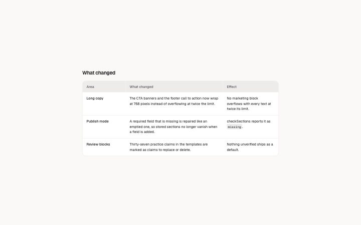
          "title": "What changed",
          "lead": "",
          "columns": [
            {
              "label": "Area"
            },
            {
              "label": "What changed"
            },
            {
              "label": "Effect"
            }
          ],
          "rows": [
            {
              "cells": [
                "Long copy",
                "The CTA banners and the footer call to action now wrap at 768 pixels instead of overflowing at twice the limit.",
                "No marketing block overflows with every text at twice its limit."
              ]
            },
            {
              "cells": [
                "Publish mode",
                "A required field that is missing is repaired like an emptied one, so stored sections no longer vanish when a field is added.",
                "checkSections reports it as `missing`."
              ]
            },
            {
              "cells": [
                "Review blocks",
                "Thirty-seven practice claims in the templates are marked as claims to replace or delete.",
                "Nothing unverified ships as a default."
              ]
            }
          ],
          "note": ""
        }} />
      </BlockSurface>
    </Theme>
  );
}
Install
Import
import Block from '@/components/klarhimmel/blocks/report-table';- report/table
- Category
- A document for a reader: key figures, decisions with a recommended default, long-cell tables, timelines, callouts, sources and prose. Rendered to one HTML file by kh-report.
Notes
When to use it
A table for cells with real sentences in them. Wide containers get a normal table, narrow ones turn each row into a card, so it works on a phone. For plain numeric figures `report-stats` reads faster, and for plan pricing see `pricing-comparison`.
Writing for it
- Define columns first, up to 8 with labels of 40 characters. The first column is the row heading, so put the thing being compared there. - Cells hold 1200 characters and support bold and links. Fill every column of every row, because the cell list is matched to the columns by position. - Use the note (300 characters) under the table for the as-of date or the method, and keep the optional lead for what the reader should conclude.
Watch out for
In the card layout on narrow screens an empty cell is skipped along with its column label, and the first cell becomes the card heading. A row whose first cell is empty has no heading at all.
Pairs well with
Usage
The block in a page, with its default content (long lists shortened). Every prop is in the table below.
import { Theme } from '@/components/klarhimmel/theme/style';
import { BlockSurface } from '@/components/klarhimmel/blocks/surface';
import ReportTable from '@/components/klarhimmel/blocks/report-table';

export default function Section() {
  return (
    <Theme theme="brand">
      <BlockSurface>
        <ReportTable props={{
          "title": "What changed",
          "lead": "",
          "columns": [
            {
              "label": "Area"
            },
            {
              "label": "What changed"
            },
            {
              "label": "Effect"
            }
          ],
          "rows": [
            {
              "cells": [
                "Long copy",
                "The CTA banners and the footer call to action now wrap at 768 pixels instead of overflowing at twice the limit.",
                "No marketing block overflows with every text at twice its limit."
              ]
            },
            {
              "cells": [
                "Publish mode",
                "A required field that is missing is repaired like an emptied one, so stored sections no longer vanish when a field is added.",
                "checkSections reports it as `missing`."
              ]
            },
            {
              "cells": [
                "Review blocks",
                "Thirty-seven practice claims in the templates are marked as claims to replace or delete.",
                "Nothing unverified ships as a default."
              ]
            }
          ],
          "note": ""
        }} />
      </BlockSurface>
    </Theme>
  );
}
Props
The type, default and text limit of every prop. On a real page, over-limit text is kept and checkSections flags it (Installation, Check a page before you ship); this live preview shows the default until it fits. The panel above edits all props.
| Prop | Type | Default | Description |
|---|---|---|---|
title | string | 'What changed' | Text, up to 100 characters. |
lead | string | '' | Text, up to 400 characters. |
columns | { label }[] | 3 items | List of 1 to 8. Each item: label. |
rows | { cells }[] | 3 items | List of up to 60. Each item: cells. |
note | string | '' | Text, up to 300 characters. |
headingLevel | '1' | '2' | - | One of '1', '2'. Optional; empty is not rendered. |